

Choose Readable Fonts for Canvas Quote Art, Proofing and Custom Sizing
The best fonts for printed quote canvases fall into four families: clean sans serifs for modern clarity, sturdy serifs for a formal or heritage feel, legible scripts for warm personal lines, and bold display or hand-lettered styles for short, single-line impact. Before picking a typeface, prioritize three things: readability at the distance you’ll actually view the piece, strong contrast or stroke weight, and generous letter and line spacing. Custom sizing and proofing support allow you to check these choices before the print is made.
TL;DR:
- Sans serif fonts should be at least 14pt bold or 18pt regular for clarity, especially over photographic backgrounds or muted palettes.
- Pair contrasting font weights and styles, such as a wide-set geometric sans with a narrow serif, to create clear hierarchy in multi-font designs.
- Use generous line spacing, at least 1.5 times the font size, and moderate tracking to ensure multi-line quotes remain easily readable from a distance.
- Larger titles allow more flexibility with softer colors, but thin strokes and low-contrast text risk vanishing or flickering when printed at size.
- Always check proofs at the actual print size and from the expected viewing distance to confirm readability, contrast, and spacing before finalizing orders.
Table of Contents
- Font families and when to use them for canvas quotes
- Readability and accessibility rules to follow
- Sizing, tracking, and leading for multi-line quotes on canvas
- Pairing fonts and choosing a mood for the space
- Color and contrast for printed text on canvas
- Practical customization checklist for ordering quote canvas
- Publisher perspective: why typographic choices matter for home and office art
- How Sense Canvas helps: view templates or start a custom order
- Sources
- FAQ
Font families and when to use them for canvas quotes
Each font family carries its own emotional tone, and matching that tone to the quote and the room is the real design decision. Sans serifs like a geometric grotesque read as modern and clean, which suits entryways and minimalist living rooms. Serif fonts carry a formal, established weight that works for study nooks, offices, and quotes with a literary or scriptural source. Scripts feel personal and warm, best kept to short sentimental lines rather than paragraphs, and they shine in bedrooms or nurseries. Bold display and hand-lettered styles deliver punch for a single line, the kind of treatment that suits a motivational phrase above a desk.
- Entryway or living room: a geometric sans for a modern, uncluttered welcome.
- Nursery or bedroom: a soft script for a short, tender phrase.
- Home office: a serif or a bold display font for a motivational one-liner.
- Dining or gathering space: a warm serif for longer, heritage-style quotes.
Avoid very thin-stroke or ultra-high-contrast display fonts for anything longer than a few words. On a large canvas, those hairline strokes tend to disappear or flicker visually, especially across multiple lines.
Readability and accessibility rules to follow

Canvas quotes are printed images of text, and images of text do not resize or adapt the way live text does, so getting the font and contrast right before printing matters more than it would on a screen. W3C guidance on contrast confirms that larger text, defined as font sizes considered large by accessibility standards (for example, roughly equivalent to 14pt bold or 18pt regular), is allowed a lower contrast ratio than smaller text, which means a big, bold headline quote can use a softer color pairing than a smaller caption while staying legible. That gives you more room to use muted or pastel palettes on large-format pieces, but it does not excuse thin strokes. Printed text can look less crisp than the same font on a screen, and faint or hairline strokes are the first thing to lose definition. When your color contrast is on the lower end, choose a sturdier weight to compensate.
Before approving any design, check it the way it will actually be seen:
- View a scaled mockup from your expected viewing distance, not just close up on a screen.
- Choose higher-contrast color combinations when the font is thin or set over a photographic background.
- Bump up stroke weight if you plan to use a softer or more muted palette.
Sizing, tracking, and leading for multi-line quotes on canvas
Point size does not translate directly from a digital file to a wall-sized print. WCAG’s large-text threshold, roughly equivalent to 14pt bold or 18pt regular, corresponds to pixel sizes around 18.5 pixels and 24 pixels, and that pixel equivalence shifts depending on the image’s export DPI, which is why a proof at the intended print size matters more than a number typed into a design tool.
For spacing, two settings do most of the work on a multi-line quote:
- Tracking (letter spacing): start at a value recommended for comfortable spacing and adjust by eye.
- Leading (line spacing): use generous line height, generally at least 1.5 times the font size, consistent with W3C text-spacing guidance for comfortable reading.
- Testing: always check a proof at the actual print size and from the distance you’ll typically view it, since spacing that looks fine on a screen can feel cramped at six feet away.
Tight tracking is the most common mistake in quote canvas design. It saves space but makes multi-line text feel dense and harder to scan from across a room.
Pairing fonts and choosing a mood for the space
Two fonts can build hierarchy in a single canvas, but only when they contrast clearly. Pair a wide-set geometric sans with a light, narrow serif for a calm, modern feel. Pair a high-contrast Didone-style serif, the kind of fashion serif museum collections trace back to luxury branding, with a plain neutral sans for a formal statement piece. Pair a restrained, legible script with a simple sans for a cozy or sentimental line without looking cluttered.
- Contrast weight or width between the two fonts, never pair two similar-weight sans faces.
- Avoid combining fonts with similar x-heights or stroke profiles, since they read as a mismatch rather than a pairing.
- Limit any composition to two fonts, one for the main line and one for a smaller attribution or accent.
A single-font treatment works best for short, punchy quotes where the words alone carry the image. Save two-font pairings for longer quotes that benefit from a visual break between the main line and a name, date, or secondary phrase.
Color and contrast for printed text on canvas
Large, bold titles have more room to use softer or unconventional color choices under W3C’s contrast guidance, but that flexibility shrinks fast if the font itself is thin. A hairline script in a pale color over a light wall can vanish in a room with soft lighting.
- Order a proof or request a scaled mockup before finalizing color choices.
- Avoid low-contrast text over busy photographic backgrounds, where letterforms compete with detail behind them.
- Raise a heavier weight, add a subtle shadow, an outline, or a color block behind the text if contrast still feels weak.
Pro Tip: If a font looks borderline in your mockup, size it up one step before switching styles entirely, since scale alone often fixes a contrast problem.
Practical customization checklist for ordering quote canvas
Apply the choices above in order, and the print will match what you approved on screen.
- Confirm your final quote text and wording, including punctuation.
- Choose a font family and weight that match the quote’s tone.
- Decide whether the quote reads as a single line or spans multiple lines.
- Pick a canvas size based on where it will hang and how far you’ll typically stand from it.
- Adjust tracking and leading so the text reads comfortably at that size.
- Choose a color and background treatment with enough contrast for the font weight you picked.
- Request a proof or scaled mockup before approving the design.
- Choose your material and finish.
- Review the mockup one more time at full scale, then place the order.
Custom sizing across various designs and proofing support let you see the layout before it prints. If a font choice still looks hard to read in your mockup, reach out to support rather than guessing, and always review the final mockup at scale, not just zoomed in, before you approve it.
Publisher perspective: why typographic choices matter for home and office art
Helping customers choose fonts is a common conversation at custom canvas art providers, usually focusing on matching tone to the room rather than picking a trendy typeface. Across many designs and fully customizable sizing, a well-spaced, sturdy font generally outlasts a flashy one. If you’re unsure, ask for proofing help before you order.
— Sense
How Sense Canvas helps: view templates or start a custom order
Once you know the family, weight, and spacing that fit your quote, the next step is seeing it at full size before committing. Custom canvas wall art providers build each piece to chosen dimensions, offer proofing to check contrast and spacing on a mockup, and provide pricing details on their websites.
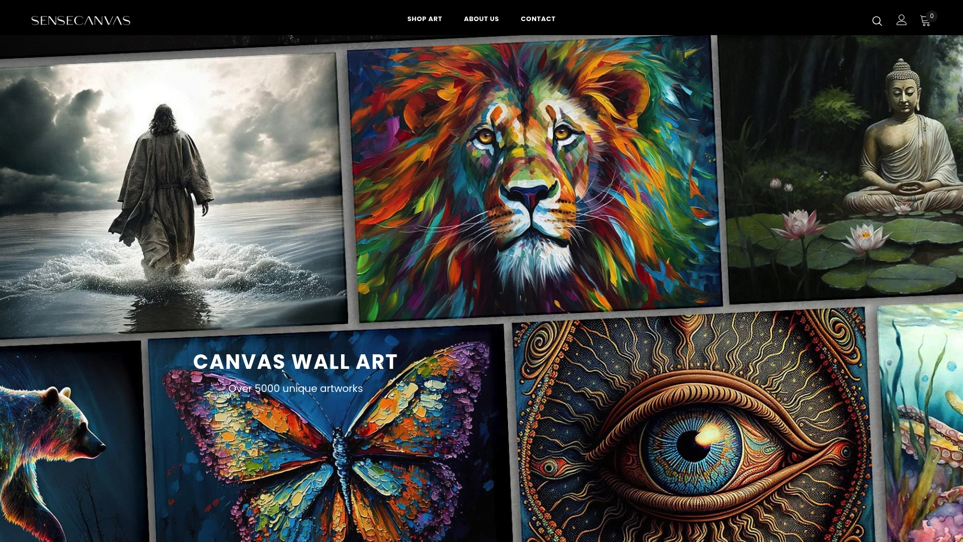
Browse the full collection of canvas wall art to compare quote layouts, or look at the motivational wall art quotes for font and phrasing ideas suited to an office or living room. If you want to mock up your own layout first, tools covered in this AI poster generator guide can help you test a font before you submit it for proofing.
Sources
This guide draws on W3C contrast guidance, W3C text-spacing recommendations, and SFMOMA’s notes on accessible typeface design for readers who want the technical detail behind these rules.
- Understanding Success Criterion 1.4.3: Contrast (Minimum) | WAI | W3C
FAQ
What font style works best for a motivational quote canvas?
Bold sans serif or display fonts tend to work best for short motivational lines, since a heavier weight holds up at large sizes and across a room. Keep the phrase short, one or two lines, and avoid thin or highly decorative letterforms that lose definition when printed large.
Are script fonts hard to read on large canvas prints?
Script fonts can be harder to read at scale if the strokes are thin or the letters connect tightly, especially over multiple lines. They work best for short, sentimental phrases with generous spacing rather than full sentences.
How much letter spacing should I use for a quote canvas?
A starting point of tracking recommended for comfortable spacing keeps multi-line quotes from feeling cramped, based on W3C text-spacing guidance. Adjust from there once you see a proof at actual size.
Can I use any font I want on a custom canvas print?
Fonts used commercially need a license that covers print reproduction, so check that a font’s license permits use on a physical product you’re purchasing or selling before finalizing a design. Free or open-license fonts are generally safer for personal use, but licensing terms vary by foundry.
How do I know if my font choice will look good before I order?
Request a scaled proof or mockup and view it from the distance you’ll actually stand at once it’s hanging. Sense Canvas offers proofing support so you can check contrast, spacing, and size before the piece goes to print.


