

Art Coordination with Furniture Styles: A Practical Guide
Art coordination with furniture styles is the deliberate pairing of artworks and furniture to create a unified, visually engaging interior. Most homeowners treat art as the last step in decorating. That instinct produces rooms that feel assembled rather than designed. Design experts Polo and Onuska argue that art should shape a space from the beginning of the design process, not after every other decision is made. When you treat art as a framework rather than a finishing touch, your rooms gain depth, personality, and a coherence that no amount of furniture shopping alone can produce.
1. Key principles for art coordination with furniture styles
Every successful furniture style art pairing rests on four foundations: scale, color, texture, and intentional contrast. Get these right and the room reads as a whole. Miss one and the art floats, disconnected from everything around it.
Scale and proportion matter more than most homeowners expect. Art that is too small above a large sofa looks timid. Art that crowds a narrow console looks aggressive. A reliable rule: artwork width should span two-thirds to three-quarters of the furniture beneath it.
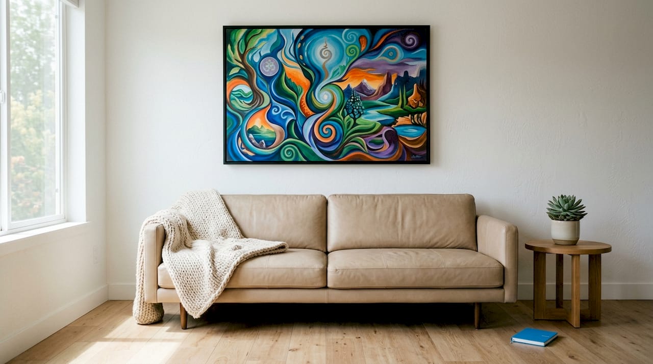
Color relationships give you three tools. You can echo a color already in the furniture for continuity. You can complement it with a hue from the opposite side of the color wheel for energy. You can contrast it sharply for drama. All three work. Choosing none of them produces the beige sameness that defines forgettable rooms.
Texture and finish are the most overlooked dimension of art and furniture harmony. Smooth tables pair well with sleek sculptures, while rustic wood calls for textured canvases. The material conversation between art and furniture is just as important as the visual one.
Intentional contrast is what separates a designed room from a decorated one. Placing a bold abstract piece above a traditional settee creates tension. That tension is not a problem. It is the point.
- Match artwork width to roughly two-thirds of the furniture below it.
- Use color to echo, complement, or contrast, never to match exactly.
- Pair furniture textures with art surfaces that either mirror or counterpoint them.
- Introduce at least one deliberate contrast to prevent the room from feeling static.
Pro Tip: Avoid what designers call “decorator art,” which is art chosen purely because it matches the sofa color. Matching art solely by color produces sterile spaces. Choose art that adds tension, emotion, or an unexpected perspective instead.
2. How to coordinate art with modern and minimalist furniture
Minimalist furniture creates a visual silence that art must fill without overwhelming. Clean lines, neutral palettes, and uncluttered surfaces define this style. The art you choose needs to honor that restraint while still saying something.
Abstract, geometric, and monochrome works are the strongest choices here. A large-format black-and-white photograph above a low-profile platform bed respects the furniture’s simplicity while giving the eye somewhere to land. A single geometric canvas in muted tones above a Parsons-style console does the same.
- Choose large-scale single pieces over grouped arrangements.
- Stick to a limited palette: one or two colors maximum in the artwork.
- Select art with clean edges and minimal visual noise.
- Allow a controlled pop of bold color, one vivid piece in an otherwise neutral room, to create a focal point without chaos.
Texture still matters in minimalist rooms. A canvas with visible brushwork or a slightly raised surface adds tactile interest that flat-printed art cannot. That subtle depth rewards close inspection without disrupting the room’s calm from across the space.
Pro Tip: In minimalist rooms, the frame is part of the art. A thin metal or natural wood frame keeps the composition clean. A heavy ornate frame fights the furniture and loses.
3. Art pairing strategies for traditional and classic furniture styles
Traditional furniture carries visual weight. Carved wood, rich upholstery, and layered detail already fill a room with information. Art in these spaces needs to complement without competing.
Classic landscapes, portraits, and figurative art reinforce the timeless elegance that traditional furniture projects. An oil-style landscape in warm ochres and deep greens above a mahogany sideboard feels inevitable rather than forced. A formal portrait above a wingback chair extends the room’s sense of history.
- Choose art with warm, deep color palettes that echo the furniture’s wood tones.
- Avoid busy, highly detailed art above ornate furniture. The two will fight each other.
- Use substantial frames, gilded or dark wood, to bridge the art and furniture visually.
- Hang art centered above furniture and allow breathing room on all sides.
Placement matters especially in traditional rooms. Framing and positioning should respect furniture detail and architectural elements like molding and wainscoting. Art hung too high or too low in a classically proportioned room disrupts the room’s internal logic.
4. Mixing contemporary art with antique and vintage furniture
This is the pairing most homeowners fear and the one that produces the most interesting rooms. Combining ultra-modern art with antique furniture adds visual friction that livens the space and prevents a static museum feel. Opposite styles attract. The key is managing the tension so it reads as intentional.
Scale is the primary tool. Large-scale, vivid contemporary art balances heavy antique wood furniture through proportion and visual weight. An oversized acrylic painting in electric blue above a Victorian credenza does not clash. It creates a dialogue between eras that makes both pieces more interesting.
Canvas thickness also plays a role. A gallery-wrapped canvas with visible depth reads as a contemporary object even before you register the image. That physical presence holds its own against the mass of antique wood.
- Use bold color in the contemporary art to energize dark, heavy antique pieces.
- Size the artwork generously. Undersized modern art above large antique furniture looks like an afterthought.
- Limit the number of contemporary art pieces in a traditionally furnished room. One or two strong works are more effective than many small ones.
- Let the antique furniture anchor the room while the art provides the surprise.
This approach works because visual weight and scale are the real organizing principles of any room, not period consistency. When both elements carry appropriate weight, the contrast becomes a feature.
5. Practical tips for placement, scale, and lighting
Correct placement is the difference between art that belongs in a room and art that merely hangs there. The standard rule: center art at 57–60 inches from the floor, which approximates average eye level. That measurement applies whether the art hangs alone or as part of a group.
- Hang art 6–12 inches above furniture to create a visual connection between the two.
- For gallery walls, treat the grouping as a single unit and apply the two-thirds width rule to the whole arrangement.
- Use picture lights or directional track lighting to highlight artwork. Strategic lighting enhances the presence of both paintings and sculptures while complementing furniture finishes.
- In rooms with high ceilings, scale up. Art that works in a standard room looks undersized when the ceiling rises above nine feet.
- Avoid centering art on a wall when the furniture below it is off-center. Hang the art centered above the furniture, not the wall.
Pro Tip: Live with art placement before committing. Tape paper templates to the wall at the intended size and position. Leave them for a day or two. You will see problems with scale and placement that you cannot spot in the moment.
Color coordination in art and furniture also extends to lighting color temperature. Warm bulbs (2700–3000K) flatter wood furniture and oil-style paintings. Cool bulbs (4000K and above) suit modern rooms with metal furniture and abstract works.
Key takeaways
Art coordination with furniture styles requires matching scale, texture, color, and contrast before choosing a single piece.
| Point | Details |
|---|---|
| Scale is the first rule | Artwork width should span two-thirds to three-quarters of the furniture below it. |
| Avoid decorator art | Choose art for emotional depth and tension, not just to match furniture colors. |
| Contrast creates interest | Pairing contemporary art with antique furniture produces dynamic, layered rooms. |
| Placement is precise | Center art at 57–60 inches from the floor and 6–12 inches above furniture. |
| Lighting completes the pairing | Match bulb color temperature to furniture finish and art style for full cohesion. |
Why most homeowners get art coordination wrong
The most common mistake I see is treating art as a reward. Homeowners finish the furniture, paint the walls, and then go looking for something to fill the empty space above the sofa. That sequence guarantees a disconnected result. Art should be a framework for expressing individuality, not a uniform afterthought chosen to match the upholstery.
The second mistake is playing it too safe. A room where every element agrees with every other element is not harmonious. It is boring. The rooms that people remember and photograph always contain at least one deliberate tension, a classical sculpture beside a neon canvas print, a vintage-style artwork hung above a glass-and-steel console. That friction is what makes a room feel alive.
The third mistake is ignoring how art changes over time. Your furniture will outlast any single design moment. Choosing art that you genuinely respond to, rather than art that matches this season’s palette, means the room stays interesting as trends shift. I have seen homeowners swap one well-chosen piece and completely refresh a room that had felt stale for years. The furniture did not change. The art did.
The practical lesson: start with the art you love, then build the furniture conversation around it. Scale, texture, and placement are all adjustable. Genuine feeling for a piece is not.
— Sense
Sensecanvas has art that works with any furniture style
Finding art that genuinely fits your furniture style is harder than it sounds. Most options are either too generic or too niche.

Sensecanvas offers over 15,000 canvas wall art prints across styles including abstract, figurative, motivational, and vintage, with prices starting at $85. Every piece is available in custom sizes, so you can hit the two-thirds width rule without compromise. Whether you are pairing a bold abstract canvas with a minimalist sofa or finding a statement piece for an antique-furnished study, Sensecanvas carries options that fit the room rather than fight it. Browse the full collection and filter by style, color, and size to find the piece your furniture has been waiting for.
FAQ
What is art coordination with furniture styles?
Art coordination with furniture styles is the intentional pairing of artworks with furniture to achieve visual harmony through matched or contrasting scale, color, and texture. It treats art as a design element rather than a decorative afterthought.
How large should art be relative to furniture?
Artwork should span two-thirds to three-quarters of the width of the furniture below it. This proportion creates a visual connection without overwhelming the piece.
Can modern art work with antique furniture?
Yes. Large-scale contemporary art paired with heavy antique furniture creates dynamic tension that energizes the room. The key is matching visual weight so neither element dominates.
How high should art be hung above furniture?
Hang art 6–12 inches above furniture and center it at approximately 57–60 inches from the floor. This placement creates a clear visual link between the art and the furniture beneath it.
What is “decorator art” and why should I avoid it?
Decorator art is chosen purely to match furniture colors, which produces sterile, personality-free rooms. Choose art that adds emotional depth or an unexpected perspective instead.
Recommended
- LimeSpot Conversion Helper
- King Chess Canvas Wall Art Print Decor Artwork Picture Painting Poster Pieces Fallen Checkmate Game Win Pop – Sense Canvas
- Vintage Coffee Canvas Wall Art Print Decor Artwork Picture Painting Poster Retro Woman Drinking Kitchen Old – Sense Canvas
- Chess King & Queen 2D Canvas Wall Art Print Decor Artwork Picture Painting Poster Black & White Piece Checkmate – Sense Canvas


