

Layering Textures with Canvas Prints for Bold Decor
Layering textures with canvas prints decor is defined as the practice of combining canvas art with mixed materials, including mirrors, plants, and textiles, to create visual depth and tactile contrast in a room. Done well, this approach turns a flat wall into a composition with real presence. Canvas prints add texture and depth to personal spaces in ways that single-piece art simply cannot. The key is understanding how each material contributes to the whole, and how to keep the arrangement from tipping into clutter. This guide covers the materials, methods, and principles that make layered wall decor work.
What materials work best for layering textures in canvas print decor?
Canvas art comes in three distinct texture categories, and knowing the difference shapes every layering decision you make. Smooth prints use flat, photographic surfaces. Hand-painted canvases carry visible brushstrokes that catch light differently at different angles. Three-dimensional relief canvases have raised surfaces that create actual shadows on the wall. Each type interacts differently with the materials around it.
The materials you layer alongside canvas prints determine the final feel of the arrangement. Mixing mirrors, plants, and canvas prints for wall aesthetics is one of the most effective ways to add contrast without adding visual noise. Mirrors bounce light and create the illusion of space. Plants introduce organic, irregular shapes that soften geometric canvas edges. Textiles like woven wall hangings or macramé add warmth and a matte surface that balances glossy or varnished canvas finishes.
Here is how each material type contributes to a layered arrangement:
- Mirrors: Reflect light and add a metallic or glass texture that contrasts with matte canvas surfaces.
- Plants: Bring organic curves and green tones that ground abstract or bold canvas prints.
- Woven textiles: Add soft, matte texture that pairs well with smooth or high-gloss canvas finishes.
- Wooden frames or shelves: Introduce warm grain patterns that complement earthy or neutral canvas palettes.
- Ceramic or sculptural objects: Provide three-dimensional weight that anchors a flat gallery arrangement.
| Canvas type | Surface quality | Best pairing material |
|---|---|---|
| Smooth print | Flat, photographic | Mirrors, metallic frames |
| Hand-painted | Visible brushstrokes | Velvet upholstery, soft textiles |
| 3D relief | Raised, shadow-casting | Minimal furniture, open wall space |
The table above shows a clear pattern. The more texture a canvas carries on its own, the simpler its surroundings need to be.
How do you balance and arrange layered textures with canvas art?
Compositional hierarchy is the single most important principle in layered wall decor. Minimalist canvas prints work best in heavily textured rooms, while highly textured art needs minimal furniture to stay in focus. This rule prevents the most common mistake in layered decor: two competing focal points that cancel each other out.
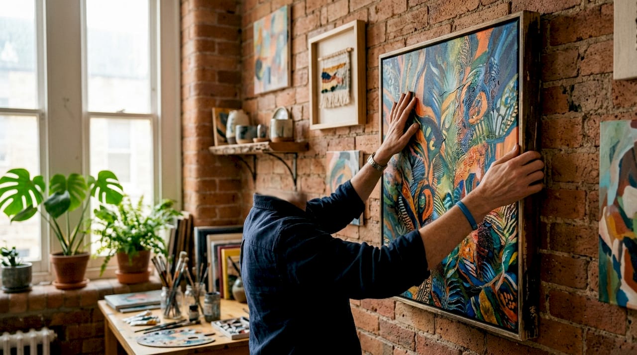
Scale matters as much as texture. A large canvas with bold brushstrokes reads as the anchor of a room. Smaller prints and objects orbit that anchor without challenging it. When every piece is the same size, the eye has nowhere to rest. Vary your canvas dimensions deliberately, using one dominant piece and two or three supporting elements at smaller scales.
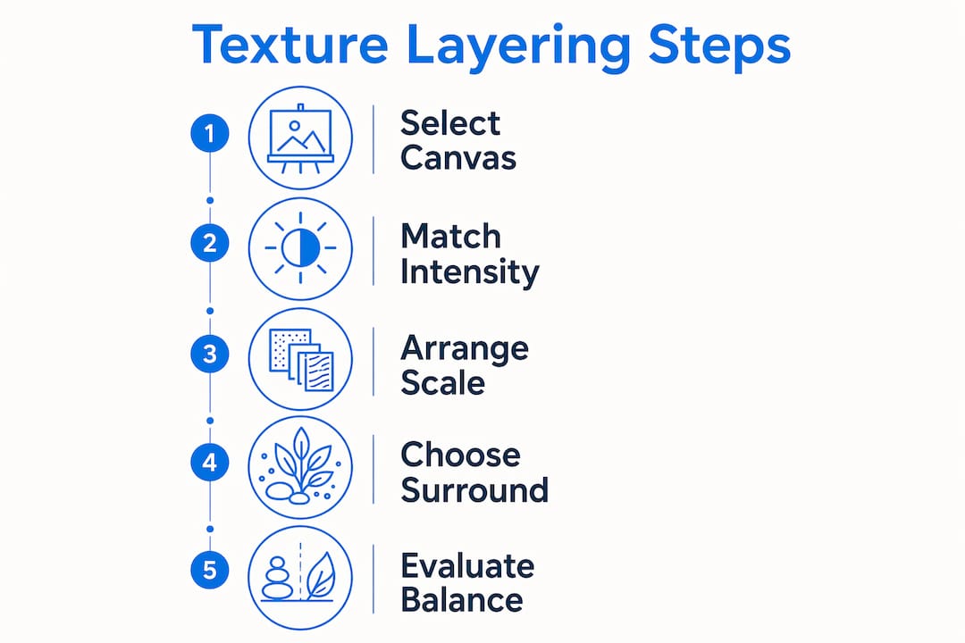
Color coordination ties the arrangement together. Pull one or two colors from your canvas print and repeat them in the surrounding objects. A canvas with deep navy tones pairs naturally with a navy ceramic vase or a dark wood shelf. This repetition creates visual rhythm without requiring identical materials.
Paintings with visible brushstrokes pair well with velvet upholstery, enhancing tactile depth without visual competition. This is tactile contrast working correctly. The rough surface of the canvas and the soft surface of the upholstery occupy different sensory registers, so they complement rather than compete.
- Use one dominant canvas as the anchor and build outward.
- Match the texture intensity of your art to the opposite intensity in your furniture.
- Repeat one accent color from the canvas in at least two other objects nearby.
- Keep negative space around highly textured pieces so they can breathe.
Pro Tip: Pick your canvas first, then shop for surrounding decor. Working in reverse, choosing art to match existing furniture, almost always produces a timid result because you are limited to what already exists in the room.
What are practical methods for layering textures using canvas prints?
The gallery wall is the most versatile format for canvas print layering. Using multiple canvas sizes and mixing themes in a gallery wall creates creativity through layered canvases with a consistent palette. The key word is consistent. A gallery wall with five different color palettes looks accidental. One with five different textures but a shared color story looks intentional.
The shelf-leaning technique is less common but highly effective. Placing canvases on mantels or shelves with layered decor items in front creates modern depth beyond wall hanging. A canvas leaned against a wall on a shelf, with a small plant or ceramic object placed in front of it, creates a genuine sense of foreground and background. That depth is impossible to achieve with wall-mounted art alone.
Foam-mounted canvases sit flush against the wall with no visible frame. Framed canvases add a border that functions as its own texture layer. For layered arrangements, framed canvases give you more visual separation between pieces, which helps when you are working with busy or detailed prints.
Here is a step-by-step setup for a layered gallery wall:
- Choose one anchor canvas, at least 24 by 30 inches, and place it at eye level in the center of your arrangement.
- Select two or three smaller canvases in complementary styles and arrange them asymmetrically around the anchor.
- Add one non-canvas element, a mirror, a woven piece, or a mounted shelf, to break the flat plane of the wall.
- Place one organic element, a trailing plant or a dried botanical arrangement, at the lower edge of the display.
- Step back and check that no two pieces of the same size sit directly next to each other.
| Display method | Depth effect | Best for |
|---|---|---|
| Wall hanging | Flat, graphic | Bold prints, photography |
| Shelf leaning | Foreground/background | Mixed media, layered objects |
| Mixed media gallery | Maximum depth | Eclectic, maximalist rooms |
Pro Tip: Before you put a single nail in the wall, lay your entire arrangement on the floor. Photograph it from above. That photo shows you exactly how the composition reads before you commit.
Home decor brands that invest in targeted digital advertising understand that gallery wall shoppers are not buying a single product. They are building a system. That insight applies to how you shop for your own layered arrangement.
How can digital texture concepts improve your physical canvas decor?
Digital texture layering offers a useful mental model for physical decor, even if you never open design software. Blending modes and opacity adjustments in programs like Adobe Photoshop combine textures to create tactile complexity. The same logic applies to a room. Each material you add is a new “layer,” and the question is always how much of the layer beneath it remains visible.
Grunge textures in digital design use rough, irregular surfaces to add age and character to clean images. You can replicate this physically by pairing a crisp, modern canvas print with a rough-hewn wooden frame or a distressed metal shelf. The contrast between clean and worn creates the same visual tension that makes grunge overlays compelling in graphic design.
Vintage paper textures in digital work add warmth and softness to high-contrast images. In physical decor, aged linen, sepia-toned prints, or warm amber lighting achieve the same effect. If your canvas art is high-contrast and bold, the materials around it should lean warm and soft to avoid a cold, clinical feel.
Here are four ways to apply digital layering logic to physical canvas arrangements:
- Opacity thinking: Place a sheer textile in front of a canvas to soften its impact, the way reducing opacity softens a digital layer.
- Blending modes: Combine materials with different light reflectance, matte canvas with glossy ceramic, to create contrast without color conflict.
- Texture overlays: Add a rough-textured frame to a smooth print to introduce surface interest the print itself lacks.
- Layer order: Put the most detailed piece at the back and simpler objects in front, just as complex base layers sit beneath simpler top layers in digital design.
This framework turns decorating decisions from guesswork into a repeatable process. Once you think in layers, every object in a room becomes a deliberate choice.
Key Takeaways
Layering textures with canvas prints works best when compositional hierarchy, tactile contrast, and color repetition work together as a system.
| Point | Details |
|---|---|
| Match texture intensity to furniture | Use textured art in minimal rooms and flat prints in heavily decorated spaces. |
| Vary canvas scale deliberately | One large anchor piece with smaller supporting elements prevents visual competition. |
| Use the shelf-leaning technique | Leaning canvases on shelves with objects in front creates foreground and background depth. |
| Repeat color from canvas to decor | Pull one or two canvas colors into nearby objects to create visual rhythm. |
| Apply digital layering logic | Think of each material as a layer with opacity and blending to guide physical arrangement decisions. |
What I’ve learned from watching layered decor go wrong
Most layered decor fails at the same point: the collector’s mistake. You find a canvas you love, then a mirror you love, then a plant you love, and you put them all on the same wall. Each piece is good. Together, they fight. The problem is not the individual choices. It is the absence of a hierarchy that tells the eye where to go first.
The fix is simpler than most decorating guides admit. Pick one piece as the undisputed focal point before you buy anything else. Every subsequent choice should either support that piece or step back from it. A canvas with heavy impasto texture and bold color needs nothing around it except space and perhaps one low-contrast object. A smooth, minimal print can carry a much busier arrangement because it does not compete.
I have also noticed that the shelf-leaning technique is consistently underused. People hang everything. But a canvas leaned on a shelf, with a small ceramic or a trailing plant placed in front of it, creates a sense of physical depth that wall-mounted art cannot replicate. That layered depth is what makes a room feel curated rather than decorated.
The other mistake worth naming is ignoring light. A three-dimensional relief canvas in a poorly lit corner loses its entire reason for existing. Its shadows and raised surfaces only read under directional light. Place your most textured pieces where a lamp or window light hits them at an angle. The texture becomes visible, and the whole arrangement comes alive.
Timeless layered decor does not chase trends. It uses proportion, contrast, and repetition, principles that have not changed in centuries of interior design. Modern canvas textures and abstract prints fit those principles just as well as classical paintings do. The medium is new. The rules are not.
— Sense
Sensecanvas prints built for layered wall arrangements
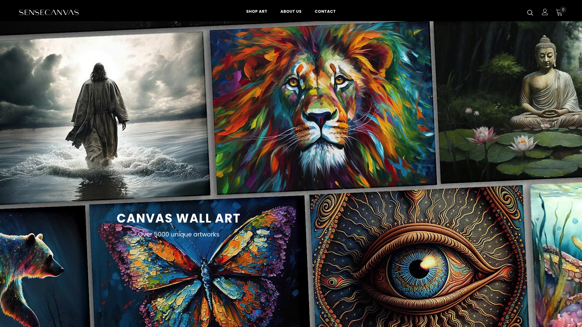
Sensecanvas carries over 15,000 unique artworks, which means finding a canvas that anchors a layered arrangement is a matter of filtering by style, not settling for what is available. The catalog spans abstract prints, bold graphic art, motivational pieces, and nature-themed works, each suited to different layering contexts. Prices start at $85, making it practical to invest in a strong anchor piece without overcommitting your budget. Whether you are building a gallery wall or setting up a shelf-leaning display, the Sensecanvas wall art collection gives you the range to match any room’s texture and color story. Custom sizing is available, so the canvas fits your wall rather than the other way around.
FAQ
What is layering textures in canvas print decor?
Layering textures in canvas print decor is the practice of combining canvas art with mixed materials like mirrors, plants, and textiles to create visual depth and tactile contrast on a wall.
How do I avoid visual clutter when layering canvas art?
Use a flat, smooth canvas print in heavily textured rooms and reserve highly textured art for minimalist spaces. Compositional hierarchy prevents two competing focal points from canceling each other out.
What is the shelf-leaning technique for canvas displays?
The shelf-leaning technique places a canvas on a mantel or shelf with smaller decor objects arranged in front of it, creating a foreground and background effect that wall-mounted art cannot achieve.
How many canvases should a gallery wall include?
A gallery wall works best with one large anchor canvas and two to four smaller supporting pieces. Mixing canvas sizes and themes with a consistent color palette keeps the arrangement cohesive.
Do framed or foam-mounted canvases work better for layering?
Framed canvases add a visible border that functions as its own texture layer, making them better for layered gallery walls. Foam-mounted canvases sit flush against the wall and work best as clean, graphic anchor pieces in minimal arrangements.
Recommended
- Sense Canvas ~ Canvas Wall Art
- Bring the Majestic Deer into Your Home with Sense Canvas
- LimeSpot Conversion Helper
- Bitcoin Yellow Concrete Canvas Wall Art Print Decor Artwork Picture Painting Poster ETH BTC Bitcoin Crypto Money Trader Office Motivation Cryptocurrency Gift for Him Financial Inspirational Stock Market – Sense Canvas


