

Conference Room Wall Art Ideas That Inspire Teams
Conference room wall art is a functional design tool, not just decoration. The right piece shapes how teams think, how clients perceive your brand, and how productive a meeting actually becomes. Office managers who treat wall art as an afterthought end up with bare walls or generic stock prints that do nothing for the room. This guide covers the best art options for conference rooms, from design principles and material selection to installation and common mistakes, so you can make choices that hold up under real meeting conditions.
What are the key design principles for conference room wall art?
Scale is the first principle most office managers get wrong. Artwork should cover 60%–75% of the usable wall surface to maintain visual balance in large corporate spaces. A piece that covers less than half the wall gets swallowed by the furniture and technology around it.
Material choice directly affects how the room functions during presentations. Canvas prints and matte-finished metal reduce glare and reflections far better than acrylic face-mounted pieces. Acrylic panels look premium in a showroom but cause severe glare under conference room lighting, which disrupts presentations and video calls.
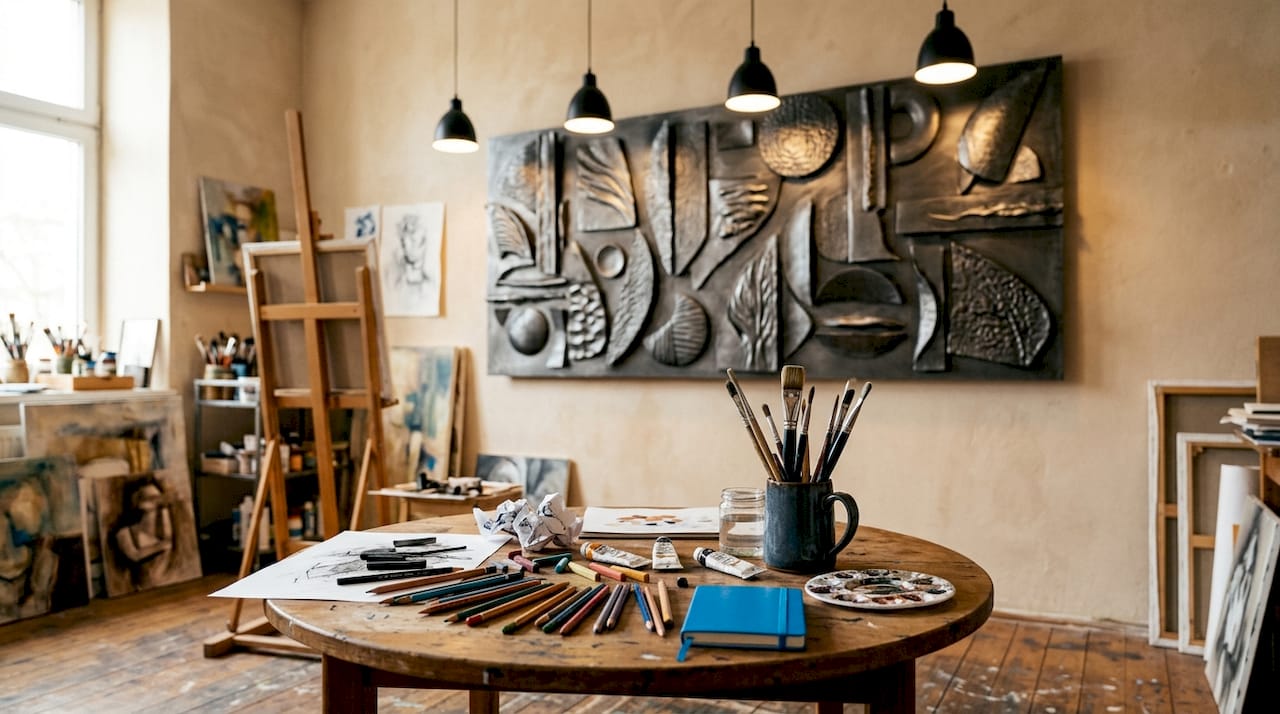
Placement relative to seating matters as much as the art itself. Art placed at eye level, designed with seated sightlines in mind, stays readable during meetings and looks clean on camera during video calls. A piece hung too high reads as an afterthought; one hung too low competes with the table.
Key design principles to apply before you buy:
- Cover the right amount of wall. Target 60%–75% of usable wall space. Measure the wall, subtract fixed obstacles like windows and screens, then size your art to that area.
- Choose matte over glossy substrates. Canvas and matte metal absorb light. Glossy acrylic reflects it directly into the eyes of seated participants.
- Hang at seated eye level. The center of the artwork should sit roughly 57–60 inches from the floor, adjusted down slightly if most viewers will be seated.
- Account for technology. Screens, projectors, and lighting fixtures all reduce usable wall space. Map these before selecting a size.
- Consider multi-panel formats for wide walls. A single large piece can feel heavy; a three-panel composition distributes visual weight evenly.
Pro Tip: Photograph the empty wall with a wide-angle lens before ordering. Print the photo and sketch the artwork dimensions on it. This takes five minutes and prevents expensive sizing mistakes.
How to choose styles and themes that support your corporate identity
Art style should match the room’s purpose, not just the company’s color palette. Bold graphics with strong diagonal lines drive energy in sales hubs, while calming, intricate patterns support focus in engineering zones and project a sense of prestige in executive boardrooms. The art you choose signals to everyone in the room what kind of thinking is expected there.
Abstract art is the most versatile choice for shared conference rooms. It adds personality without imposing a specific narrative, which means it works across different meeting types and audiences. A well-chosen abstract piece from a collection like modern art for offices can anchor a room without competing with the agenda.
Nature-inspired and biophilic themes serve a specific function. Research in workplace design consistently shows that natural imagery reduces perceived stress and supports sustained attention. A canvas print of a coastal scene or a forest canopy works harder than a motivational poster in a room where people spend hours in back-to-back meetings. Sensecanvas offers nature-inspired canvas prints that bring this effect to professional spaces without looking decorative or casual.
Style selection by room type:
- Client-facing boardrooms: Abstract art with neutral tones or geometric patterns. Avoid anything that reads as personal or niche. The goal is to project confidence and taste.
- Internal team rooms: Motivational or conceptual art works well here. A piece like a chess pawn print communicates strategic thinking without a word of text.
- Creative and ideation spaces: Bold color, asymmetry, and layered compositions encourage lateral thinking. Abstract acrylic works from curated collections like abstract acrylic art fit this environment well.
- Executive suites: Understated, high-quality single pieces. Scale matters more than complexity here.
- Reception areas: Reception area wall art ideas follow the same rules as conference rooms but prioritize first impressions. Choose one strong statement piece rather than a gallery wall.
Visual metaphors aligned with brand values create a sophisticated atmosphere without overt promotion. A financial services firm might choose geometric gold tones; a tech company might use circuit-inspired abstract patterns. The brand message lands without a logo in sight.
What practical steps are needed to select and install conference room art?
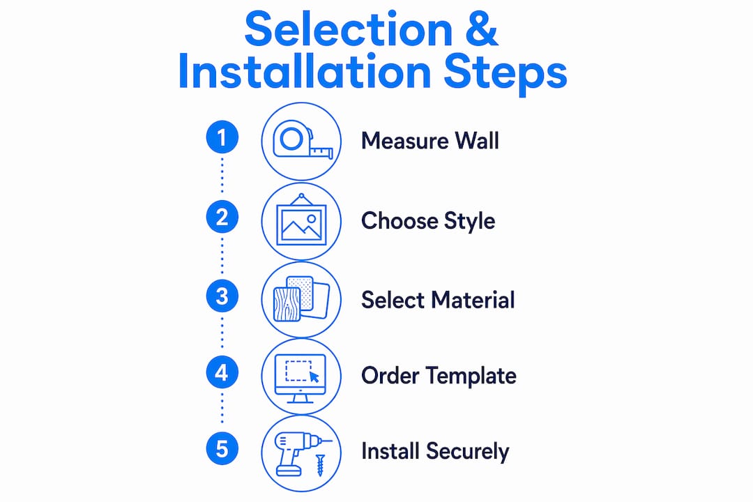
Measurement comes before everything else. Pull out a tape measure and record the full wall dimensions, then subtract the space occupied by windows, mounted screens, whiteboards, and light switches. The number you are left with is your usable wall area. Size your artwork to fill 60%–75% of that figure.
Once you have your dimensions, choose between a single large piece and a multi-panel composition. Multi-panel custom wall graphics create immersive, continuous experiences that command attention on wide walls. A single large canvas works better on narrower walls where a split composition would feel fragmented.
Installation requires the right hardware for the wall type and the weight of the piece. Proper mounting hardware matched to wall construction and artwork weight prevents damage and safety hazards. Drywall anchors rated for the piece’s weight, French cleats for heavy canvas, and anti-tip brackets for large framed pieces are all standard options depending on the situation.
| Step | Action | Why it matters |
|---|---|---|
| Measure usable wall space | Subtract obstacles from total wall area | Prevents undersized or oversized art orders |
| Choose substrate | Canvas or matte metal for lit rooms | Reduces glare during presentations |
| Select composition | Single piece vs. multi-panel | Matches wall width and visual weight needs |
| Confirm mounting hardware | Match to wall type and artwork weight | Prevents damage and safety hazards |
| Set hanging height | Center at 57–60 inches from floor | Keeps art readable from seated positions |
Pro Tip: Order a printed paper template at the exact dimensions of your planned artwork before the piece arrives. Tape it to the wall and live with it for a day. You will catch placement problems before they become permanent.
Maintenance is straightforward with canvas. Dust canvas prints with a dry microfiber cloth. Avoid water and cleaning sprays directly on the surface. Sustainable materials including PVC-free substrates and low-VOC inks also reduce long-term upkeep and support corporate environmental commitments.
What mistakes do office managers make with conference room art?
The most common mistake is the “logo slap.” Mounting an oversized company logo on the conference room wall reads as insecure rather than confident. Generic corporate logos as wall art diminish a space’s prestige. Clients and employees both notice, and neither reaction is positive.
The second mistake is ignoring acoustic function. Wall graphics and canvas panels provide acoustic dampening, increase meeting privacy, and reinforce brand messaging. A bare wall reflects sound. A canvas-covered wall absorbs it. In a room where confidential conversations happen, that difference matters.
The third mistake is choosing art that cannot be seen from the seats that matter. Art hung too high, too small, or on a wall outside the primary sightline of seated participants is wasted. Test visibility from the chair at the far end of the table and from the camera position used for video calls.
“The best conference room art is invisible in the sense that it never distracts from the meeting. It sets a tone, absorbs sound, and signals professionalism, all without anyone stopping to comment on it. When people do comment, the art is doing too much.”
A few more pitfalls worth avoiding:
- Undersized art on large walls. A single 24x36 inch print on a 12-foot wall looks like a sticky note.
- Overly literal themes. A law firm hanging courtroom photography is on-the-nose. Abstract interpretations of justice or balance communicate the same idea with more sophistication.
- Ignoring the video call frame. Remote participants see the wall behind the presenter. Art that reads as cluttered or distracting on camera undermines the meeting before it starts.
Key Takeaways
The most effective conference room wall art covers 60%–75% of usable wall space, uses matte substrates to reduce glare, and reflects brand identity through visual metaphor rather than literal logos.
| Point | Details |
|---|---|
| Scale to the wall | Art should cover 60%–75% of usable wall space to avoid looking lost among furniture. |
| Choose matte substrates | Canvas and matte metal reduce glare and keep presentations visible for all participants. |
| Match style to room purpose | Bold graphics energize sales rooms; calm, intricate patterns support focus and executive prestige. |
| Avoid the logo slap | Visual metaphors aligned with brand values create more sophistication than oversized logos. |
| Install at seated eye level | Center artwork at 57–60 inches from the floor so it reads clearly from every chair in the room. |
What I have learned from getting conference room art wrong first
The first conference room I outfitted had a beautiful acrylic piece, large format, high gloss, and genuinely striking. By the second week, the facilities team had taped a piece of cardboard over part of it because the glare was blinding the presenter. That experience taught me more about substrate selection than any design guide ever did.
The second lesson came from a client-facing boardroom where we hung a large abstract canvas that the CEO personally loved. It was bold, colorful, and completely wrong for the room. Clients kept asking about it during meetings, which sounds like a compliment until you realize it was pulling attention away from the pitch. Art in a client room should set a tone, not start a conversation.
The third lesson is about scale. Office managers consistently underestimate how large a piece needs to be. What looks enormous in a gallery looks modest on a 14-foot conference room wall. When in doubt, go larger. A piece that fills the wall with confidence reads as intentional. A piece that floats in the middle of a wall reads as an afterthought.
The practical truth is that the best business meeting room decor decisions come from treating art as infrastructure, not decoration. You measure it, you spec the materials, you test the placement, and you maintain it. The aesthetic payoff follows from the functional discipline.
— Sense
Sensecanvas canvas art for your conference room
Sensecanvas offers over 15,000 canvas wall art designs suited for professional office environments, with prices starting at $85. Every piece is available in custom sizes, which means you can order to the exact dimensions of your usable wall space rather than compromising on a standard size.
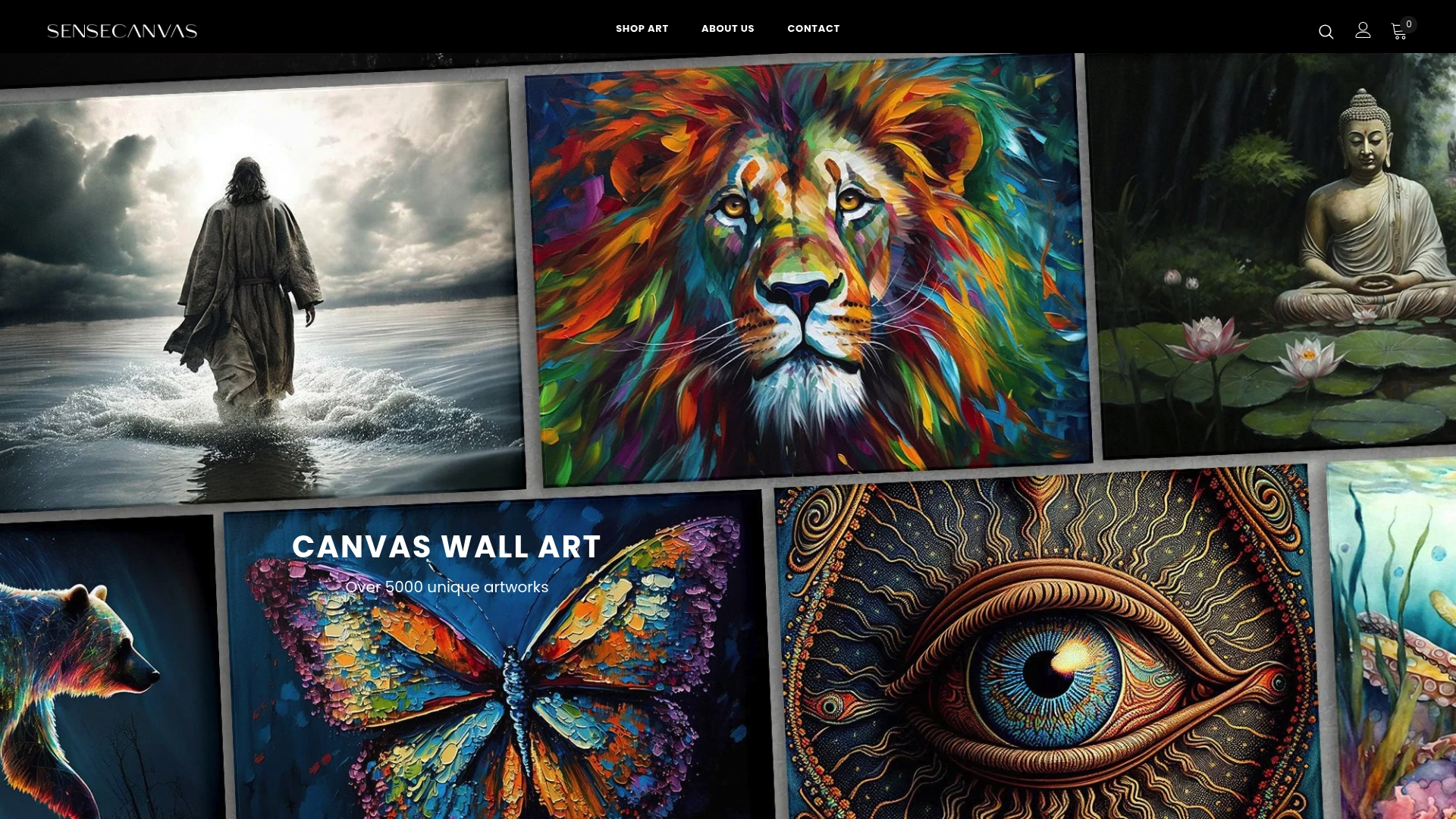
Canvas is the right substrate for conference rooms. It absorbs light rather than reflecting it, holds color well under fluorescent and LED lighting, and requires minimal maintenance. Sensecanvas prints are built for long-term display in high-use spaces. Whether you need a motivational neon print for a team room or a refined abstract piece for a boardroom, the catalog covers both ends of the spectrum. Browse the full Sensecanvas wall art collection to find the right fit for your space.
FAQ
What size art works best for a conference room wall?
Art should cover 60%–75% of the usable wall surface. Measure the wall, subtract fixed obstacles like screens and windows, then size your artwork to fill that area.
What is the best material for conference room wall art?
Canvas and matte-finished metal are the best options. Both reduce glare under conference room lighting, which keeps presentations visible and prevents reflections during video calls.
Should conference rooms use abstract or branded art?
Abstract art with visual metaphors tied to brand values outperforms direct logo displays. Overt logo art reads as low-prestige; subtle thematic art communicates brand identity with more sophistication.
How high should conference room art be hung?
The center of the artwork should sit at roughly 57–60 inches from the floor. Adjust slightly lower if most viewers will be seated, and confirm visibility from the camera position used for video calls.
Can wall art improve meeting room acoustics?
Canvas panels and wall graphics provide acoustic dampening that reduces echo and improves speech clarity. This is a functional benefit that bare walls cannot offer.
Recommended
- 100 Bill Gold Canvas Wall Art Print Decor Artwork Picture Painting Poster Hundred Benjamin Franklin Money Cash – Sense Canvas
- 100 Bill Gold Canvas Wall Art Print Decor Artwork Picture Painting Poster Money Benjamin Franklin Hundred Cash – Sense Canvas
- Get It Done Canvas Wall Art Print Decor Artwork Picture Painting Poster Neon Motivation Office Entrepreneur Pop – Sense Canvas
- Poker Cards Canvas Wall Art Print Decor Artwork Picture Painting Poster King Queen Jack Ace Playing Game Gold Deck of Card Mancave Decor Game Room Casino Lounge – Sense Canvas


