

How Color Theory Affects Decor: A Homeowner's Guide
Color theory is the science of using color deliberately in interiors to shape mood, spatial perception, and visual balance. Most homeowners treat color as a finishing touch. Professional designers treat it as the structure of a room. That distinction explains why some spaces feel instantly right and others never quite come together, no matter how good the furniture is. Understanding how color theory affects decor gives you the same framework designers use, applied to your own home.
How do color hues, temperatures, and psychology influence home decor?
Color is a psychological tool that acts directly on the nervous system, not just on the eyes. Warm colors stimulate the nervous system and increase heart rate, while cool colors calm and slow it down. That physiological fact is the foundation of color psychology in design, and it determines which colors belong in which rooms.
Warm hues, red, orange, and yellow, create energy and intimacy. They pull walls closer and make large, open rooms feel more human in scale. A deep terracotta in a dining room encourages conversation and appetite. A burnt orange accent wall in a living room adds warmth without overwhelming the space.
Cool hues, blue, green, and purple, expand a room visually and lower its emotional temperature. A soft sage green in a bedroom signals rest to the brain before you even lie down. A pale blue in a bathroom makes a small space feel airy. These effects are consistent across most people, which makes cool tones a reliable choice for rooms where calm is the goal.
- Red: Stimulates energy and appetite. Best in dining rooms and social spaces.
- Orange: Encourages warmth and creativity. Works well in kitchens and studios.
- Yellow: Lifts mood and increases alertness. Effective in entryways and home offices.
- Blue: Reduces stress and lowers perceived temperature. Ideal for bedrooms and bathrooms.
- Green: Balances and restores. Suits living rooms, reading nooks, and home offices.
- Purple: Adds depth and a sense of luxury. Strong in bedrooms and accent walls.
Pro Tip: Choose your room’s primary color based on its function first, then refine the shade. A bedroom needs a cool or muted tone. A home gym needs a warm, energizing one.
Why is the 60-30-10 rule crucial for balanced color schemes?
Color harmony in interiors is not about matching colors. It is about managing their visual weight. The 60-30-10 rule gives every room a clear structure: 60% dominant color, 30% secondary color, and 10% accent color. This ratio keeps the eye moving without creating chaos.
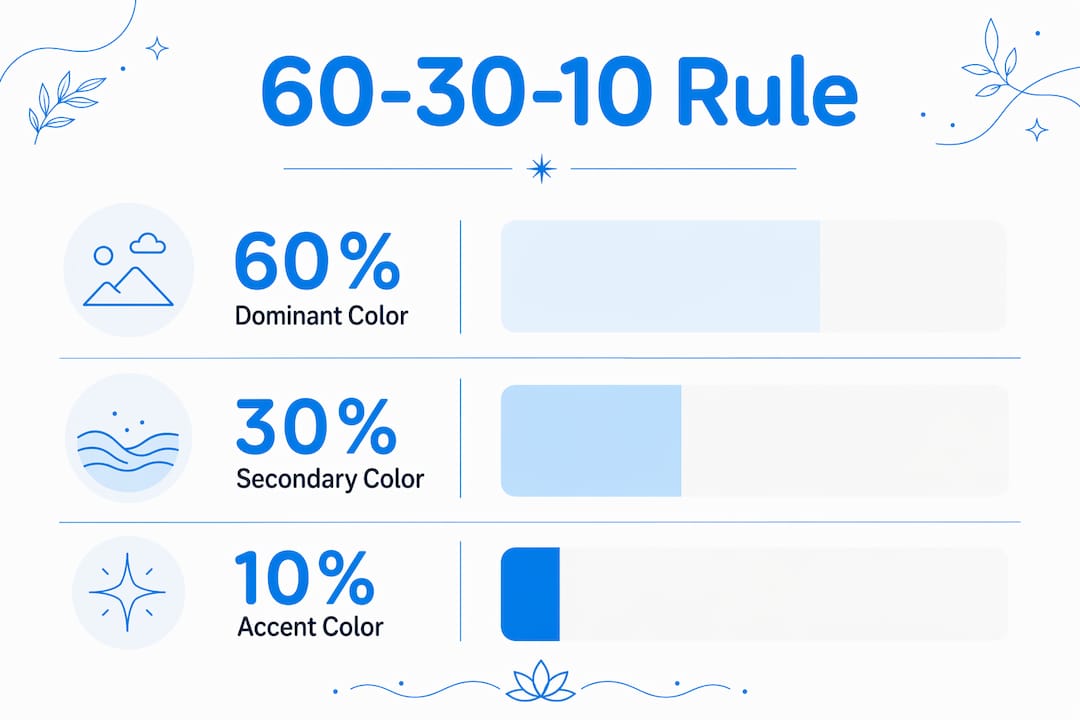
The dominant color, usually the walls, sets the room’s emotional tone. The secondary color, applied to large furniture, rugs, or drapery, supports and contrasts the dominant. The accent color, used in throw pillows, art, and small accessories, delivers personality and visual punch. Without this structure, rooms either feel flat or visually exhausting.
Color relationships determine how those three layers interact. Three schemes cover most residential interiors:
- Complementary: Colors opposite each other on the color wheel, like navy and burnt orange. High contrast, high energy. Best used when one color dominates and the other accents.
- Analogous: Colors adjacent on the wheel, like blue, blue-green, and green. Low contrast, naturally cohesive. Ideal for bedrooms and spaces where calm is the priority.
- Triadic: Three colors equally spaced on the wheel, like red, yellow, and blue. Vibrant and balanced. Works best when saturation is kept moderate to avoid visual noise.
Saturation and value matter as much as hue selection. A room with three colors at full saturation will feel aggressive. The same three colors at reduced saturation feel sophisticated. Value contrast is the real driver of cohesion. Rooms with similar value levels across surfaces feel unified even when the hues differ significantly.
Pro Tip: Before buying paint, identify your 10% accent color first. It is usually the hardest to find and the most specific. Build the 60% and 30% around it.
The most common mistake homeowners make is applying too many colors at equal weight. A room with five colors at 20% each has no anchor. Pick one dominant color and commit to it. The other layers exist to support it, not compete with it.
How do spatial perception and lighting interact with color choices?
Color value, the lightness-to-darkness ratio of a color, drives perceived room volume more than hue does. A dark navy room feels smaller and more intimate than the same room painted in a light gray, regardless of actual square footage. Light Reflectance Value (LRV) quantifies this effect. High-LRV colors reflect more light and make rooms feel larger. Low-LRV colors absorb light and create enclosure.
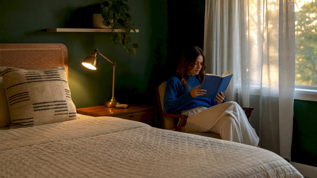
Lighting conditions change everything. Paint appears grayer and heavier as light levels drop, and indoor light color temperature shifts how hues read throughout the day. A warm incandescent bulb amplifies yellow and orange tones while muting blues. A cool LED does the opposite. A color that looks perfect at noon can look muddy by 7 PM under artificial light.
Room orientation compounds this effect. North-facing rooms receive indirect, cooler light all day. Warm paint tones compensate for that coolness. South-facing rooms get strong, warm light that can make already-warm colors feel intense. Cool or neutral tones balance them out. East-facing rooms get warm morning light and cool afternoon light, making them the most variable to plan for.
Pro Tip: Test paint samples on a 12-by-12-inch section of the actual wall. Observe them at 8 AM, noon, and 8 PM before committing. A color that passes all three tests will work year-round.
The environmental psychology of color extends beyond paint. Flooring, fabric, and art all reflect and absorb light differently. A matte wall finish absorbs light and softens color. A gloss finish reflects it and intensifies color. Choosing the right sheen is as important as choosing the right hue.
How do undertones affect color cohesion with fixed elements?
Every neutral color carries an undertone that determines how it interacts with fixed elements like flooring, cabinetry, and countertops. A “greige” paint that reads as warm beige next to a cool gray floor will look pink or orange by contrast. That clash is not a color problem. It is an undertone problem.
Undertones fall into two families: warm (yellow, red, orange) and cool (blue, green, purple). Fixed elements in your home already have undertones, whether you chose them intentionally or not. Hardwood floors with red undertones need wall colors from the warm family or true neutrals. Gray tile with blue undertones pairs with cool-family walls or warm colors used as deliberate contrast.
- Identify undertones in fixed elements first. Hold a white piece of paper next to your floor or countertop. The color that appears by contrast reveals the undertone.
- Match undertone families, not just hues. A warm white and a cool white look completely different next to the same wood floor.
- Test swatches on the actual wall, not on paper. Printed swatches shift under different lighting conditions and against different surfaces.
- In open-plan spaces, use a unified undertone family. Shared undertones across zones prevent visual discontinuity as the eye moves through the space.
Pro Tip: In open-plan homes, vary value and saturation between zones rather than switching undertone families. This creates definition without visual breaks.
What practical steps help homeowners apply color theory effectively?
Applying color theory at home does not require a design degree. It requires a clear process and the patience to test before committing.
- Define the mood for each room. Write one word: calm, energizing, intimate, airy. That word determines your hue family before you look at a single paint chip.
- Identify your fixed elements. Note the undertones of your flooring, cabinetry, and any large furniture you are keeping. These are non-negotiable anchors.
- Choose your 60% color. Select a dominant color that matches the room’s mood and complements the fixed elements. Keep saturation moderate for walls.
- Build the 30% and 10% layers. The secondary color goes on large soft furnishings. The accent color goes on art, pillows, and decorative objects.
- Sample on the wall. Paint at least two large swatches and observe them across morning, afternoon, and evening light before purchasing full quantities.
- Establish a recurring anchor color. Use one color, even in small doses, across multiple rooms. This creates visual flow through the home without making every room identical.
- Add art last. Wall art is the most flexible element in a room. Use it to introduce your accent color or to bridge the dominant and secondary tones. A piece like bold neon canvas art can deliver the 10% accent punch without repainting.
The most common pitfall is choosing paint from a chip under store lighting. Store lighting is designed to make colors look appealing, not accurate. Always sample at home.
Key Takeaways
Color theory is the most reliable framework homeowners have for creating rooms that feel intentional, balanced, and emotionally right.
| Point | Details |
|---|---|
| Color drives first impressions | Up to 90% of initial judgments about a space form within 90 seconds, based primarily on color. |
| Use the 60-30-10 rule | Assign 60% to dominant, 30% to secondary, and 10% to accent color for visual balance. |
| Value matters more than hue | Lightness and darkness control perceived room size more reliably than color family. |
| Test under real lighting | Observe paint samples at multiple times of day before committing to a color. |
| Match undertones to fixed elements | Undertone mismatches between walls and flooring create clashes that no amount of styling will fix. |
What I’ve learned from watching homeowners get color wrong
Most homeowners I work with make the same mistake: they fall in love with a color on a screen or a chip and skip the testing phase entirely. They paint a whole room and then wonder why it looks nothing like the inspiration photo. The answer is almost always lighting, not the color itself.
Color is structural. It is not decoration applied after the real decisions are made. The moment you choose a wall color, you have set the emotional register of that room. Every piece of furniture, every textile, every artwork will either support that register or fight it. Getting the structure right first makes every subsequent decision easier and cheaper.
The other thing I have seen consistently: homeowners underestimate the power of the 10% accent layer. They play it safe with neutrals all the way through and then wonder why the room feels lifeless. A single piece of colorful canvas wall art in the right accent hue does more for a room than repainting the walls. Art is the lowest-risk, highest-impact way to test a bold color before you commit to it structurally.
Color theory is not a rigid formula. Personal associations, cultural context, and the way your specific home receives light all shape how a color actually performs. Treat the principles as a framework, not a rulebook. The goal is a home that feels right to you, informed by science but shaped by your own experience.
— Sense
Wall art that works with your color palette
Color theory gives you the structure. Art gives you the soul. Sensecanvas offers over 15,000 canvas wall art pieces across abstract, motivational, and thematic styles, all available in custom sizes to fit your exact space.

Whether you are locking in a bold accent color or adding depth to a neutral room, the right artwork does both jobs at once. A piece with strong complementary tones reinforces your color scheme and adds visual interest that paint alone cannot deliver. Sensecanvas prints start at $85, with customization options that let you match size and composition to your room’s specific proportions. Browse the full collection to find pieces that align with your palette and your space.
FAQ
How does color theory affect the mood of a room?
Color directly influences the nervous system. Warm hues stimulate energy and increase heart rate, while cool hues promote calm and lower it.
What is the 60-30-10 rule in interior design?
The 60-30-10 rule divides a room’s color into 60% dominant, 30% secondary, and 10% accent. This ratio creates visual balance without making a space feel flat or chaotic.
Why does paint color look different at home than in the store?
Store lighting is designed to flatter colors, not replicate home conditions. Lighting temperature and intensity shift how paint reads, so always test samples on your actual wall across multiple times of day.
What are undertones and why do they matter in decor?
Undertones are the subtle warm or cool tints within a color. Undertone mismatches between wall paint and fixed elements like flooring or cabinetry cause visual clashes that are difficult to correct without repainting.
How do I make a small room feel larger with color?
Choose high-LRV colors, meaning light, low-saturation tones, for walls and large surfaces. Color value controls perceived room volume more reliably than any other color property.
Recommended
- Family Name Homestead Colorful Canvas Wall Art Print Decor Artwork Picture Painting Poster – Sense Canvas
- LimeSpot Conversion Helper
- Family Name Colorful Canvas Wall Art Print Decor Artwork Picture Painting Poster – Sense Canvas
- Family Name Gathering Colorful Canvas Wall Art Print Decor Artwork Picture Painting Poster – Sense Canvas


