

How to Mix Art Styles in Home Decor That Works
Mixing art styles in home decor is the practice of combining artworks from different genres and aesthetics into a unified, intentional collection that reflects your personality and elevates your living space. Done well, it produces rooms that feel curated rather than cluttered, personal rather than catalog-perfect. The secret is not picking pieces you love at random. It is applying a few proven design frameworks, like the 60-30-10 ratio and a shared color story, that give your collection structure without stripping out its character. This guide walks you through every step.
What principles make mixing art styles in home decor work?
The 60-30-10 ratio is the most effective framework for preventing chaos when blending art styles. It divides your collection into 60% dominant style, 30% secondary style, and 10% accent style. That structure gives your eye a clear resting point while still delivering variety and surprise.
Color coordination is the second pillar. Choosing 3 to 5 dominant colors shared across all your artworks ties even contrasting styles together. A bold abstract canvas and a quiet botanical print can coexist when both carry the same dusty sage and warm terracotta tones.

Framing is the detail most homeowners overlook. Limiting frame styles to two or three creates visual unity across a mixed display. A thin black metal frame works for contemporary prints; a natural wood frame suits traditional or vintage pieces. Mixing five different frame finishes reads as unfinished, not eclectic.
Visual weight matters as much as style. Pairing high-contrast, large pieces with smaller, minimalist art prevents any single artwork from dominating the room. Think of it as a conversation: every piece needs space to speak without shouting over its neighbors.
- Apply the 60-30-10 ratio to style distribution, not just color
- Anchor your palette with 3–5 colors that repeat across all pieces
- Use no more than three frame styles in any single display
- Balance large, bold works with smaller, quieter pieces nearby
- Treat visual weight as seriously as physical size
Pro Tip: Before hanging anything, lay your pieces on the floor in the arrangement you plan to use. Step back six feet and squint. If one piece immediately pulls all your attention, it is too dominant for that position.
How do you plan and select art for a mixed-style gallery?
Planning starts with your room, not the art store. Pull the three to five colors already present in your furniture, rugs, and textiles. Those tones become your color story, and every piece you add should carry at least one of them. This approach makes art a modular, low-risk tool for tying a room together rather than a gamble.
A shared theme or motif acts as a second connector. You do not need every piece to depict the same subject. You need them to whisper to each other through repeated shapes, textures, or emotional tones. A colorful family name canvas can sit beside an abstract landscape when both carry warm amber tones and organic curves.
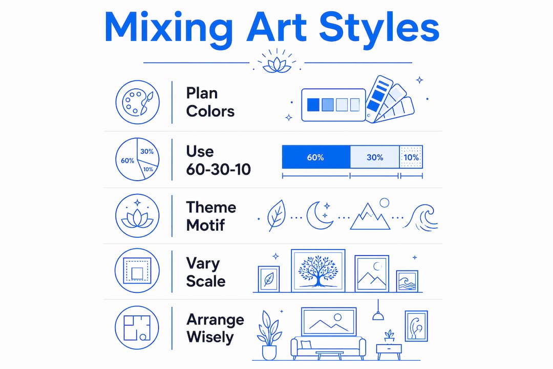
Scale variation adds flow. A gallery wall built entirely from 8x10 prints reads as wallpaper. Mix a large 36x48 anchor piece with medium 18x24 works and a few small 8x10 accents. The size contrast creates rhythm and guides the eye across the wall.
Personal narrative is what separates a curated collection from a decorated room. Artworks are powerful narrative pieces that reflect the identity of the people who live there. Choose pieces that mean something, not just pieces that match.
Here is a practical sequence for building your selection:
- Map your color story. Pull three to five colors from existing room elements and write them down.
- Choose your dominant style. This fills 60% of your wall space. Abstract, landscape, and floral all work well as dominants.
- Pick your secondary style. At 30%, this creates contrast. Pair abstract with vintage portraiture, or modern geometric with botanical illustration.
- Select your accent pieces. The final 10% can be bold, unexpected, or highly personal. A personalized GPS coordinates canvas or a striking pop art print adds the surprise that makes a collection memorable.
- Check for shared threads. Lay out your selections and confirm each piece shares at least one color, texture, or motif with at least one other piece in the group.
How should you display and arrange mixed art styles effectively?
Arrangement is where good selections either succeed or fall apart. The largest piece in your collection serves as the anchor. Place it first, at eye level, aligned with the dominant style in your 60-30-10 plan. Everything else builds outward from that anchor.
Vertical stacking controls horizontal chaos. When you spread too many pieces across a wide horizontal band, the eye races left to right without settling. Stacking pieces vertically in columns slows the eye down and creates a more deliberate, gallery-like feel.
The “one per sightline” rule keeps rooms fresh. Avoid placing two gallery walls within the same line of sight. If your living room already has a gallery wall on the north wall, the east wall should feature a single large statement piece or a simple two-piece arrangement instead.
Odd-numbered clusters create natural rhythm. Groups of three or five feel balanced without being symmetrical. Symmetry reads as formal; odd-numbered clusters read as collected and lived-in.
| Display technique | Best use case | Common mistake to avoid |
|---|---|---|
| Anchor and build | Large rooms with a clear focal wall | Centering the anchor too low |
| Vertical stacking | Narrow walls or hallways | Using identical frame sizes in each column |
| Odd-number clusters | Accent walls and small groupings | Grouping pieces too far apart to read as a unit |
| Single statement piece | Walls already busy with furniture | Choosing a piece too small for the wall scale |
Pro Tip: Use painter’s tape on the wall to map out your arrangement before drilling a single hole. Live with the tape layout for two days. What feels right on day one often shifts by day two.
How do you blend vintage and modern art styles without clutter?
Vintage and modern art can share a wall without conflict. The 60% modern base, 30% vintage, 10% bridging accents formula works as well for style mixing as it does for color. A room anchored in contemporary canvas prints can absorb a vintage oil reproduction and a sepia-toned botanical print without losing its identity.
Shared visual threads are what make disparate pieces feel intentional. A modern abstract print and a vintage map can coexist when both carry the same muted gold and navy palette. The color connection makes the style contrast feel deliberate rather than accidental.
Scale and breathing room matter more with vintage pieces. Antique and vintage works often carry more visual detail than modern prints. Give them more wall space around them so the detail can register without crowding.
- Start with a modern anchor piece that sets your dominant palette
- Introduce vintage pieces one at a time, checking for color or texture overlap with existing works
- Use a neutral or natural wood frame to bridge old and new pieces
- In small spaces, limit vintage accents to one or two pieces per wall
- Let a contemporary accent, like a bold neon or graphic canvas, pull the vintage piece into the present
Key Takeaways
Blending art styles successfully requires the 60-30-10 ratio, a shared color palette of 3–5 tones, and no more than three frame styles across any display.
| Point | Details |
|---|---|
| Use the 60-30-10 ratio | Assign 60% to your dominant style, 30% to secondary, and 10% to accent pieces. |
| Anchor with a shared palette | Choose 3–5 colors present in all artworks to unify contrasting styles visually. |
| Limit frame styles | Use no more than three frame finishes to keep mixed displays cohesive. |
| Follow the one-per-sightline rule | Vary display types across sightlines to prevent visual repetition and staleness. |
| Let personal narrative lead | Choose pieces that carry meaning, not just pieces that match the furniture. |
What I have learned from years of watching rooms come together
The most common mistake I see is treating a mixed art collection like a shopping list. Homeowners find a piece they love, buy it, hang it, then repeat the process without ever stepping back to ask whether the collection is having a conversation or just occupying space. The result looks like a storage unit with good lighting.
The rooms that work are edited. Their owners bought twenty pieces and hung eight. They resisted the urge to fill every wall and trusted that negative space is not wasted space. It is breathing room. It is what lets the pieces they did hang actually land.
The other thing I have noticed is that ignoring proportion and visual scale is the single most common mixing error. A beautiful vintage portrait hung next to an oversized abstract canvas will always lose. Not because the portrait is wrong, but because the scale mismatch makes both pieces look like they belong somewhere else.
My honest advice: start with one wall. Apply the 60-30-10 rule, pick your palette, and hang three to five pieces. Live with it for a month before touching another wall. Patience is the design principle nobody puts in a guide, but it is the one that separates rooms that feel collected from rooms that feel decorated.
— Sense
Art that fits every style mix, from Sensecanvas
Finding pieces that work across multiple styles is the hardest part of building a mixed collection. Sensecanvas offers over 15,000 canvas wall art prints spanning abstract, floral, vintage-inspired, motivational, and pop art styles, all available in custom sizes starting at $85.
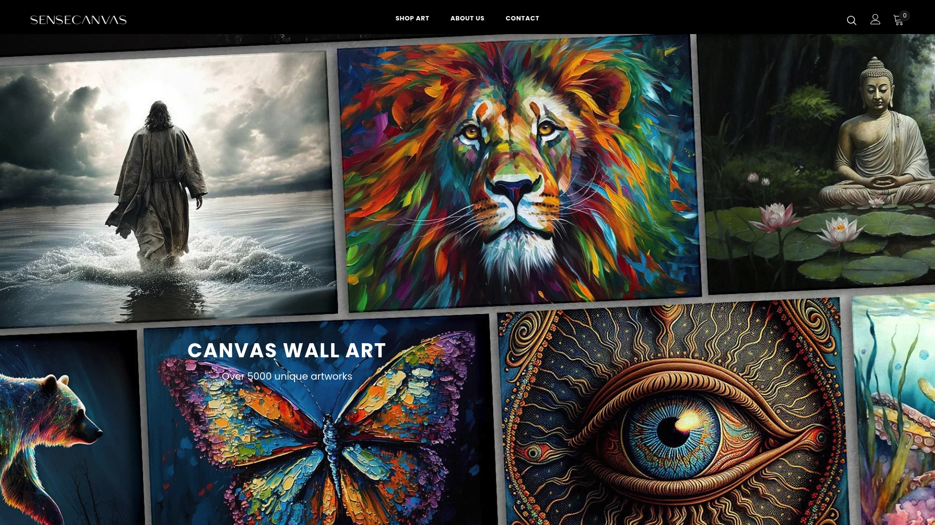
Whether you need a bold abstract ocean canvas to anchor a gallery wall or a graphic modern print to bridge a vintage grouping, Sensecanvas carries options across every aesthetic. Each piece ships ready to hang, and the customization options let you match size and finish to your exact wall dimensions. Browse the full canvas wall art collection to find pieces that fit your color story and your space.
FAQ
What is the 60-30-10 rule for mixing art styles?
The 60-30-10 rule divides your art collection into 60% dominant style, 30% secondary style, and 10% accent style. This ratio creates visual balance while still delivering contrast and personality.
How many colors should a mixed art display share?
A mixed display works best when all pieces share 3–5 dominant colors. That shared palette acts as a visual tie, making even contrasting styles feel intentional and curated.
Can you mix abstract and realistic art in the same room?
Yes. Balancing abstract with realistic art requires managing visual weight through contrast and spacing rather than matching sizes. A large abstract piece pairs well with a smaller, detailed realistic work when both share a common color or texture.
How many frame styles can you use in a mixed display?
Use no more than two or three frame styles in any single display. Thin black metal suits contemporary prints; natural wood frames work for traditional or vintage pieces. More than three finishes reads as unfinished rather than eclectic.
What is the one-per-sightline rule in art arrangement?
The one-per-sightline rule means you should avoid placing two identical display types, such as two gallery walls, within the same line of sight. Varying display types across sightlines keeps the room visually fresh and prevents repetition.


