

How to Balance Wall Decor: a Practical Guide
Balancing wall decor is the practice of arranging art and objects so that no single piece overwhelms the space or disappears into it. Knowing how to balance wall decor means understanding three things: visual weight, proportion, and placement. The 57–60 inch eye-level standard is the most widely cited rule in interior design, and it applies whether you have one canvas above a sofa or a full gallery wall. Get these fundamentals right, and every room you decorate will feel intentional, grounded, and finished.
How to balance wall decor: size relative to furniture
The single most common mistake homeowners make is hanging art that is too small. A piece that floats alone above a large sofa reads as an afterthought, not a design choice.
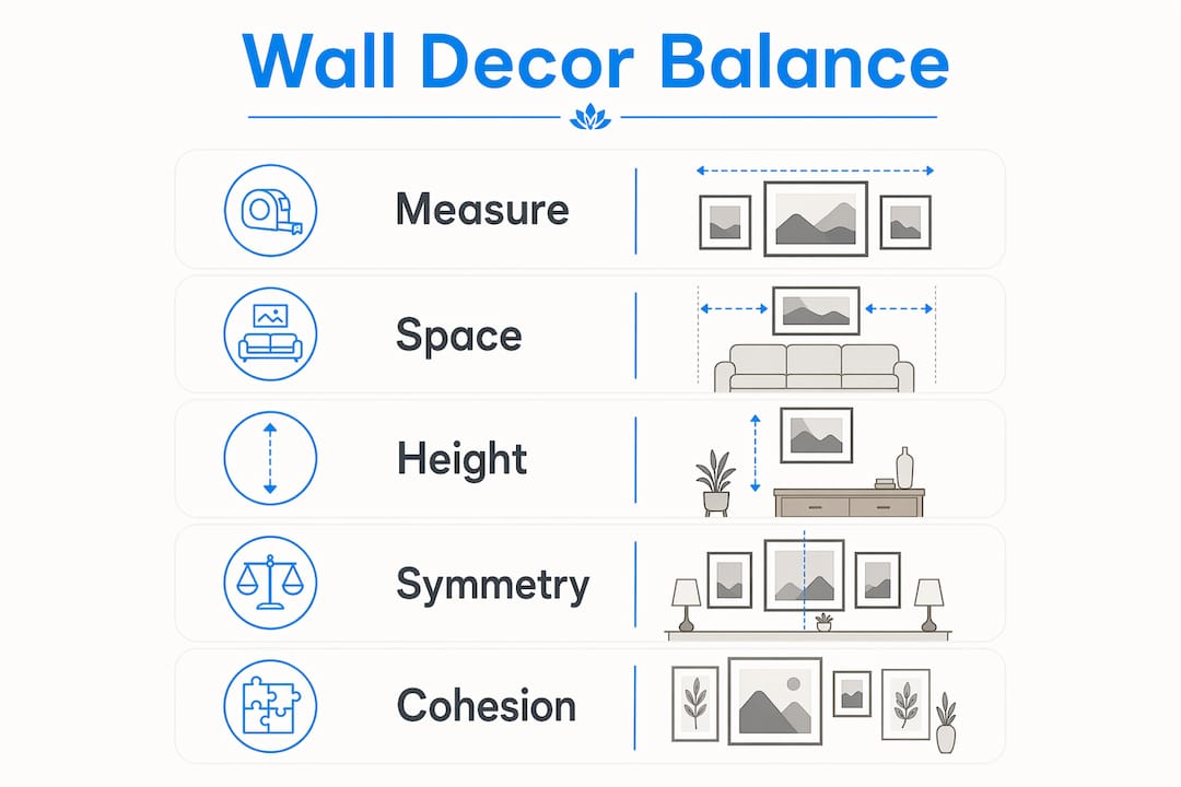
The correct rule is straightforward: artwork should span 60%–75% of the width of the furniture below it. If your sofa is 84 inches wide, your art or gallery grouping should measure roughly 50–63 inches across. That range keeps the piece visually connected to the furniture without crowding the wall.
Here is what that looks like in practice:
-
84-inch sofa: Target art width of 50–63 inches. A single large canvas or a three-piece grouping works well.
-
60-inch console table: Target art width of 36–45 inches. One medium canvas or two smaller pieces side by side fits the proportion.
-
48-inch bed headboard: Target art width of 29–36 inches. A single statement piece or a pair of matching prints is ideal.
-
36-inch dresser: Target art width of 22–27 inches. One compact canvas or a small diptych keeps the scale honest.
Art that is too small on a large wall creates an incomplete, floating feeling. Slightly bigger pieces always read as more finished and deliberate.
Pro Tip: Measure your furniture width before you shop for art. Write the number down and bring it with you. Buying art by eye in a store or online without that reference is the fastest way to end up with a piece that feels wrong on the wall.
The vertical gap between the top of your furniture and the bottom edge of the art matters just as much as the width. Leave 6–12 inches between the furniture surface and the bottom of the frame. Less than 6 inches feels cluttered. More than 12 inches and the art starts to float, losing its visual connection to the furniture below.
How should you space multiple pieces on a gallery wall?
Gallery walls fail or succeed based almost entirely on spacing. Inconsistent gaps make a wall look accidental. Consistent gaps make it look curated.
The standard recommendation is 2–4 inches between pieces for a tight, cohesive gallery layout. If you prefer a lighter, more open arrangement, space pieces 6–10 inches apart. The key rule: never let gaps exceed 6 inches in a clustered grouping, or the wall starts to read as separate, unrelated pieces rather than one unified display.
Follow these steps to plan a gallery wall without guesswork:
-
Gather all pieces and lay them on the floor. Arrange them until the grouping feels balanced. A floor layout lets you adjust spacing and visual weight before you commit to a single nail hole.
-
Choose your layout style. A grid arrangement uses uniform frames in rows and columns. An organic arrangement mixes sizes and orientations freely. A symmetrical arrangement mirrors pieces on either side of a central anchor.
-
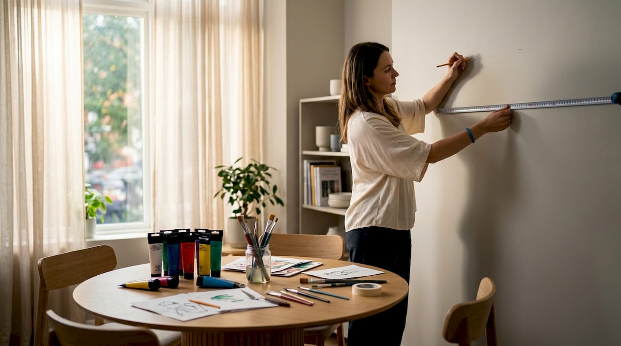
Trace each frame on paper. Cut out the shapes and tape them to the wall with painter’s tape. This gives you a full-scale preview of the final arrangement.
-
Check spacing with a ruler. Measure every gap before you drill. Even one outlier gap breaks the visual rhythm.
-
Step back and view from across the room. What looks balanced up close can feel off from a distance. Adjust before hanging.
Pro Tip: Photograph your floor layout before you move anything to the wall. If pieces shift during installation, you have a reference to return to.
Art should fill roughly 70%–75% of the wall area in a gallery arrangement. If your grouping looks sparse after installation, add one or two smaller pieces to fill the gaps rather than spreading existing pieces further apart.
What height should wall art be hung for natural balance?
Height placement is where most homeowners go wrong after they have the size right. Hanging art too high is the most frequent error, and it makes ceilings feel lower and rooms feel disconnected.
The standard for decorating wall spaces is to center artwork at 57–60 inches from the floor. That range aligns with the average human eye level and is the benchmark used by most professional galleries and interior designers.
| Situation | Recommended placement | Why it works |
|---|---|---|
| Art above a sofa | Bottom edge 6–12 inches above sofa back | Anchors art to furniture visually |
| Art above a console | Bottom edge 6–12 inches above surface | Creates a cohesive vignette |
| Art on a bare wall | Center at 57–60 inches from floor | Aligns with human eye level |
| Art above a bed | Bottom edge 6–12 inches above headboard | Grounds the piece to the bed |
| Art in a tall-ceiling room | Center slightly higher, but never above 66 inches | Prevents art from feeling lost |
When no furniture sits below the art, centering at eye level creates a visual anchor tied to human scale. Without that anchor, art hung too high looks like it is trying to escape the room.
Pro Tip: Use a piece of painter’s tape to mark the center point of your art on the wall before you measure for the hook. It is far easier to adjust tape than to fill nail holes.
Rooms with tall ceilings tempt homeowners to hang art higher to “fill the space.” Resist that instinct. Art hung above eye level forces viewers to look up, which feels unnatural and tiring. Fill vertical space with taller pieces or stacked groupings instead.
How do symmetry, asymmetry, and style cohesion create visual harmony?
Visual balance in wall decor does not require matching everything. It requires intention. Symmetry and asymmetry are both valid approaches, and the choice depends on the mood you want the room to carry.
Symmetry delivers a formal, calm, and ordered look. Two identical prints flanking a central mirror above a fireplace is a classic example. It works because the eye resolves the arrangement instantly and moves on. Asymmetry adds energy and personality. A large canvas offset by two smaller pieces of different sizes creates movement and keeps the eye engaged longer.
Style cohesion is what prevents asymmetry from becoming chaos:
-
Repeat frame finishes. Repeating a frame style at least twice in a grouping signals intentional curation rather than random collection.
-
Connect through color. Art pieces do not need to match in color, but they should share at least one tone. A warm amber in one piece echoed in another creates a thread the eye follows.
-
Mix object types deliberately. Combining canvas art, a mirror, and a small shelf adds texture and depth. The key word is “deliberately.” Each object should earn its place.
-
Use texture as a unifier. Cohesion through frame texture or medium works even when colors differ widely. A set of black frames in different sizes reads as a collection. The same pieces in mismatched finishes read as clutter.
The most curated walls mix mediums and sizes but hold the arrangement together through one repeated element, whether that is a frame color, a subject theme, or a consistent mat style.
What practical steps produce a balanced, professional result?
Planning before drilling is the single habit that separates confident decorators from frustrated ones. The steps below apply whether you are hanging one piece or twenty.
-
Sketch your wall to scale. Draw the wall dimensions on paper and sketch furniture placement. Mark where you want art to go before you touch a measuring tape.
-
Measure furniture width first. Calculate your target art width using the 60%–75% rule. Write it down.
-
Use painter’s tape on the wall. Map out the exact footprint of each piece before hanging. Step back and live with the tape layout for a day.
-
Check from multiple distances. A layout that looks right from 2 feet away can feel wrong from across the room. Always check from the room’s main entry point.
-
Take a photo and review it. A photo flattens the perspective and reveals spacing issues your eye misses in person. Adjust based on what the photo shows.
-
Hang the largest piece first. The anchor piece sets the visual center of gravity. All other pieces should relate back to it.
Pro Tip: Avoid the three most common pitfalls: uneven spacing between pieces, art that floats more than 12 inches above furniture, and pieces that are too small for the wall. Each one is easy to prevent with a tape measure and five minutes of planning.
Laying art on the floor before hanging eliminates “drilling anxiety” and lets you confirm the visual weight of the arrangement before committing. This step alone prevents most installation regrets.
Key Takeaways
Effective wall decor balance requires proportional sizing, consistent spacing, and eye-level placement to create a finished, intentional look in any room.
| Point | Details |
|---|---|
| Size to furniture ratio | Art should span 60%–75% of the furniture width below it for proper proportion. |
| Vertical gap rule | Leave 6–12 inches between furniture and the bottom edge of art to anchor pieces visually. |
| Eye-level placement | Center artwork at 57–60 inches from the floor to align with human scale. |
| Gallery wall spacing | Keep gaps at 2–4 inches for tight layouts or 6–10 inches for open arrangements. |
| Style cohesion | Repeat frame finishes or textures at least twice to signal intentional curation. |
What I have learned from years of watching walls go wrong
Most homeowners treat wall decor as the last step, something to handle after the furniture is in place and the paint is dry. That order is the root of most decorating regrets. The walls are not a backdrop. They are part of the room’s structure, and they deserve the same planning attention as the sofa or the rug.
The mistake I see most often is not hanging art too high, though that is common. It is buying art without a measurement in hand. People fall in love with a piece in a store or online, bring it home, and then discover it is half the width it needs to be to look right above the credenza. The 60%–75% rule exists precisely to prevent that moment.
Asymmetry gets a bad reputation because people confuse it with randomness. A well-executed asymmetrical gallery wall is actually harder to pull off than a symmetrical one. It requires you to think about visual weight, not just physical size. A dark, dense painting carries more visual weight than a light watercolor of the same dimensions. Balance those weights, not just the frame sizes, and asymmetry becomes one of the most interesting things you can do with a wall.
My honest advice: stop trying to match everything and start trying to connect things. One repeated element, a frame color, a subject, a texture, is enough to make a diverse collection feel like a deliberate choice. The eye is forgiving when it senses intention. It is unforgiving when it senses none.
— Sense
Wall art sized and styled for balanced spaces
Finding art that fits your wall’s proportions should not require a design degree. Sensecanvas offers over 15,000 canvas prints across styles ranging from abstract and motivational to bold graphic and fine art, all available in custom sizes so you can match the 60%–75% furniture rule without compromise.

Whether you are building a gallery wall or anchoring a single statement piece above a sofa, Sensecanvas lets you filter by size and style to find art that fits your space from the start. Pieces start at $85, and the full canvas art collection includes options like the Money Wall canvas for bold, graphic impact or the Adam canvas print for a more refined, curated feel. Every piece ships ready to hang, so the only measuring you need to do is the wall.
FAQ
What is the ideal height to hang wall art?
The center of wall art should sit 57–60 inches from the floor, which aligns with average human eye level. When art hangs above furniture, position the bottom edge 6–12 inches above the furniture surface.
How wide should art be relative to my sofa?
Art or a gallery grouping should span 60%–75% of the sofa’s width. For an 84-inch sofa, that means targeting a grouping roughly 50–63 inches wide.
How much space should I leave between gallery wall pieces?
2–4 inches between pieces is the standard for a tight, cohesive gallery wall. For a looser, more open arrangement, 6–10 inches works well, but avoid gaps larger than 6 inches in clustered groupings.
Does wall art need to match in color to look balanced?
No. Cohesion through frame finish or texture creates a unified look even when colors vary. Repeating one element, such as a black frame or a linen mat, is enough to make a mixed collection feel intentional.
Should I plan a gallery wall layout before hanging?
Yes. Laying pieces on the floor first lets you adjust spacing and visual weight before committing to nail holes. Photograph the floor layout so you have a reference during installation


