

How Art Styles Complement Each Other in Your Home
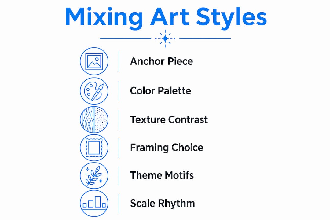
Art styles complement each other best when you balance contrast with cohesion, using a handful of shared elements to hold everything together. The goal is not to match pieces perfectly but to create a conversation between them. Here is what that looks like in practice:
- Shared color palette: Limit recurring tones to 2–3 colors across all pieces so the eye moves naturally from one to the next.
- Consistent framing: Matching or coordinated frame finishes connect wildly different styles without forcing them to look alike.
- Recurring theme or motif: A botanical thread, a mood, or even a shared subject matter can unify a minimalist print and an expressive oil painting.
- Texture and medium variety: Mixing a matte digital print with a textured canvas adds depth without visual noise.
Done well, this approach shifts your walls from background decoration to an active visual experience. Guests stop and look. Rooms feel layered and personal rather than catalog-assembled. The psychological payoff is real too: curated contrast tends to feel energizing, while a room full of identical styles reads as flat. The art style harmony you are after comes from intention, not accident.
Table of Contents
- How do you find the anchor piece that sets the tone?
- Practical ways to mix visual styles for balance and harmony
- Creative ways to arrange and display mixed art styles
- How do you choose art styles that actually suit your home?
- What curators know about juxtaposition that most decorators miss
- Find your next anchor piece at Sensecanvas
- Key Takeaways
How do you find the anchor piece that sets the tone?
Every strong mixed-art collection starts with one piece that does the heavy lifting. Interior designers call this the anchor, and it works exactly the way the word suggests: it holds everything else in place.
Your anchor does not have to be the largest piece in the room, though it often is. What matters is that it carries a clear visual identity. A bold abstract painting with a dominant color, a vintage photographic print with strong graphic lines, or a striking black-and-white portrait all work well because they give you something concrete to respond to when choosing the next piece. Starting with a focal point creates a guiding force that ties the collection together, no matter how varied the other selections become.
How to evaluate your anchor options:
- Walk the room and note the colors already present in furniture, textiles, and wall color. Your anchor should either echo one of those tones or introduce a deliberate contrast.
- Consider the room’s emotional register. A calm, neutral bedroom calls for a different anchor than a lively living room where you want energy and conversation.
- Bold abstracts work as anchors in modern or transitional spaces. Vintage prints and black-and-white photography anchor rooms that lean traditional or eclectic.
- Scale matters. An anchor piece that is too small gets lost; one that is too large can crowd out everything else. As a rough guide, the anchor should occupy roughly one-third to one-half of the wall space you plan to fill.
- Once you have your anchor, use it as a reference for every subsequent choice: pull a color from it, mirror its mood, or deliberately contrast its texture.
Choosing your anchor first also prevents the most common mistake in mixed-art decorating, which is buying pieces you love individually but that have no relationship to each other. The anchor gives the collection a spine. Everything else hangs off it.
Pro Tip: Lay your anchor piece flat on the floor and physically place smaller candidate pieces around it before hanging anything. Seeing them together at eye level reveals connections and clashes you will miss on a screen.
Practical ways to mix visual styles for balance and harmony
The mechanics of blending art styles come down to a few repeatable strategies. None of them require formal design training. What they require is a willingness to look for threads rather than matches.
Color as the primary unifier
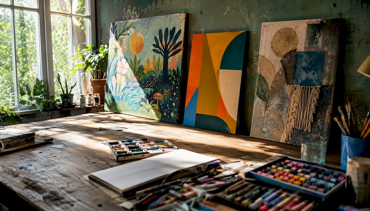
Limiting your palette to 2–3 shared tones is the single most reliable way to make a mixed collection feel intentional. This does not mean every piece must contain those colors prominently. A hint of ochre in one painting and a golden detail in another creates a subtle visual thread that the eye registers even when the mind does not consciously notice it. Avoid exact color matches across pieces: shared visual threads rather than identical hues prevent the collection from looking repetitive or catalog-assembled.
Texture and medium contrast
Pairing a smooth digital print with a heavily textured oil painting creates the kind of tactile contrast that makes a wall genuinely interesting to look at. Mixing mediums such as digital prints and oil paintings adds dimension and ensures the display feels dynamic rather than flat. The contrast between surfaces does part of the compositional work for you.
Abstract meets realistic
Abstract and realistic art combined add depth and intrigue, especially against a neutral background that lets the contrast breathe. A modern geometric print next to a classical still-life painting is a pairing that sounds risky but consistently works because the two styles occupy different visual frequencies without competing for the same attention.
Framing as connective tissue
Frame choice is often underestimated. Using a consistent color palette for frames, such as black, white, and natural wood, connects pieces that have nothing else in common. Matching frame finishes act as a visual connector that lends intentionality to collections combining highly different styles. You can mix ornate vintage frames with sleek minimalist ones for an extra layer of contrast, as long as the finish tones stay coordinated.
Recurring themes and motifs
A shared subject, such as nature, architecture, or portraiture, creates cohesion even when the styles diverge sharply. A watercolor botanical and an acrylic abstract can coexist comfortably if both carry organic, flowing forms. The theme does not need to be literal. Shared emotional qualities, such as a calm, meditative feeling across otherwise very different pieces, function as connections that create harmony alongside contrast.
Scale and proportion
Varying sizes creates visual rhythm. Two pieces of similar size hung side by side feel balanced, but a larger piece centered above a narrower, elongated work creates an elegant asymmetry that draws the eye through the wall rather than stopping it. Proportion also affects mood: large-scale pieces feel commanding, while a cluster of smaller works reads as intimate and collected.
Pro Tip: Look for shared visual threads rather than exact matches. A piece does not need to repeat a color or subject to belong in a collection. Sometimes a shared emotional quality, like a similar sense of quietness or intensity, is the thread that holds everything together.
Creative ways to arrange and display mixed art styles
Arrangement is where the strategy becomes visible. You can have the right pieces and still produce a wall that feels cluttered or accidental if the layout does not support the collection.
Gallery wall fundamentals
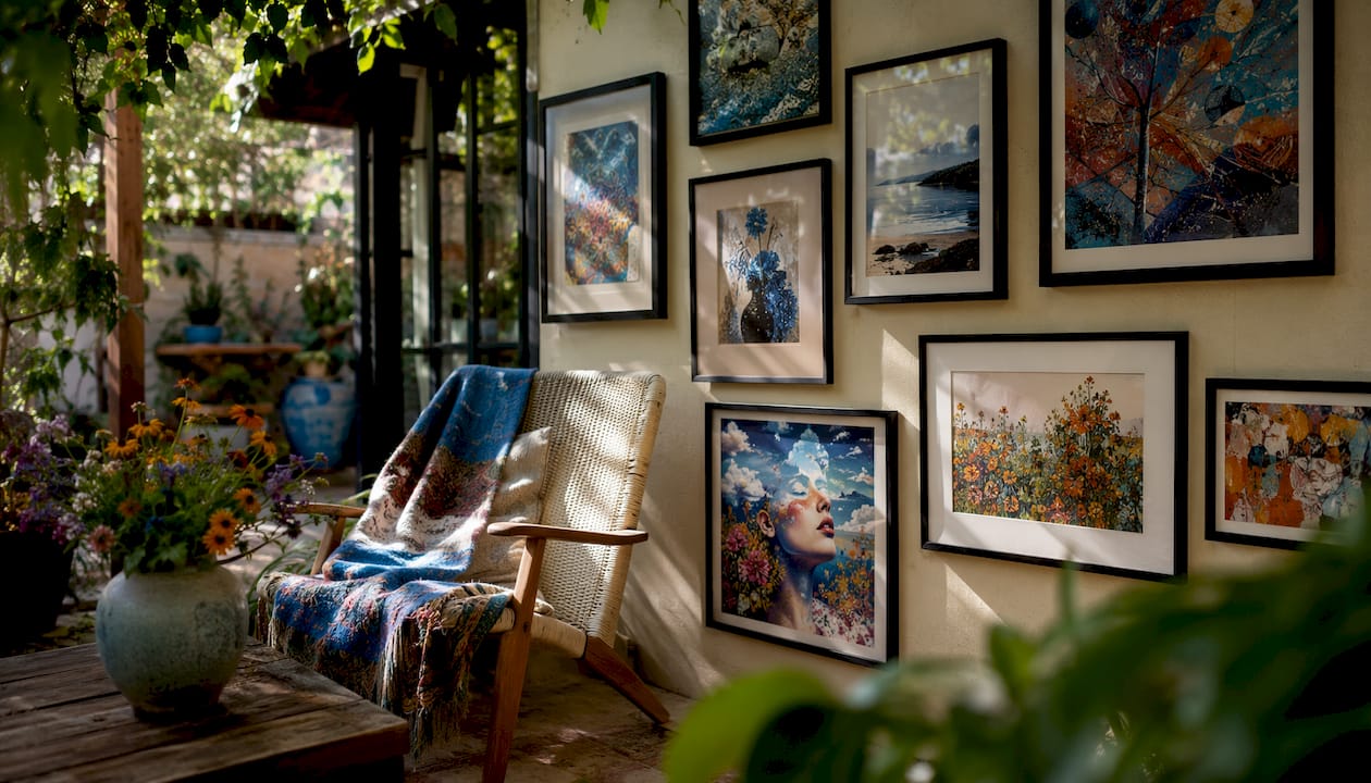
Gallery walls benefit from varying sizes and orientations to create rhythm and interest. Vertical and horizontal pieces energize the display in ways that a grid of identically sized frames never can. Asymmetry is your friend here. A common mistake is spacing every piece exactly the same distance apart, which produces a rigid, institutional feel. Instead, cluster some pieces closer together and give others more breathing room.
Consistent matting and framing
When styles vary dramatically, consistent matting or frame finishes pull the arrangement together visually. A white mat around every piece, regardless of the art’s style or medium, creates a unifying border that signals curation rather than accumulation.
Mixing mediums for depth
Do not limit yourself to flat prints and paintings. Incorporating a small sculptural piece, a textile, or a three-dimensional object into a gallery wall adds physical depth that flat art alone cannot achieve. A bronze sculpture placed on a shelf below a painting, for example, grounds the wall and adds a tactile dimension that photographs well and reads even better in person.
Lighting as a design tool
Lighting does more work in a mixed-art display than most people expect. Directional picture lights or adjustable track lighting let you control which pieces draw the eye first, effectively curating the viewing sequence. Warm light (around 2700–3000K color temperature) enriches oil paintings and warm-toned prints. Cooler light suits black-and-white photography and graphic digital art. Using different light temperatures across a single wall can subtly reinforce the contrast between styles while keeping the overall arrangement readable.
For a real-life example of how eclectic living room decor can pull together disparate styles into a cohesive space, the key is always the same: a clear organizing principle, whether that is color, framing, or theme, applied consistently even as the individual pieces diverge.
How do you choose art styles that actually suit your home?
Choosing art for a specific interior is a different task from choosing art you love in the abstract. The room has opinions, and working with them rather than against them produces better results.
Assess what you already have
Start with your existing interior style and color scheme. A room with warm wood tones, leather furniture, and earthy textiles will absorb certain art styles naturally and fight others. Contemporary geometric prints tend to feel sharp and slightly cold in that context unless they carry warm tones. Expressionist works with rich ochres and burnt siennas, on the other hand, feel like they belong. Matching art to your interior style is less about following rules and more about reading the room honestly.
Choose styles that complement, not compete
The goal is not to find art that disappears into the room. It is to find art that adds something without fighting the existing design for dominance. A contemporary piece in a traditionally furnished room can revitalize the space precisely because of the contrast. The neutral palettes of modern homes act as a blank canvas, making it easier to introduce bolder or more traditional works without the room feeling confused.
Consider emotional tone
Every room has a mood, and art either supports or disrupts it. A bedroom designed for rest calls for art that feels calm, even if the styles are mixed. A home office benefits from pieces that feel focused or energizing. Evaluating the emotional quality of a piece, not just its visual style, is one of the most useful filters you can apply.
Practical guidelines for variety:
- Aim for several different art styles as a starting point. Beyond that, maintaining cohesion requires increasingly deliberate unifying elements.
- Include at least one piece with personal meaning. A collection that tells your story feels different from one assembled purely for aesthetics.
- Experiment before committing. Lean a piece against the wall and live with it for a few days before hanging it permanently.
- Consider the 2026 interior design trends shaping home aesthetics, particularly the move toward layered, collected-over-time looks that mix periods and styles intentionally.
- Think about the room’s function. High-traffic social spaces can handle more visual complexity than private, restful rooms.
The best collections feel like they were assembled over time, even when they were not. That collected quality comes from choosing pieces with genuine personal resonance rather than filling a wall to match a color scheme.
What curators know about juxtaposition that most decorators miss
The shift from matching art to curating it is the difference between a room that looks finished and one that feels alive. Gallery curators have understood this for decades. The principle translates directly to home collections.
“The most dynamic combinations are the ones that balance contrast with connection. Think of it as hosting a conversation between two artworks: each has its own personality, but together they create something richer and more compelling.” — Liza Pruitt
Juxtaposition works because contrast creates attention. Placing a traditional oil painting beside a contemporary wire-mesh portrait does not create confusion; it creates a focal point that invites closer looking. The viewer’s eye moves between the two pieces, registering the difference and then searching for the connection. That search is what makes a collection engaging rather than merely decorative.
Curator-backed principles for experiential collections:
- Lead with contrast, anchor with connection. Every strong pairing has at least one element that bridges the gap, whether that is a shared color, a similar emotional quality, or a complementary scale.
- Treat the collection as a conversation. Each piece should have something to say to the others. A soft, calming work placed beside something more dynamic creates a push and pull that makes both pieces more interesting than either would be alone.
- Avoid visual monotony. A collection where every piece shares the same style, scale, and mood asks nothing of the viewer. Contrast is what generates engagement.
- Think about the sequence. In a room with multiple walls of art, consider the order in which a visitor encounters the pieces. Curators call this the viewing sequence, and it shapes the emotional arc of the experience.
- Use sculpture and mixed media to add dimension. A bronze sculpture placed near a colorful contemporary painting creates a contrast of material, weight, and color that flat art alone cannot produce. The role of art in home decor extends well beyond the visual when three-dimensional objects enter the mix.
- Approach your collection as a personal museum. Just as museums represent a vast array of styles, time periods, and regions, your home can do the same. That framing shifts the goal from “does this match?” to “does this belong in the story I am telling?”
The practical takeaway is straightforward: stop asking whether two pieces match and start asking whether they have something to say to each other. When the answer is yes, and when at least one visual or emotional thread connects them, the pairing works regardless of how different the styles appear on the surface.
Find your next anchor piece at Sensecanvas
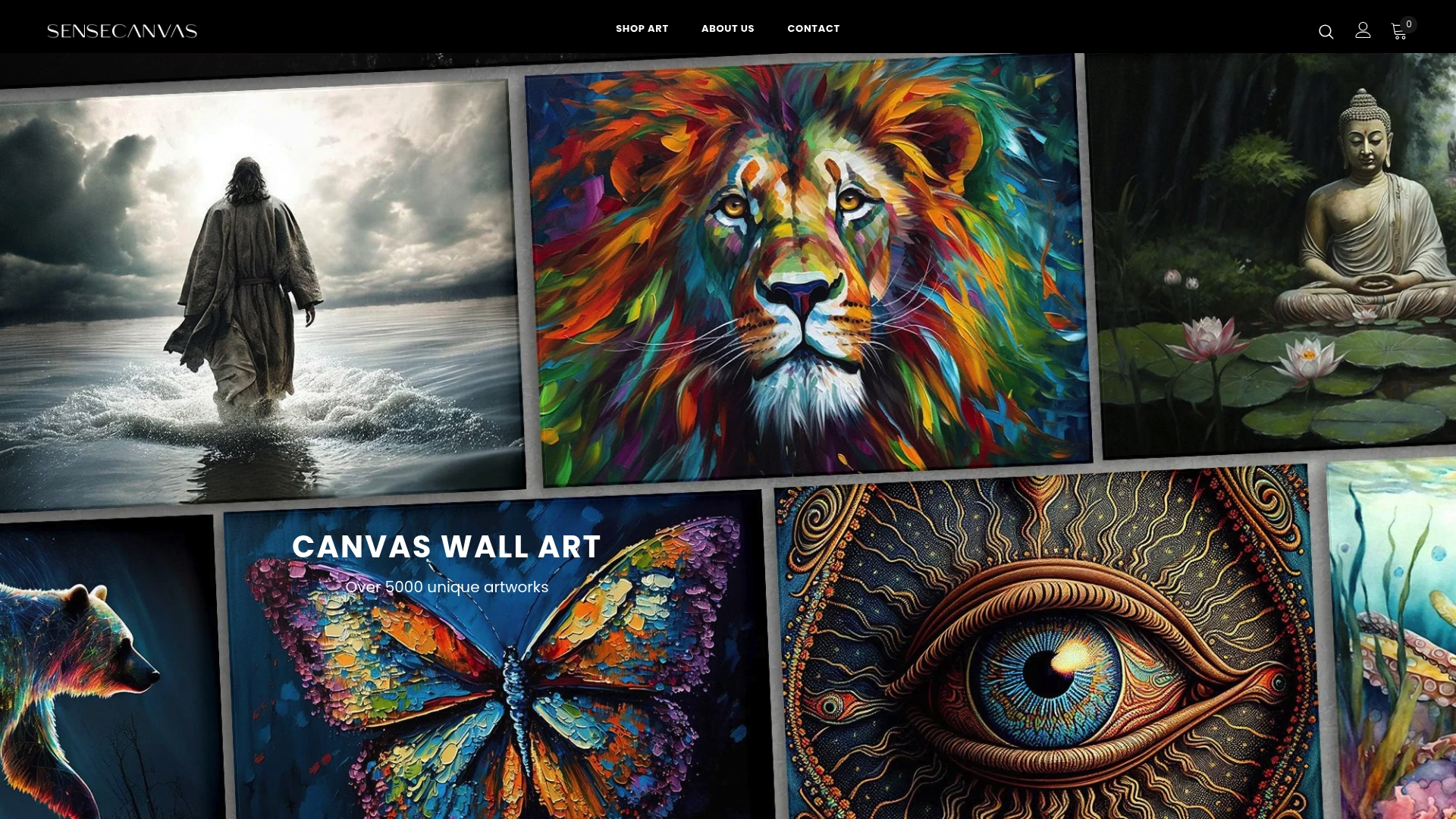
Sensecanvas carries over 15,000 canvas wall art pieces spanning abstract, nature, motivational, and figurative styles, all available with custom sizing so the piece fits your wall rather than the other way around. Whether you are building a gallery wall from scratch or adding a bold anchor to an existing collection, the Sensecanvas collection gives you the range to mix styles with intention. Prices start at $85, and every piece ships ready to hang.
Key Takeaways
Mixing art styles works best when contrast is deliberate and at least one unifying element, whether color, framing, or theme, holds the collection together.
| Point | Details |
|---|---|
| Start with an anchor piece | Choose one bold, clear piece first and use it as the reference point for every subsequent selection. |
| Limit your color palette | Stick to 2–3 shared tones across pieces to create cohesion without forcing exact color matches. |
| Aim for three to four different art styles | Three to four different art styles gives variety without chaos, provided a unifying element ties them together. |
| Frame finishes connect disparate works | Coordinated frame colors act as a visual connector, making even Renaissance and modern pieces feel intentionally curated. |
| Contrast creates engagement | Juxtaposing contrasting styles, such as abstract alongside realistic, turns a wall into an experience guests want to explore. |


