

Matching Art to Interior Styles: A Homeowner's Guide
Matching art to interior styles is the practice of selecting artwork that reinforces a room’s color palette, scale, mood, and design language. Done well, it turns a decorated room into a cohesive space that feels intentional and personal. Done poorly, even beautiful art can feel out of place. This guide covers the core principles of art selection in interior design, then walks through specific advice for every major style, from modern minimalism to maximalist bohemian. Whether you are decorating a living room or a home office, the right artwork does more than fill wall space. It defines the room.
1. Matching art to interior styles: the foundational rules
The best art choices start with four criteria: scale, color, mood, and medium. Get these right and the artwork will feel like it belongs. Miss one and the room will feel slightly off, even if you cannot immediately identify why.
Scale is the most commonly mishandled factor. Oversized art anchors rooms more effectively than small pieces, which can look lost against large walls. A general rule: the artwork should span roughly two-thirds of the furniture it hangs above.
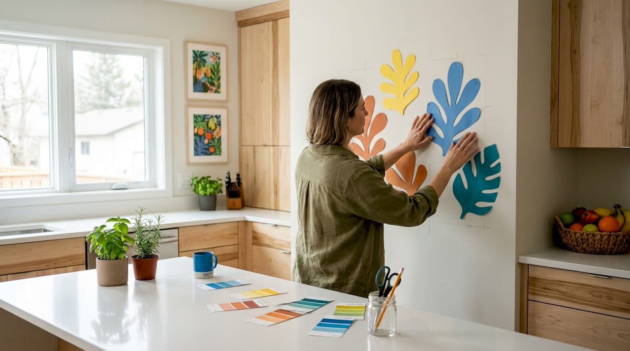
Color is your fastest alignment tool. Repeating subtle room colors in your artwork, whether in textiles, trim, or accent objects, creates contrast without overwhelming the palette. You do not need an exact color match. A painting that pulls one tone from your throw pillows is enough.
Mood is often overlooked. A serene watercolor reads differently than a bold graphic print, even if both share the same color family. Match the emotional register of the art to the function of the room.
Medium matters for texture. Canvas prints add warmth and depth. Framed works on paper feel lighter and more refined. Mixed media pieces add tactile interest to flat, neutral walls.
- Scale: aim for art that fills at least two-thirds of the wall or furniture width
- Color: pull one or two tones from existing textiles or trim
- Mood: match the art’s emotional energy to the room’s purpose
- Medium: use canvas for warmth, paper for refinement, mixed media for texture
- Placement: hang art so the center sits at eye level, roughly 57–60 inches from the floor
Pro Tip: Before you buy, tape paper cutouts to the wall in the intended size. Living with the shape for a day tells you more than any online preview.
2. Art for modern and contemporary interiors
Modern interiors favor restraint. Clean lines, neutral palettes, and open space define the style, so the artwork needs to hold its own without cluttering the visual field.
Abstract canvas prints work exceptionally well here. Bold color blocks, geometric compositions, and minimal line work all complement the style’s emphasis on form over decoration. Frames should be thin, in black, white, or natural wood, to avoid competing with the art itself.
Choosing art for interior design in modern spaces works best when you treat a single large-format piece as the room’s focal point rather than grouping several smaller works. One strong statement piece reads as confident. A cluster of small prints reads as indecisive in a modern room.
- Subjects: abstract, geometric, architectural photography
- Palette: monochrome, earth tones, or a single bold accent color
- Frames: thin metal or minimal wood in neutral tones
- Format: large single canvas over grouped arrangements
Pro Tip: In a modern room with an all-white palette, a single oversized canvas in deep charcoal or burnt sienna does more work than any gallery wall.
3. Art for traditional and transitional interiors
Traditional interiors draw from historical design, think rich wood furniture, symmetrical layouts, and layered textiles. The artwork should match that sense of depth and permanence.
Classic oil-style paintings, botanical prints, and portraiture all fit naturally. Ornate or gilded frames reinforce the style’s formal character. Symmetrical arrangements, two matching prints flanking a fireplace, for example, reinforce the balance that traditional rooms depend on.
Transitional interiors blend traditional structure with contemporary simplicity. The art selection follows the same logic: pair a classic subject (a landscape, a still life) with a cleaner, more modern frame. This keeps the room from feeling either too formal or too stark.
- Traditional subjects: landscapes, portraits, botanicals, classical still life
- Traditional frames: gilded, carved wood, or dark stained finishes
- Transitional approach: classic subject plus minimal frame
- Avoid: overly graphic or pop-art styles, which clash with traditional furniture
Pro Tip: In a transitional room, a black-and-white photograph in a simple wood frame threads the needle between old and new without committing fully to either.
4. Art for eclectic, bohemian, and maximalist interiors
These styles reward boldness and personal expression. The goal is not uniformity. It is curated energy.
- Eclectic interiors mix periods, cultures, and mediums intentionally. Repeat one or two colors across different pieces to create visual cohesion without matching styles. A vintage map next to a contemporary abstract print works if both share a warm ochre tone.
- Bohemian interiors favor handcrafted and culturally rich artwork. Woven wall hangings, ethnic prints, and richly colored canvases all fit. Texture is as important as image. Look for art that has physical depth, not just visual interest.
- Maximalist interiors use art as part of a layered, high-impact composition. Layering textures with canvas prints adds dimension to already-busy walls. The key is intentionality. Every piece should earn its place.
- Gallery walls suit all three styles. Consistent frames provide calm in salon-style arrangements, while mismatched frames add layered, eclectic character. Choose your approach based on how much visual noise the room can absorb.
- Framing strategy: in bohemian rooms, skip the frame entirely and hang canvas prints directly. In eclectic rooms, mix frame materials but keep one consistent finish, all matte, all metallic, or all natural wood.
Pro Tip: For a gallery wall, lay all your pieces on the floor first and photograph the arrangement. Editing on the floor costs nothing. Editing on the wall costs nail holes.
5. Art for coastal, Scandinavian, and minimalist interiors
These three styles share a common thread: restraint. The art should support the room’s lightness, not compete with it.
| Style | Best Art Subjects | Palette | Frame Style |
|---|---|---|---|
| Coastal | Ocean scenes, botanicals, natural textures | Blues, sandy neutrals, soft whites | Driftwood, whitewashed, or natural wood |
| Scandinavian | Geometric forms, nature motifs, simple line art | Muted grays, warm whites, soft greens | Thin black or natural birch |
| Minimalist | Single bold statement, abstract with clean lines | Monochrome or one accent color | Frameless canvas or thin metal |
Botanical wall art pairs naturally with coastal and Scandinavian interiors, complementing wood accents and greenery without overwhelming the palette. Its soft, organic quality reinforces the natural feel these styles depend on.
Scandinavian interiors favor minimalism and muted tones, so art with strong graphic contrast or saturated color will feel jarring. Stick to pieces with breathing room, compositions that use negative space as deliberately as the subject itself.
In minimalist rooms, one statement piece carries the entire wall. Choosing art for interior design in these spaces means resisting the urge to add more. A single large abstract canvas in two tones does more than a carefully arranged group of five smaller prints.
6. Practical tips for mixing artwork across your home
Art is a deeply personal decision that shapes a home’s mood and reflects who lives there. That means your collection does not need to be uniform. It needs to be coherent.
- Mix price points deliberately. Mixing established and emerging artists with meaningful objects creates a more interesting and personal interior than buying a matched set. A $200 print next to a $2,000 original can look intentional if the scale and color work together.
- Protect delicate pieces from light. Natural light affects art durability, with works on paper being especially vulnerable to fading. Hang these away from direct sunlight or use UV-protective glass.
- Match art to room function. Energetic, bold pieces suit living rooms and home offices. Calm, muted works suit bedrooms and reading nooks. Hallways benefit from smaller, narrative pieces that reward close viewing.
- Hang at the right height. The center of any artwork should sit at 57–60 inches from the floor, which is standard eye level. Hanging art too high is the single most common placement mistake.
- Use color theory in decor to guide groupings. When mixing multiple pieces, a shared color in each work ties the group together without requiring matching styles or subjects.
Pro Tip: In a hallway, stagger art at slightly different heights rather than aligning every center point. It creates a more dynamic, gallery-like feel.
Key takeaways
Matching art to interior styles works best when scale, color, mood, and medium align with the room’s design language and the homeowner’s personal identity.
| Point | Details |
|---|---|
| Scale anchors the room | Art should span roughly two-thirds of the furniture width; too small reads as an afterthought. |
| Color ties art to the room | Pull one or two tones from existing textiles or trim to create cohesion without an exact match. |
| Style dictates art character | Modern rooms favor bold abstracts; traditional rooms favor classic subjects with ornate frames. |
| Framing shapes the mood | Consistent frames calm busy rooms; mismatched frames add eclectic, layered character. |
| Personal identity matters most | Art that reflects who you are outlasts any trend and makes the space feel genuinely yours. |
What I have learned from choosing art for real rooms
The design principle that took me longest to trust is this: the “right” artwork for a room is rarely the most obvious choice. A coastal living room does not need a seascape. It needs something that carries the same lightness and calm, which might be a soft geometric print or a single botanical canvas in seafoam and cream.
Art trends in interior design shift constantly, but the rooms that age well are the ones where the art reflects the person, not the moment. Zélika García puts it plainly: art is an extension of personality and identity within interior design. That is not a soft sentiment. It is a practical guide. When you choose art that genuinely resonates with you, it tends to work with your space because your taste and your home already share a common thread.
The mistake I see most often is playing it safe with scale. People buy small because small feels less risky. But a piece that is too small for its wall does not disappear quietly. It draws attention to itself by looking wrong. Go bigger than feels comfortable. You will almost always be glad you did.
The other thing worth saying: your collection should grow over time. A home filled with art bought in one shopping session looks like a showroom. A home where pieces arrive over years, from travels, from artists you discovered, from gifts, looks like a life. Start with one piece that genuinely moves you. Build from there.
— Sense
Find the right canvas for your interior style
Sensecanvas offers over 15,000 canvas wall art pieces across styles that span abstract, botanical, motivational, animal themes, and more. Every piece is available in custom sizes, so you can match the exact scale your room needs rather than settling for a standard format that almost fits.
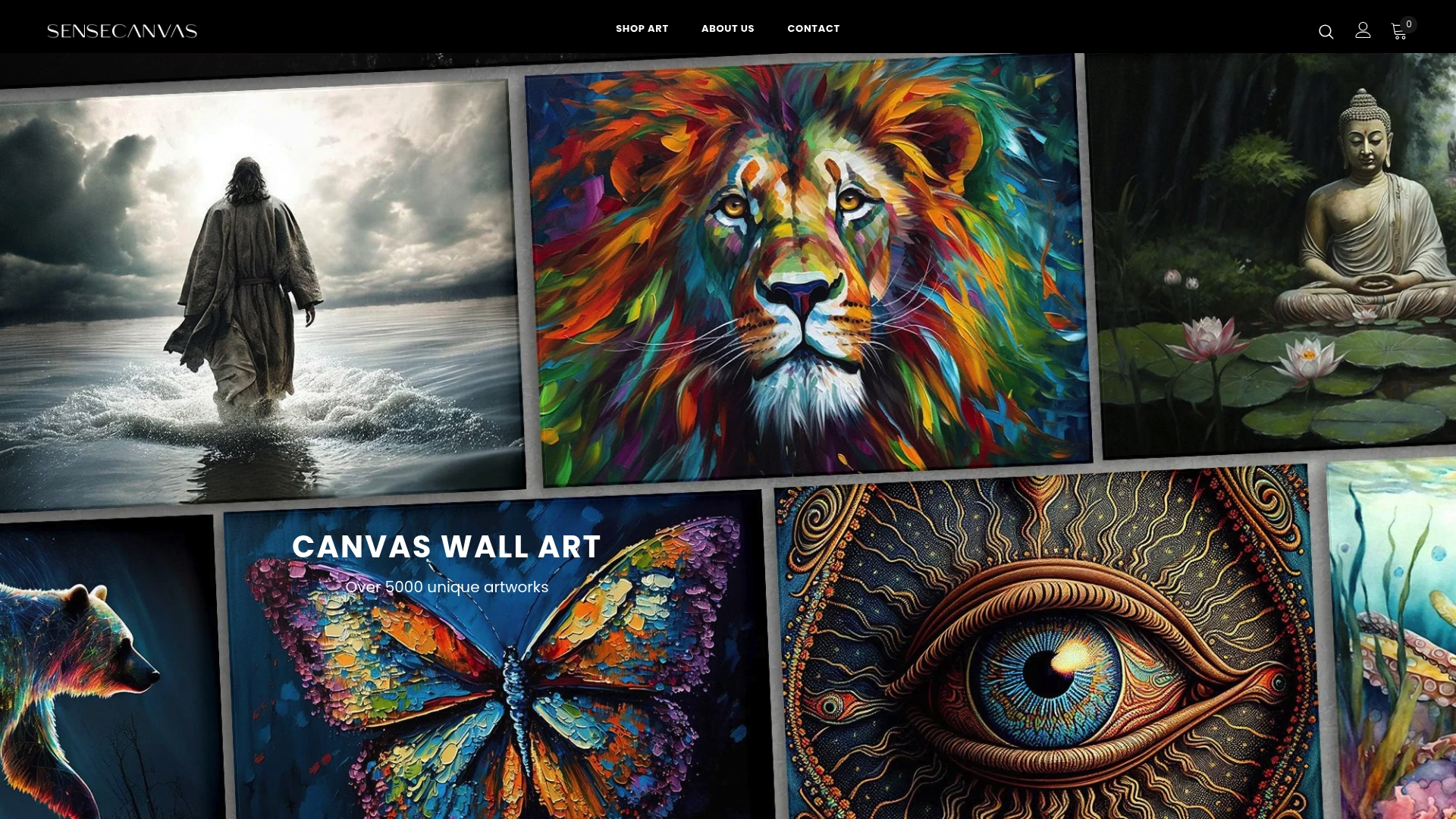
Prices start at $85, and the catalog covers everything from bold color-block abstracts suited to modern interiors to richly textured prints that work in bohemian and eclectic spaces. If you know your style but not your piece, browsing by theme or color palette makes the selection process direct and practical. The right artwork for your room is already there.
FAQ
How do I choose the right art size for my wall?
The artwork should span roughly two-thirds of the wall or the furniture below it. Hanging art that is too small is the most common mistake, and oversized art anchors rooms far more effectively.
What art works best in a minimalist interior?
A single large-format piece with clean lines and a limited color palette suits minimalist rooms best. Resist grouping multiple pieces, since one strong statement carries more visual weight in a spare space.
Can I mix different art styles in the same home?
Yes. Mixing art styles across a home creates a more personal and interesting interior than buying a matched set. Repeat one or two colors across pieces to maintain cohesion.
Where should I hang art in relation to furniture?
Hang art so its center sits at 57–60 inches from the floor. When placing art above furniture, keep a gap of roughly 6–8 inches between the top of the furniture and the bottom of the frame.
Does frame style really affect how art looks in a room?
Significantly. Consistent frames calm busy rooms, while mismatched frames add eclectic character. Choose your framing approach based on how much visual complexity the room already carries.


