

The Role of Color in Office Art Selection
Color in office art selection is the practice of using hue, saturation, and tone in workplace artwork to directly shape employee mood, focus, and output. This is not a decorating preference. It is a measurable design decision. Employees in art-enriched environments experience up to 32% higher productivity, 45% greater wellbeing, and 60% higher engagement than those in sparse workspaces. Color psychology in office decor is the recognized industry term for this discipline, and it sits at the intersection of neuroscience, interior design, and organizational behavior. Get the colors right, and your walls do real work.
What psychological effects do specific color hues have in office art?
Color acts as a silent instructor for the brain, triggering physiological responses that are suited to different workplace functions. This means the hue you hang above a desk is not neutral. It is sending a signal to every person who sits beneath it.
The research on specific hues is clear and consistent:
- Blue and teal: Cool tones lower heart rate and foster analytical focus. These are the right colors for accounting departments, legal teams, and any space where sustained concentration matters.
- Blue-green at low saturation: A randomized controlled trial published in january 2025 found that low-saturation blue-green palettes with lightness values of 65–75 and saturation of 20%–30% reduced salivary cortisol by 18.7% within four weeks among high-stress employees. That is a measurable physiological shift from a paint-level color choice in art.
- Red and orange: Warm tones stimulate dopamine release and raise energy levels. They are effective in short-burst, high-energy zones like brainstorming rooms and sales floors, but they fatigue the eye when used across large surfaces.
- Terracotta and amber: These warm accents stimulate collaboration without the aggression of pure red. They work well in meeting rooms and communal areas.
- Green: Mid-range greens signal balance and recovery. They reduce eye strain and work well in breakrooms or wellness corners.
- Gray and white: Neutral backgrounds in art allow other colors to carry the emotional weight. They prevent visual overload in already-busy office interiors.
The practical implication is that you can zone your office by color without repainting a single wall. Art placement does the same job at a fraction of the cost and disruption.
Pro Tip: Test your color choices with a small group of employees before committing to a full installation. Color perception varies by personality type and cultural background, so what reads as “calming” to one team may feel flat or cold to another.
How does color influence productivity and wellbeing in office environments?
The evidence connecting color in workplace art to measurable outcomes is not anecdotal. It comes from controlled studies and large-scale surveys.
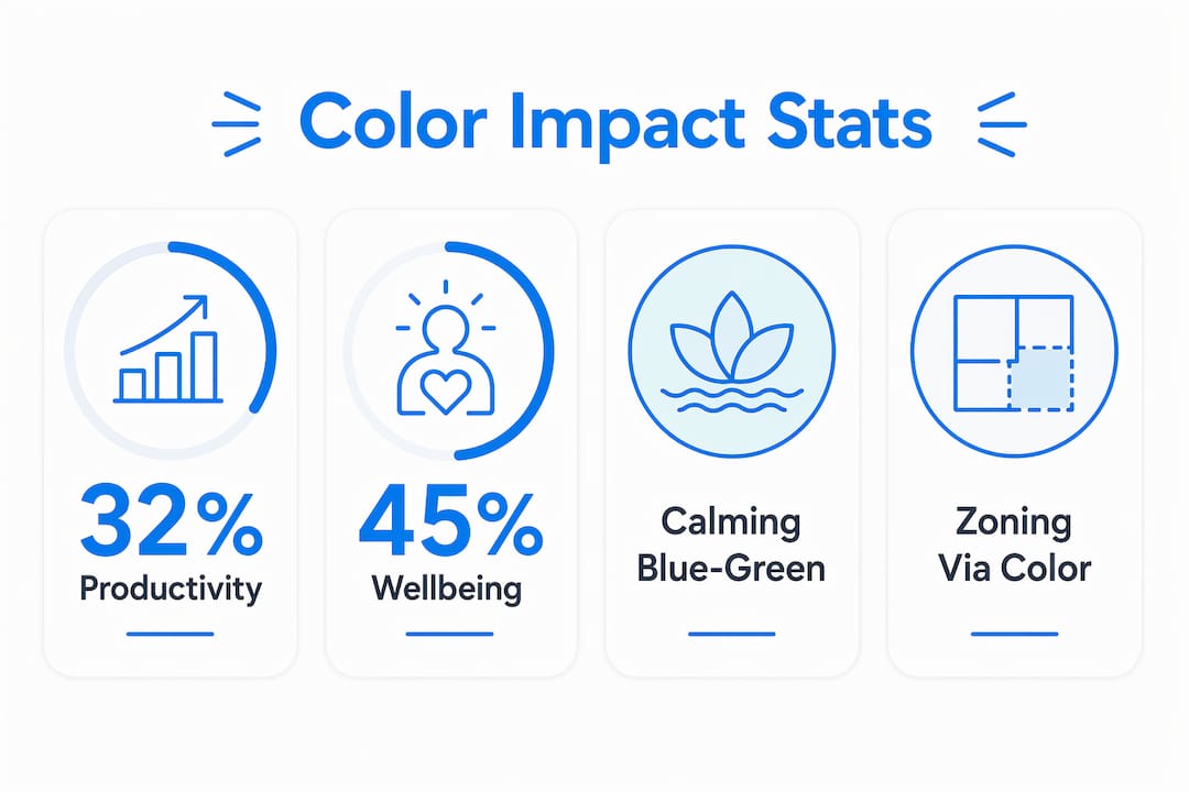
A University of Exeter study found that art-enriched workspaces yield up to 32% higher productivity and 45% greater wellbeing compared to lean, undecorated offices. A separate survey of more than 800 employees across 32 organizations found that 78% agree artwork reduces stress and 64% agree it increases creativity and innovation. These numbers point to a consistent pattern: art with intentional color choices changes how people feel and perform at work.
“Color in office art does not just decorate a space. It regulates the emotional and cognitive state of everyone who works in it. The right palette lowers stress hormones, sharpens focus, and signals to employees that their environment was designed with care.”
The table below summarizes the key findings:
| Study / Source | Finding | Implication |
|---|---|---|
| University of Exeter study | 32% productivity increase, 45% wellbeing gain | Art investment pays back in measurable output |
| Survey of 800+ employees, 32 organizations | 78% say art reduces stress; 64% say it boosts creativity | Employees notice and respond to art choices |
| RCT, january 2025, 120 participants | 18.7% cortisol reduction with blue-green palettes | Specific hues produce physiological stress relief |
| Design expert analysis | Abstract art reduces mental fatigue and supports divergent thinking | Style and color work together for cognitive benefit |
The concept of color as a cognitive tool connects to what designers call “visual rest stops.” Abstract art in muted or cool tones gives the brain a brief recovery moment between tasks. That recovery is not passive. It actively supports the kind of divergent thinking that produces new ideas. Understanding why art affects room mood at a neurological level helps managers make better purchasing decisions, not just prettier ones.
What practical principles guide color selection for different work zones?
Choosing office art colors by work zone is the most direct way to apply color psychology in office decor. The goal is to match the emotional tone of the art to the cognitive demand of the task performed in that space.
Follow these steps when selecting art for each zone:
- Map your workspace by function. Identify focus zones, collaboration zones, and recovery zones before selecting any art. Each zone needs a different color strategy.
- Apply cool tones to focus zones. Deep blue, teal, and low-saturation blue-green work best in areas where employees need sustained concentration. These hues lower arousal and reduce distraction.
- Use warm accents in collaboration zones. Terracotta, amber, and muted orange stimulate energy and social engagement without overwhelming the space. Limit warm tones to accent pieces rather than full-wall coverage.
- Choose neutral or green tones for recovery zones. Breakrooms and wellness areas benefit from mid-range greens and soft neutrals. These colors reduce eye strain and signal a mental shift away from task mode.
- Prioritize abstract styles across all zones. Abstract art in professional spaces avoids distraction and allows diverse personal interpretation. It enhances curiosity and focus without imposing a single narrative on the viewer.
- Build color harmony with existing decor. Repeat one or two colors from your existing furniture or flooring in the artwork. This creates visual coherence without forcing an exact match. Aligning art with furniture is a practical skill that prevents the “afterthought” look most offices default to.
One principle that experienced designers consistently flag: avoid over-branding. Hanging your exact logo colors on every wall does not reinforce culture. It turns art into signage. Office art should avoid literal branding and logo colors to maintain relevance through rebrands and acquisitions. Tone and material connection age far better than exact color replication.
Pro Tip: When selecting art for a mixed-use open-plan office, use color temperature as a zoning tool. Cooler pieces near workstations, warmer pieces near collaboration tables. You create psychological zones without physical barriers.
How to balance artistic style, scale, and color harmony in office art?
Color does not operate alone. It works with scale, material, and style to create an overall visual effect. Getting the color right but the scale wrong produces a result that feels off, even if no one can explain why.
Visual weight proportionality is the principle that artwork should be sized relative to the wall, furniture, and lighting around it. A small canvas on a large blank wall reads as an afterthought. An oversized piece in a narrow corridor creates pressure. The color within that art amplifies or softens the scale effect. A large piece in deep blue recedes visually and feels calm. The same size in bright red advances and dominates.
The table below contrasts abstract and figurative art in terms of color application and office impact:
| Attribute | Abstract art | Figurative art |
|---|---|---|
| Color flexibility | High. Color carries the full emotional message. | Moderate. Color supports the subject matter. |
| Distraction risk | Low. Invites open interpretation. | Higher. Literal subjects can pull focus. |
| Longevity | Strong. Avoids dated cultural references. | Variable. Depends on subject relevance over time. |
| Zone suitability | All zones, especially focus and recovery areas. | Best in reception and social spaces. |
| Branding risk | Low when colors are tonal, not logo-exact. | Higher if subject matter is brand-specific. |
Material and texture also affect how color reads in a space. A matte canvas finish absorbs light and makes colors appear softer and more receding. A gloss or metallic finish reflects light and makes the same color appear more saturated and forward. In offices with strong overhead lighting, matte finishes generally produce more consistent color perception across the day. Checking 2026 art trends shows a clear shift toward textured, matte-finish abstract pieces in professional interiors, which aligns with the research on reducing visual fatigue.
Key Takeaways
Color in office art selection is the single most cost-effective tool for shaping employee mood, reducing stress, and improving focus across distinct workspace zones.
| Point | Details |
|---|---|
| Color drives measurable outcomes | Art-enriched offices show up to 32% higher productivity and 45% greater wellbeing. |
| Specific hues produce specific effects | Blue-green palettes at low saturation reduce cortisol by 18.7% within four weeks. |
| Zone art by function | Use cool tones for focus areas, warm accents for collaboration, and greens for recovery zones. |
| Abstract art outperforms figurative in offices | It reduces distraction, allows personal interpretation, and ages better without branding risk. |
| Scale and material amplify color impact | Proportional sizing and matte finishes ensure color reads consistently across the workday. |
What I have learned from watching offices get color wrong
Most offices that invest in art still get the color strategy backward. They pick art that matches the brand palette exactly, hang it at eye level in the lobby, and call it done. The result looks intentional for about six months. Then the rebrand happens, or the furniture changes, and suddenly the art looks like a relic.
The offices that get it right treat color in art as a functional tool, not a decorating checkbox. I have seen a single well-placed teal abstract canvas in a financial firm’s open-plan floor do more for afternoon focus than any productivity software rollout. The employees did not talk about the art. They just stopped leaving their desks at 2 PM to take walks.
The other mistake I see constantly is ignoring employee input. Involving your team in art selection is not a soft HR gesture. It directly increases the wellbeing and engagement gains the research documents. When people feel ownership over their environment, the art works harder. A piece chosen by a committee of managers lands differently than one chosen with the team.
Color strategy in office art is not a one-time decision either. Spaces change, teams change, and the emotional needs of a workforce shift. Build in a review every two to three years. Swap pieces between zones. Rotate palettes seasonally if the budget allows. The science supports flexibility. The art should serve the people in the room, not the other way around.
— Sense
Office art with the right colors, ready to hang
Sensecanvas offers over 15,000 canvas wall art pieces designed to fit the full range of office environments, from calm focus zones to high-energy collaboration spaces. Every piece is available in custom sizes, so the scale-to-wall proportionality that design experts recommend is built into the ordering process. Prices start at $85, making it practical to art-direct multiple zones without a large capital outlay.
For offices that need calming blue-green tones in focus areas, the abstract ocean canvas is a direct match for the low-saturation palette the 2025 RCT identified as cortisol-reducing. For motivation-driven spaces, the full Sensecanvas collection covers abstract, motivational, and nature-themed options across every color temperature.
FAQ
What is the role of color in office art selection?
Color in office art selection determines the emotional and physiological response employees have to their workspace. Specific hues trigger measurable changes in focus, stress levels, and energy, making color the most functional element of any art purchase.
Which colors work best in office focus zones?
Cool tones like deep blue and teal work best in focus zones. A 2025 randomized controlled trial found that low-saturation blue-green palettes reduced cortisol levels by 18.7% within four weeks among high-stress employees.
Does office art color actually affect productivity?
Yes. A University of Exeter study found that art-enriched workspaces produce up to 32% higher productivity and 45% greater wellbeing compared to undecorated offices.
Should office art match the company brand colors?
Office art should avoid exact brand color replication. Tone and material connections age better than logo-exact matches and remain relevant through rebrands and organizational changes.
Is abstract or figurative art better for office environments?
Abstract art is generally preferred in professional office spaces. It avoids distraction, allows diverse personal interpretation, and works across all workspace zones without imposing a single narrative.


