

How Color Palettes Guide Art Selection for Your Space
Your color palette is the single most powerful tool you have when choosing canvas wall art. It tells you which pieces will feel at home in a room and which will fight everything around them. Before you browse a single artwork, your palette answers three questions: what mood do you want the space to carry, which hues already anchor the room, and how much visual energy can the walls handle?
Color palettes work by organizing your choices around hue (the color family), value (lightness or darkness on a scale from black to white), and saturation (how vivid or muted a color reads). Get those three variables working together and the art you pick will feel like it belongs. Ignore them and even a beautiful piece can make a room feel off.
A few things to keep in mind before you start:
- Hue sets the emotional tone. Warm reds and oranges feel energetic; cool blues and greens read as calm.
- Value does the structural work. Value contrast determines whether art reads as bold or recedes into the wall.
- Saturation controls attention. High saturation pulls the eye; muted tones let the room breathe.
- Lighting shifts all three. Natural daylight reads colors differently than warm incandescent bulbs, so always test your palette in the actual room light.
- Psychological effects are real and predictable. Warm palettes evoke intimacy and energy, while cool palettes foster calm and relaxation.
Table of Contents
- What color theory principles actually matter for art selection?
- How to use your color palette to pick the right canvas art
- How Sensecanvas helps you find art that fits your palette
- Key Takeaways
- Sensecanvas: canvas wall art built around your color palette
What color theory principles actually matter for art selection?
Color theory is the structured framework artists and designers use to predict how colors interact and what feelings they produce. For anyone choosing canvas wall art, you only need to understand the parts that directly affect how a piece looks on your wall.
Value comes first. Value is measured on a 0–10 scale from black to white, independent of hue. A painting with strong value contrast reads clearly from across a room; one with compressed values looks flat. This is why two artworks in the same color family can feel completely different hanging in the same space.
Saturation controls hierarchy. Professional artists use high saturation sparingly at focal points and keep background elements muted. When you apply that same logic to art selection, you are looking for pieces where the most vivid color lands on the subject, not scattered across the whole canvas.
Color temperature creates depth. Warm colors visually advance; cool colors recede. A painting dominated by warm tones will feel closer and more immediate on the wall. Cool-toned art tends to open a space up visually.
The six harmony schemes give you a starting framework:
- Monochromatic: one hue across a range of values. Quiet and cohesive, but needs strong value range to avoid reading flat.
- Analogous: three to five neighboring hues. Serene and natural, great for bedrooms and reading rooms.
- Complementary: two opposite hues. Maximum contrast and energy, best used with one color dominant.
- Split-complementary: one hue plus two colors adjacent to its complement. More flexible than pure complementary, easier to balance.
- Triadic: three equally spaced hues. Vibrant and decorative, works well in offices and creative spaces.
- Tetradic: two complementary pairs. The most complex to balance; keep at least one or two hues at low saturation.
Pro Tip: Before committing to a piece, convert a photo of it to grayscale on your phone. If the value structure still reads clearly in black and white, the art has the compositional strength to hold up in your room.
How to use your color palette to pick the right canvas art
Start with the room, not the artwork. Walk through the space and identify the three colors that already dominate: wall color, the largest furniture piece, and the flooring or rug. Those three form your baseline palette. Your art needs to either echo one of them, contrast one deliberately, or introduce a new accent that the room’s existing palette can absorb.

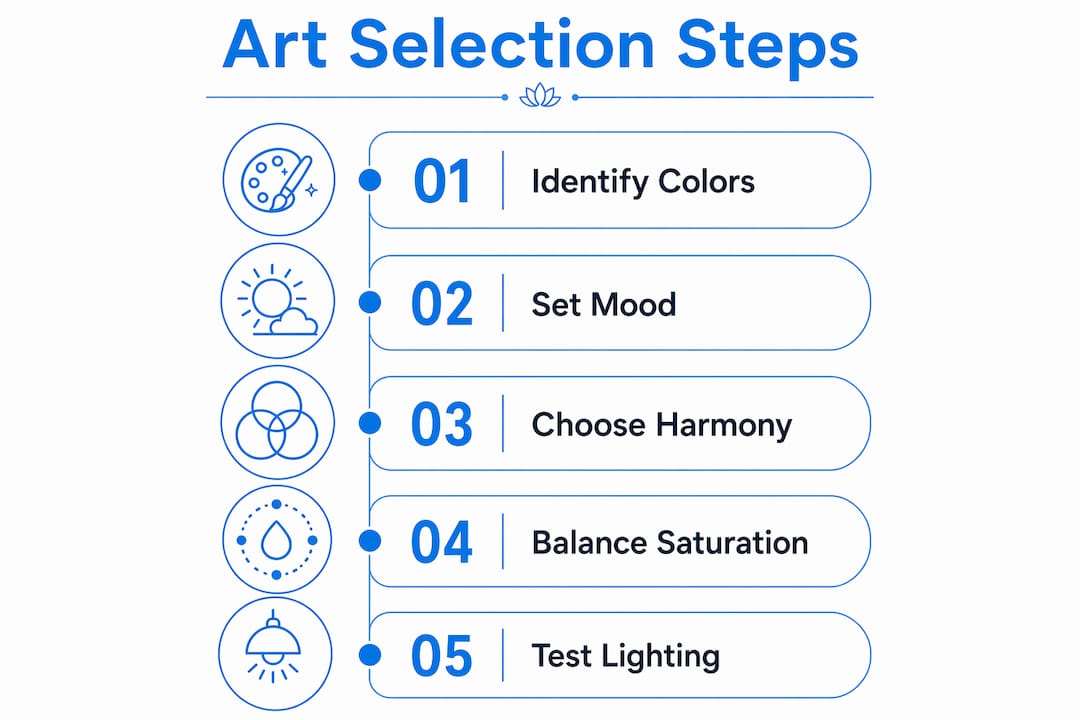
Step 1: Decide on a mood. A home office that needs to feel focused and calm calls for a cool analogous palette, blues and blue-greens with controlled saturation. A living room meant for conversation and warmth points toward analogous warm tones or a complementary scheme with orange and blue. The psychological color associations you choose here drive every decision that follows. For more on how this plays out room by room, the Sensecanvas guide on color theory and decor is worth reading before you shop.
Step 2: Match your harmony scheme to that mood. Complementary schemes suit high-energy spaces like gyms, studios, or bold dining rooms. Analogous schemes work for bedrooms, spas, and any room where you want people to relax. Triadic schemes fit creative offices and playrooms where variety and stimulation are the point.
Step 3: Balance saturation and value in the art itself. Look for pieces where the focal subject carries the highest saturation and the strongest value contrast. Desaturated background elements in the artwork create depth and prevent the piece from visually competing with your furniture. Art that is uniformly vivid across the whole canvas tends to feel chaotic in a decorated room.
Step 4: Account for your lighting. Warm incandescent or Edison bulb lighting shifts cool colors toward neutral and amplifies warm ones. LED daylight bulbs read colors more accurately. If your room runs warm, a cool-toned artwork will read more neutral than it does in the store. Test a digital mockup in your actual space before buying. For office environments specifically, the Sensecanvas article on office art and color covers how lighting conditions shift palette perception in professional settings.
Step 5: Run a small test before committing. Working painters complete small color studies before finalizing a palette. You can do the same thing digitally: drop a photo of the artwork into a room photo using your phone’s photo editor or a free mockup tool. If the colors feel right at thumbnail size, they will hold up at full scale on the wall. The color psychology behind viewer response also applies here: colors that feel right in a small preview tend to produce the same emotional response at room scale.
For matching art to a specific interior style, the Sensecanvas guide on art and interior styles breaks down which palettes work for mid-century modern, Scandinavian, industrial, and other common aesthetics.
How Sensecanvas helps you find art that fits your palette
Sensecanvas offers over 15,000 curated canvas artworks organized across styles including abstract, nature, motivational, and spiritual themes, each with enough palette variety that you can filter by the dominant color family your room needs.
| Feature | Details |
|---|---|
| Collection size | Over 15,000 curated artworks across multiple styles and color palettes |
| Customization | Size and design adjustments to fit specific wall dimensions and decor |
| Starting price | Starting at $85 |
| Style range | Abstract, animal, motivational, spiritual, nature, and more |
| Educational resources | Blog articles on color theory, interior matching, and office art selection |
Customization is where Sensecanvas separates itself from a generic print shop. You can specify the exact size you need, which matters when you are trying to hit a particular value balance on a wall. A piece that works at 24×36 inches may read completely differently at 16×20, because the value contrast that reads boldly at large scale can disappear when the canvas shrinks. Getting the size right is part of getting the palette right.
Key Takeaways
Color palettes guide art selection by giving you a structured way to match hue, value, and saturation across your room and your artwork, so every piece feels intentional rather than accidental.
| Point | Details |
|---|---|
| Value comes first | Strong value contrast (0–10 scale) makes art readable from across the room, independent of hue. |
| Saturation controls focus | Reserve high saturation for focal points in the artwork; muted backgrounds create depth without visual chaos. |
| Match harmony to mood | Choose from six schemes (monochromatic through tetradic) based on the emotional tone your room needs. |
| Lighting shifts perception | Test your palette under the room’s actual lighting before buying; warm bulbs shift cool colors toward neutral. |
| Sensecanvas fits the process | With over 15,000 artworks and custom sizing from $85, Sensecanvas lets you match palette decisions to a specific piece. |
Sensecanvas: canvas wall art built around your color palette
Choosing art by palette is the right approach. Finding a collection large enough to actually execute it is the harder part. Sensecanvas solves that with over 15,000 pieces spanning every major color family and style, all available with custom sizing so the piece fits your wall and your value balance, not just your taste.
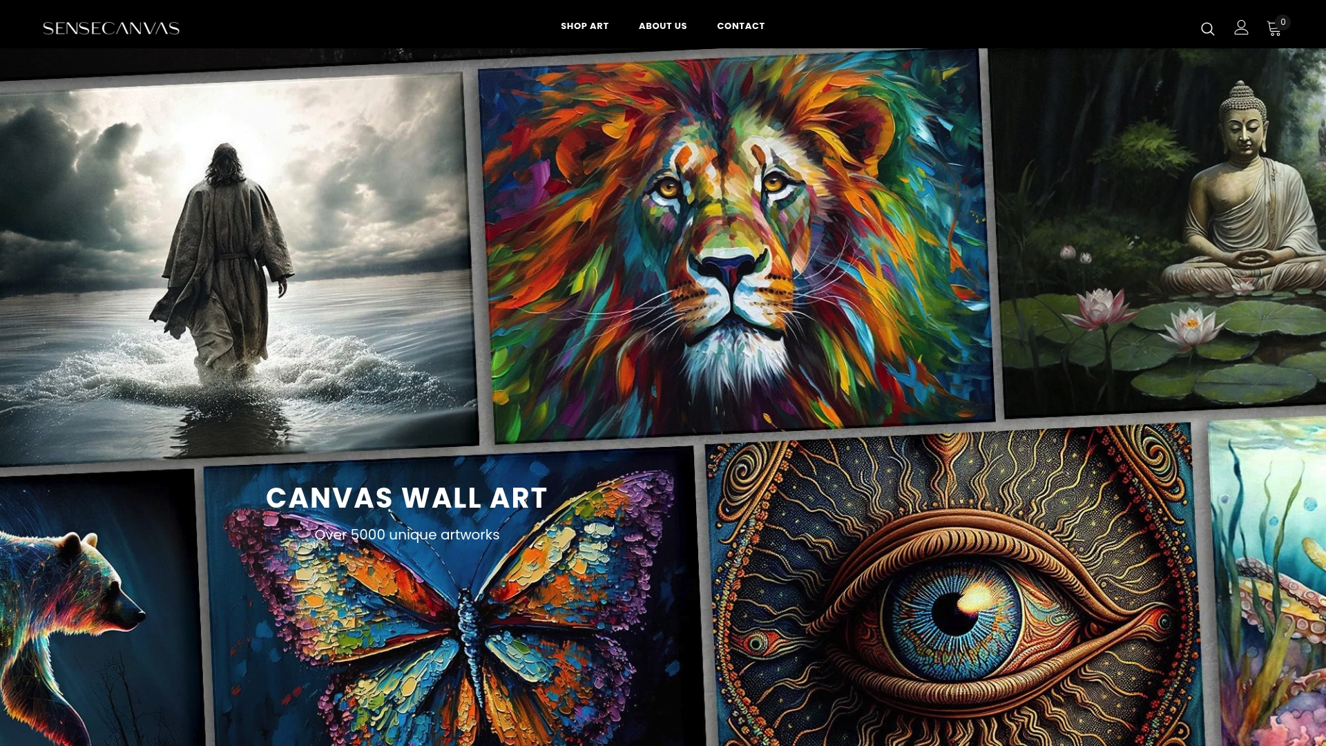
Prices start at $85, and the catalog covers a range from calm blue-green abstracts to bold warm-toned statement pieces. Whether you are furnishing a focused home office or a living room that needs warmth and energy, the range is wide enough that your palette leads the search rather than limiting it. Browse the full canvas wall art collection at Sensecanvas and filter by the color family your room is already built around.


