

How Art Complements Architectural Features in Any Room
Art complements architecture when it matches the scale of the feature it sits near, aligns with the room’s natural sightlines, and picks up a color or texture already present in the structure. Get those three things right and a blank wall or an awkward archway starts to look designed on purpose, not decorated after the fact.
Before you buy or hang anything, run through this:
- Measure the feature first (mantel, beam span, archway width), then size the art to it.
- Keep art centered on sightlines from the main seating or entry point, not just the wall’s center.
- Pull one color or texture from the architecture into the piece.
- Light the art separately from the room’s ambient lighting.
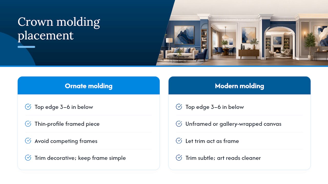
- Leave at least 3 to 6 inches of breathing room around trim, molding, or arch edges.
- Group multiples when a single canvas would look lost against a big surface.
- Match the art’s material (matte canvas, glossy metal print) to the wall’s finish.
- Check weight limits and wall material before mounting anything heavy.
Pro Tip: If you’re mid-renovation, decide on art placement before drywall goes up. Planning ahead lets you add proper lighting, structural support, and correct viewing distances instead of retrofitting them later.
Key Takeaways
Art complements architecture when its scale, color, and placement are matched to the specific feature it accompanies, from crown molding to vaulted ceilings.
| Point | Details |
|---|---|
| Match scale to the feature | Size art to between 42 and 63 inches across when paired with an 84-inch-wide sofa. |
| Respect clearance zones | Leave 3 to 8 inches of space around molding, arch edges, and trim for a clean, intentional look. |
| Coordinate texture and color | Echo the building’s existing palette and materials, or introduce deliberate contrast, but not both at once. |
| Light and mount separately | Use angled accent lighting at 3000K and confirm wall material before installing heavy pieces. |
| Order custom-sized art | Sensecanvas offers over 15,000 designs starting at $85, sized to fit specific architectural dimensions. |
Table of Contents
- Feature-by-Feature Rules for Placing Art
- What Design Principles Guide Every Placement Decision?
- Choosing Materials, Lighting, and Mounting Hardware
- How Have Artists and Architects Collaborated Successfully?
- How Does Art Affect the Feel of a Room?
- How Do You Pick Art That Matches a Room’s Purpose?
- Can Digital Art Work With Traditional Architecture?
- How Has Art Shaped Architecture Throughout History?
- Does Regional Architecture Change What Art Belongs There?
- How Sense Canvas Helps You Match Art to Your Space
- Frequently Asked Questions
- Sources
Feature-by-Feature Rules for Placing Art
Every architectural feature has its own logic. Here’s how to work with the ones people search for most.
Crown molding. Hang art so the top edge sits 3 to 6 inches below the molding line, never touching it. A framed piece with a simple, thin profile reads best under ornate molding, since two decorative frames competing for attention just creates visual noise. Under plain, modern molding, unframed or gallery-wrapped canvas looks cleaner and lets the trim do the framing work.
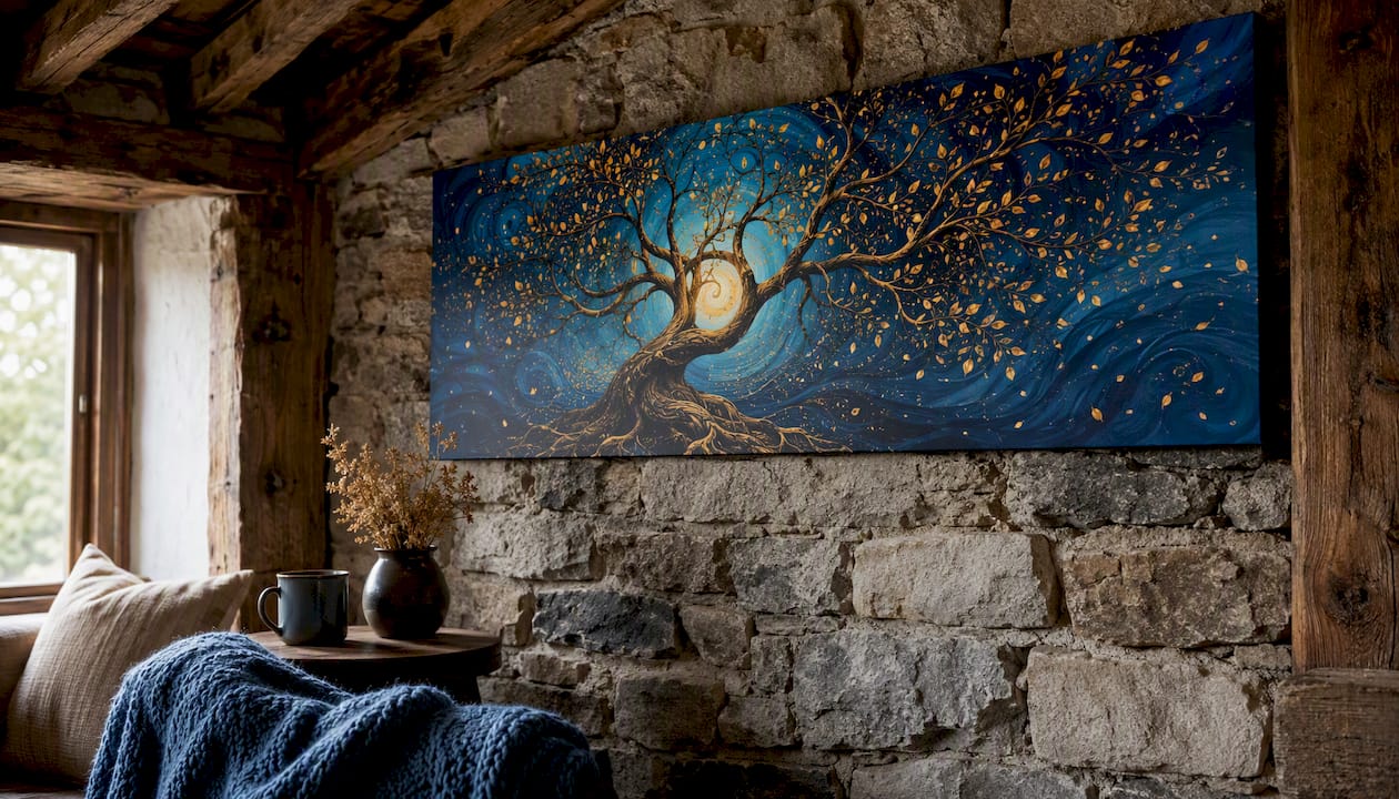
Exposed beams and vaulted ceilings. These features pull the eye upward, so art needs to hold its own at a distance. A single large canvas, at least 40 inches wide, tends to work better than a small piece that gets swallowed by the ceiling height. Orient the piece vertically if the beams run horizontally, and horizontally if they run vertical, so the art contrasts rather than disappears into the lines.
Archways and alcoves. Center art on the arch’s midpoint, not the wall behind it, since an off-center hang under a curved opening looks like a mistake rather than a choice. Leave 4 to 8 inches of clearance from the inside edge of the arch. Mirrored pairs work well in symmetrical alcoves; a single statement piece works better in an asymmetrical nook.
Built-in shelves. Mix flat canvas with three-dimensional objects like small sculptures or ceramics so the shelf doesn’t read as a flat gallery wall stuffed into cubbies. Crowded built-ins lose the architectural detail they’re meant to showcase.
Go narrower and the piece looks stranded; go wider and it overwhelms the surround. A single large canvas reads as a calm focal point; a stacked or layered arrangement (small piece leaning on a larger one) works better on wide, low mantels where one piece alone would feel undersized.
Vaulted or double-height walls. These need multi-panel or triptych arrangements planned at the design stage, not added afterward. Account for viewing distance, since a piece meant to be seen from 20 feet away needs bolder shapes and higher contrast than something hung at eye level. Designers stress that art here should act as a sensory bridge, adding depth without fighting the ceiling’s height.
What Design Principles Guide Every Placement Decision?
Scale and proportion aren’t guesswork. A sofa that’s 84 inches wide pairs well with a canvas or grouping between 42 and 63 inches across.
Color strategy comes down to a choice: echo or contrast. Pulling a wall’s stone gray or a floor’s warm oak tone into the art creates cohesion. Choosing a saturated, unexpected color creates a focal point instead. Neither is wrong, but mixing both approaches in one room usually looks unplanned.
Texture matters as much as color. Canvas softens a room dominated by concrete or glass. Metal prints and sculptural pieces hold their own against heavy wood beams or stone. The strongest results happen when art borrows textures and motifs from the building itself instead of ignoring them.
- Centered placement suits symmetrical rooms and formal spaces.
- Offset placement suits asymmetrical layouts and casual rooms.
- Multiples balance visual weight across long or uneven walls.
Choosing Materials, Lighting, and Mounting Hardware
Canvas suits warm, textured rooms with wood or brick. Acrylic and metal prints suit sleek, modern surfaces like polished concrete or glass. Match the frame’s edge treatment to nearby trim; a thin black frame reads cleanly against white molding, while a raw wood frame blends into exposed-beam ceilings.
For lighting, aim accent fixtures at a 30-degree angle to avoid glare, and choose a color temperature around 3000K for warm, gallery-style illumination that doesn’t wash out the piece. Always layer accent lighting separately from ambient room light.
Mounting matters more than people expect. Vaulted and masonry walls often need toggle bolts or reinforced anchors rather than standard drywall hooks, and any exterior installation needs weatherproof sealing and engineered attachment hardware to survive temperature swings and moisture.
Pro Tip: Before ordering, confirm your wall type, measure twice, and check the piece’s total weight against your hardware’s rated capacity.
How Have Artists and Architects Collaborated Successfully?
The Willis Tower façade project shows what happens when artist and architect design the mounting system together from day one. The engineered tile and frame assembly turned an exterior surface into a performance-quality art installation rather than something bolted on as an afterthought.
Institutional lobbies tell a similar story. Site-specific commissions often involve architects and artists working through sightlines and lighting together, so the finished piece fills the space without blocking circulation or clashing with maintenance access.
Look for three things in any photo of a successful integration: the art’s scale relative to the room, whether it sits on a natural sightline from the entry, and how the lighting separates it from the surrounding architecture.
Public art woven into a building’s design does more than decorate. It supports placemaking and gives a space a story tied to its specific context, which is why murals and etched glass often end up written into the building’s program rather than added after construction.
How Does Art Affect the Feel of a Room?
Art changes how a space feels almost immediately, and the effect compounds when it’s placed with the architecture in mind rather than against it. A large, warm-toned canvas under an exposed beam softens what could otherwise feel like a cold, industrial ceiling. A bold, high-contrast piece in a minimalist archway gives an otherwise quiet hallway a sense of arrival.
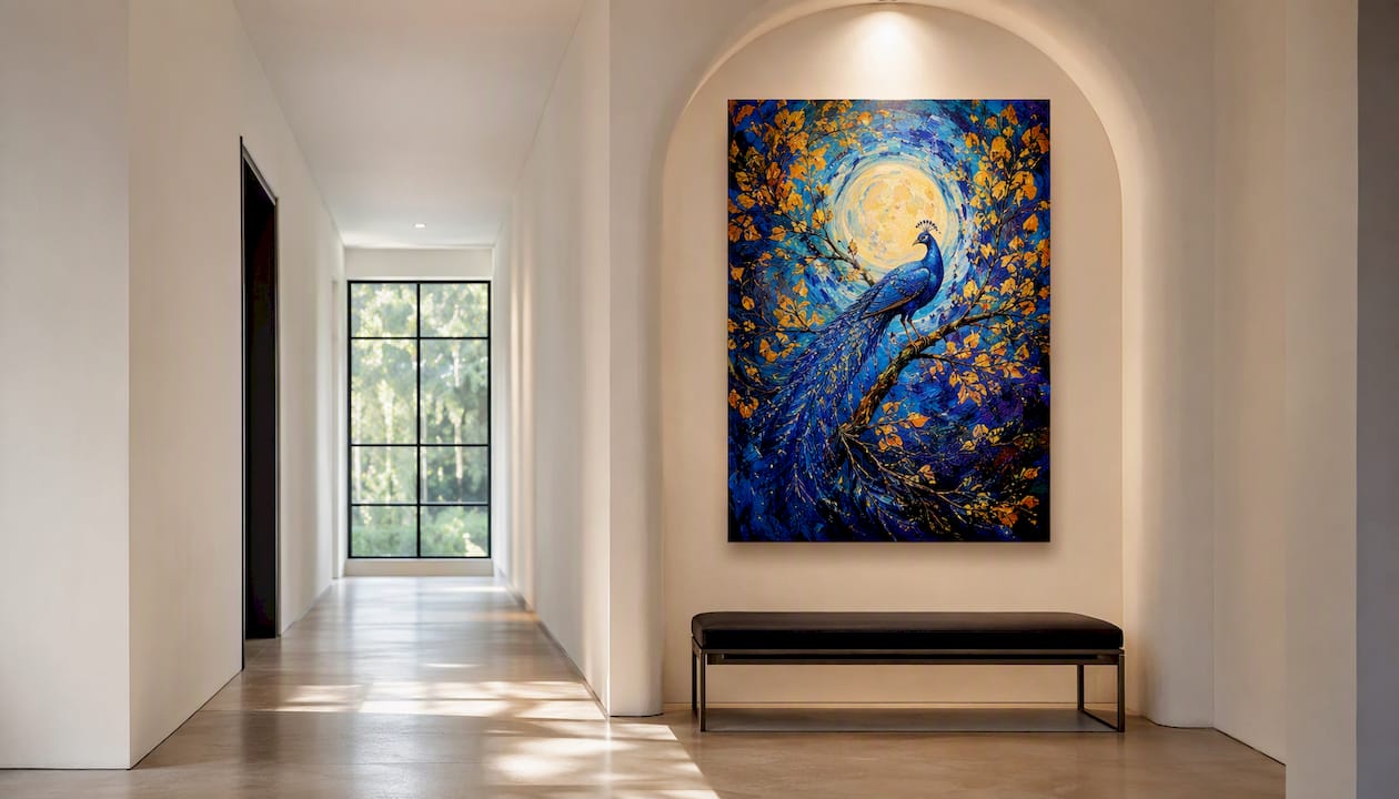
The emotional lift comes from coherence, not just the art itself. When a piece echoes the room’s palette or texture, the brain reads the whole space as intentional, which lowers the low-grade visual tension that comes from clutter or mismatched elements. When art contrasts sharply and deliberately, it does the opposite: it draws the eye and creates energy, which works well in entryways or transitional spaces where you want movement, not calm.
Scale plays into this too. Undersized art on a large wall reads as an oversight and can make a room feel unfinished, even sparse. Correctly scaled art under a vaulted ceiling or beside a fireplace reads as confidence, like the room was built with that piece in mind. That’s the psychological trick behind good architectural art placement: it’s not about filling space, it’s about making the structure itself feel resolved.
How Do You Pick Art That Matches a Room’s Purpose?
A home office needs different art than a dining room, even if both share the same wall dimensions. Match the piece to how the space actually gets used, not just how it looks in isolation.
In work areas, muted palettes and structured compositions support focus, while a chaotic, high-contrast piece can compete with concentration. In dining rooms and living spaces, warmer tones and organic shapes support conversation and relaxation. Entryways benefit from bold, welcoming pieces since they set the tone for the whole home in the first few seconds of arrival.
Ambiance also depends on how art interacts with a room’s natural light. A north-facing room with cool, indirect light pairs well with warm-toned art that adds visual heat the room lacks. A sun-drenched south-facing room can handle cooler, more saturated palettes without feeling cold.
- Home offices: muted, structured, low-glare finishes.
- Dining and living rooms: warmer palettes, organic or abstract shapes.
- Entryways: bold color, larger scale, high visual impact.
- Bedrooms: soft textures, calmer palettes, smaller accent pieces near beams or headboards.
Function should always come before decoration. A stunning piece in the wrong spot for how a room gets used ends up working against the space instead of for it.
Can Digital Art Work With Traditional Architecture?
Digital art and print reproductions raise a specific question for older or heavily traditional buildings: does a modern medium clash with historic detail? Usually not, if the framing and mounting respect the architecture around it. A digitally rendered abstract piece in a simple black frame can sit comfortably beside original crown molding, because the frame, not the medium, does the work of bridging old and new.
Digital art also solves a scale problem that traditional media sometimes can’t. Large-format prints can be produced at exact dimensions to fit a specific vaulted wall or archway, which matters more for good architectural integration than whether the image originated as a painting or a digital file.
The bigger consideration is finish and texture. A high-gloss digital print against rough stone or aged wood can look sterile by comparison. Choosing a canvas or matte finish for the print softens that mismatch and lets the piece feel grounded in the room rather than pasted onto it. Screen-based digital displays, meanwhile, need their own planning: ventilation, cable routing, and glare control from nearby windows all affect whether the installation reads as intentional or improvised.
How Has Art Shaped Architecture Throughout History?
Gothic cathedrals used stained glass not as decoration but as structural storytelling, filling soaring walls with light and narrative in a single move. Renaissance buildings folded frescoes directly into ceilings and walls so the art and the architecture became one continuous surface, impossible to separate.
Modernism flipped that relationship. Bauhaus and International Style buildings stripped ornamentation back and treated art as a deliberate counterpoint, a single bold piece against a clean, unadorned wall. That contrast is still the dominant approach in contemporary homes: minimal architecture, maximal focal art.
The synthesis of art and architecture works best when each discipline keeps its own identity while still forming one cohesive whole, a principle that holds whether you’re looking at a 14th-century cathedral or a 2026 open-concept living room. The lesson for homeowners is simple: art doesn’t need to imitate its architectural setting to belong in it. It needs to respect the setting’s scale, light, and structure.
Does Regional Architecture Change What Art Belongs There?
A Southwestern adobe home calls for different art than a Scandinavian-style interior, even if both spaces share the same square footage and layout. Regional architecture carries its own materials, light quality, and cultural references, and art that ignores those cues tends to feel imported rather than integrated.
Coastal and Mediterranean architecture, with its whitewashed walls and natural light, tends to support brighter, higher-contrast art since the walls themselves act like a gallery backdrop. Craftsman and mid-century homes, with their warm wood tones and lower ceilings, usually call for earthier palettes and smaller-scale groupings rather than one oversized statement piece.
Urban loft conversions with exposed brick and industrial windows can handle bold, saturated, even abstract work because the architecture itself is already high-contrast. A quiet farmhouse interior with shiplap and soft light usually asks for more restraint. None of these are strict rules, but they explain why the same painting looks right in one house and out of place in another. Architecture sets the visual vocabulary; the art either speaks that language or fights it.
A Publisher’s Note on Planning Art Early
Coordinating art with architecture works best when it happens during design, not after the paint dries. We’ve spent years supplying customizable canvas pieces for homes, offices, and everything shaped by an unusual archway or a stubborn beam. If you’re mapping out sizes for a specific wall, our sizing and material guides are worth a look before you order.
How Sense Canvas Helps You Match Art to Your Space
Sensecanvas builds around that problem directly, with over 15,000 designs available in custom sizes so a piece can be ordered to fit your exact beam span or mantel width instead of forcing your wall to fit a standard frame size.
Before you order, measure four things: the width of the feature or furniture piece, the ideal hanging height (center of the art at roughly 57 to 60 inches from the floor), your typical viewing distance, and your wall material for mounting purposes. Sense Canvas pieces start at $85, with sizing and finish options built for exactly this kind of feature-specific placement, whether that’s a reception area or a living room built around exposed beams. Browse the full catalog to find a piece sized for your space, or start with a specific design like the abstract ocean print to see the customization options in action.
Frequently Asked Questions
How wide should art be relative to a fireplace mantel? Anything narrower looks stranded; anything wider crowds the surround.
What height should art hang below crown molding? Leave 3 to 6 inches of clearance between the top of the art and the molding line so the two elements don’t visually compete.
Can large canvases work under exposed beams? Yes, and they usually work better than small pieces. A canvas at least 40 inches wide holds its own against beam height, especially when oriented to contrast with the beam direction.
Does art need to match the architectural style of a home? Not exactly. Art needs to respect the scale, light, and material language of the space more than mimic its style. Modern digital prints can work in traditional homes when framing and finish bridge the gap.
Where should I mount art on masonry or vaulted walls? Use toggle bolts or reinforced anchors rated for the piece’s full weight, and confirm the wall type before drilling, since masonry and drywall require different hardware entirely.
Sources
- The Synergy Between Art and Architecture
- Maximizing Architectural Design with Art | O’Brien Architects
- When artwork becomes façadework: a collaboration with Olafur Eliasson
- Integrating Art & Architecture | MWA Architects
- The intersection of architecture and art: finding beauty in buildings - HMC Architects


