

Swap 2–3 Pieces and One Texture: Seasonal Wall Art Ideas That Work
Swap two to three pieces and add one textural element. That’s the entire trick behind a wall that feels seasonal without looking like a theme park. The season-by-season ideas below cover exactly what to change, when, and with what materials, plus weekend DIY projects if you’d rather build than buy.
TL;DR:
- Swapping artwork within existing frames is the most cost-effective and clean method, especially when changing seasonal colors or textures.
- Use a larger singular piece instead of multiple small frames to create a calmer, more intentional wall, particularly for fall and winter displays.
- Texture plays a bigger seasonal role than color, with woven, pressed botanicals, and layered canvases enhancing the feeling of summer and fall.
- Winter decor should focus on dark, muted tones with minimal accents, using large moody landscapes and metallic elements for contrast without holiday clutter.
- Consistent spacing and layout rules are essential for a balanced gallery wall, with adjustments limited to two or three pieces when swapping seasons.
Table of Contents
- Seasonal Wall Art Ideas: The Quick-Swap Rules That Apply Year-Round
- Spring Wall Art Ideas: Light Palettes and Airy Materials
- Summer Wall Art Ideas: Bright Tones Without the Beach-Cottage Cliché
- Fall Wall Art Decor: Warmth Through Color and Weight
- Winter Wall Art Ideas: Calm Contrast Instead of Holiday Clutter
- Gallery Wall Layout: Getting Spacing and Scale Right
- Weekend DIY Wall Art Projects You Can Finish in Two Days
- Buying Guide: Canvas, Framed Print, or Fabric Panel
- What Most Seasonal Decor Advice Gets Backwards
- Sense Canvas: Custom Canvas Art Built for Seasonal Swapping
- Sources
- FAQ
Seasonal Wall Art Ideas: The Quick-Swap Rules That Apply Year-Round
Before jumping into spring florals or winter moldboards, get the mechanics right. If your new print is the same size as your old one, swap it inside the existing frame rather than buying new hardware. Designers lean on this trick constantly because it keeps installation clean and costs almost nothing. If sizes don’t match, resist the urge to buy three small pieces. One larger canvas usually reads calmer and more intentional than a cluster of mismatched frames.
Three levers control the whole transformation:
- Color — a palette swap alone can shift a room from winter to spring.
- Texture — baskets, fabric, and woven pieces change how deep a wall feels, often faster than color does.
- Restraint — edit existing pieces instead of piling on new ones; a cluttered “seasonal” wall reads as messy, not festive.
Keep spacing consistent when you swap. Frames should sit within 2 to 3 inches of each other, and centers should align on an invisible horizontal line unless you’re intentionally building a staggered layout.
Spring Wall Art Ideas: Light Palettes and Airy Materials
Spring swaps should feel like a window opening, not a holiday announcement. Stick to sage green, dusty rose, sky blue, and pale yellow, and use them sparingly. One accent piece per wall does more than three competing prints.
Pressed botanicals in double-glass frames are the standout material for this season. Because spring decor leans on light-filled botanicals and pastel watercolors to lift a room’s energy, they photograph beautifully against neutral walls and cost little to assemble yourself. Linen fabric panels in soft cream or blush are another strong option. They avoid the glare that glossy prints throw under bright spring light.
Good placement spots: an entryway (first impression, low commitment), a bedroom wall behind a headboard, or above a kitchen breakfast nook.
- Try a set of three pressed-flower shadow boxes in a row above a console table.
- Swap a heavy framed print for an unstretched linen panel pinned with brass tacks.
Pro Tip: Buy one extra sheet of pressed botanical material when you do this project. Flowers fade under UV light, and having a spare means you can refresh the piece next spring without starting over.
For more finished options, botanical canvas pieces sized for smaller walls can stand in when pressing your own flowers isn’t realistic this month.
Summer Wall Art Ideas: Bright Tones Without the Beach-Cottage Cliché
Summer is where most people overshoot. Recommended summer palettes lean on turquoise, coral, and sandy beige, but the trick is muting them slightly rather than going full saturation. A washed-out coral reads more expensive than a bright one, and it won’t fight with your existing furniture come August.
Texture carries more of the seasonal feeling than color does in summer. Woven baskets mounted in a loose cluster, linen panels, and shadow boxes holding pressed seagrass or dried palm all do the job.
- Group three to five woven baskets of varying sizes above a sofa instead of a single flat print.
- Use a shadow box with sand-toned fabric backing and one pressed botanical for a coastal look without literal shells.
- Rotate in a coastal-toned canvas, like an abstract ocean piece, for a punch of color that still reads sophisticated.
If you’re going for a full coastal refresh in a shore-adjacent home, distinctive coastal styling approaches offer good material-sourcing ideas beyond wall art alone. Weekend timelines work here too. Simple summer DIY wall projects using basic linen, pressed botanicals, and woven fiber deliver results that look far more expensive than the materials cost.
Fall Wall Art Decor: Warmth Through Color and Weight
Fall is the season where heavier frames finally make sense. Cranberry, burnt orange, mustard, and warm neutrals pair well against darker wood tones and deeper wall colors. Unlike spring’s pastel restraint, fall rewards a little visual weight.
Wood-framed canvases work harder here than in any other season. A wood-plank family canvas style piece, for instance, brings texture and warmth that a flat print simply can’t. Textured canvases with visible brushwork or layered framing, where a smaller print sits inside a wider mat and darker outer frame, both add depth without adding clutter.
- Choose one focal piece per wall rather than an even spread of equally sized art.
- Layer a smaller accent print over or beside a larger textured canvas for visual weight.
- Swap light wood frames for richer, carved frame tones to shift the whole wall’s temperature without changing the art itself.
Pro Tip: Fall is the easiest season to fake with props alone. A single small dish of pine cones on a nearby shelf does more seasonal signaling than an entire extra print.
Winter Wall Art Ideas: Calm Contrast Instead of Holiday Clutter
Winter walls should feel restful, not like a greeting card. Snowy white, cloudy gray, deep navy, and small evergreen accents create contrast without tipping into holiday kitsch that you’ll want down by January 2.
An oversized moody landscape, think fog, mountains, or a monochrome forest, works as a strong single focal piece. Metallic accents in silver or brushed gold catch low winter light in a way that flat matte prints can’t. Framed textile panels in navy or charcoal wool-look fabric add warmth to a wall that might otherwise feel cold.
- Choose one large, moody landscape print over a cluster of small winter-themed pieces.
- Add a metallic-framed mirror or print near a window to bounce limited daylight around the room.
- Keep evergreen accents to one small piece so the look reads “winter,” not “Christmas.”
The trick with winter art is picking pieces that don’t scream holiday. A deep navy abstract or a gray-toned landscape can stay up through February and into early spring without looking out of place, which saves you a swap.
Gallery Wall Layout: Getting Spacing and Scale Right
A gallery wall lives or dies on consistency, not creativity. Follow these rules before you touch a hammer:
- Keep gaps between frames at 2 to 3 inches, measured consistently across the whole layout.
- Align either the centers or the tops of your frames on one invisible line, never both inconsistently.
- Scale your total arrangement to roughly two-thirds the width of the furniture below it.
- When swapping seasonally, replace only two or three pieces rather than rebuilding the whole layout, and repeat one frame color or material across the new additions for cohesion.
- Use a laser level or paper templates taped to the wall before you commit to nail holes.
Weekend DIY Wall Art Projects You Can Finish in Two Days
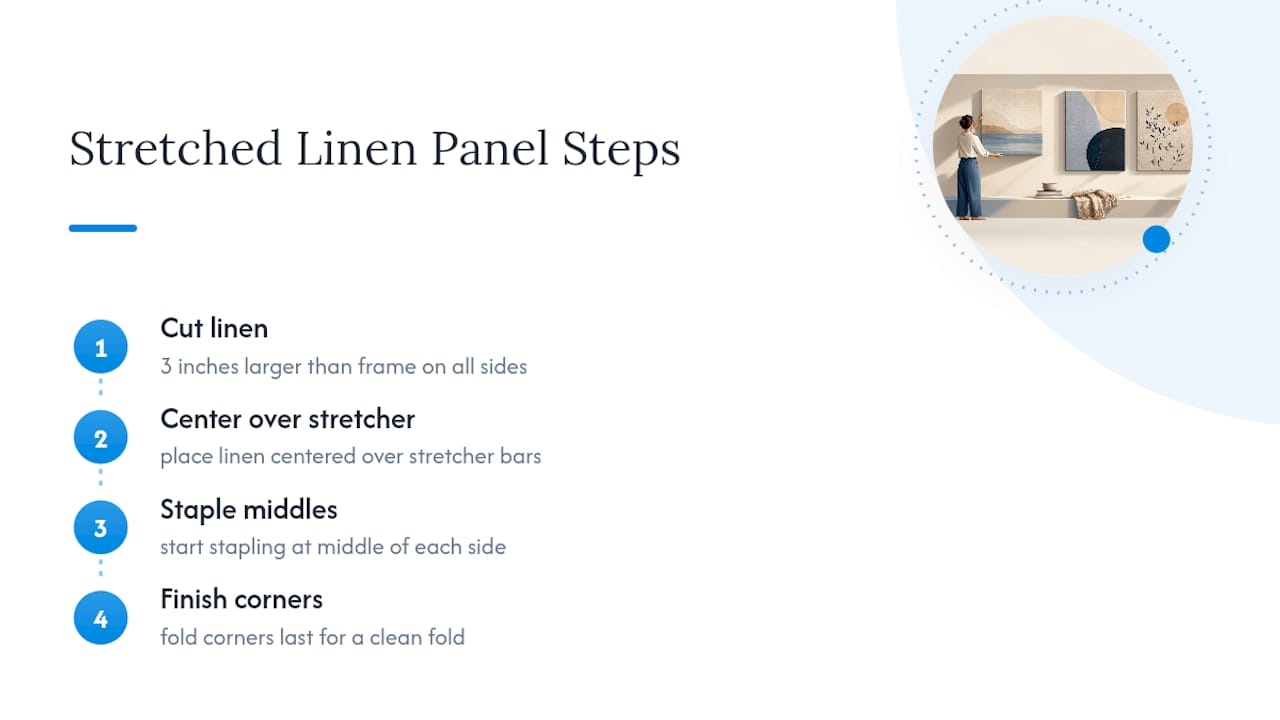
Stretched Linen Panel Materials: canvas stretcher bars, linen fabric, staple gun, fabric scissors. Cut linen 3 inches larger than your frame on all sides, center it over the stretcher, staple the back starting at the middle of each side, then finish corners last for a clean fold.
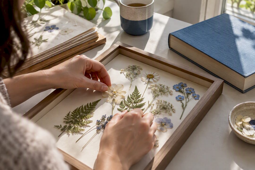
Pressed-Botanical Shadow Box Materials: shadow box frame, pressing paper or a heavy book, UV-protective glass, acid-free backing. Press flowers for 7 to 10 days, arrange on the backing, seal with UV glass to slow fading, and hang out of direct sun regardless.
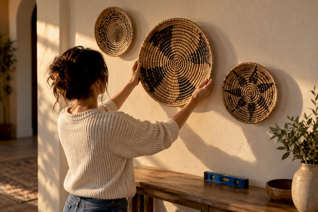
Woven-Basket Cluster Materials: three to five baskets of varying sizes, sawtooth hangers, a level. Lay the baskets on the floor first to test the arrangement, then mount largest to smallest from the center outward, keeping visual weight balanced left to right.
Pro Tip: Fabric panels avoid the glare that glossy prints throw under overhead lighting, and because they’re not stretched permanently, you can unpin and store them flat between seasons.
Buying Guide: Canvas, Framed Print, or Fabric Panel
Pick your finish based on the room, not just the art itself.
- Canvas works best in living rooms and hallways with moderate, indirect light.
- Framed prints under glass suit bedrooms where you want protection from dust but don’t want glare fighting a nightstand lamp.
- Fabric panels handle bright kitchens and sunrooms well since they don’t reflect glare the way glossy prints do.
- As a sizing rule of thumb, leave 3 to 4 inches of clearance above furniture and center the piece at eye level, roughly 57 to 60 inches from the floor.
- Custom sizing and finish (matte versus glossy, gallery wrap versus framed) matter more for seasonal pieces than permanent ones, since you’ll be handling and storing them repeatedly.
What Most Seasonal Decor Advice Gets Backwards
Most seasonal decor guides treat every season as a full theme overhaul, pumpkins in October, snowflakes in December, tulips in April. That’s expensive, exhausting, and it’s not actually what makes a wall feel seasonal. The research on this is consistent: texture and restraint do more work than color saturation. A muted coral reads more sophisticated than a bright one, and a single woven basket cluster shifts a room’s feel faster than four new prints.
The mistake homeowners make most often is buying new frames every season instead of new art. Frames are the expensive, permanent part. Prints, fabric panels, and pressed botanicals are the cheap, swappable part. Get that backwards and seasonal decorating becomes a budget drain instead of a fun weekend project.
If you’re starting from scratch, prioritize one large, well-made focal piece over a wall of small seasonal knickknacks. A single strong canvas, in a size and finish that fit your actual wall, outperforms five mismatched theme prints every time. Build the “boring” foundation first. The seasonal swaps are supposed to be the easy part.
— Sense
Sense Canvas: Custom Canvas Art Built for Seasonal Swapping
This service addresses a common challenge seasonal decorators face: needing a specific size, in a desired finish, promptly. With more than 15,000 designs across styles like abstract, floral, and animal themes, you can find a seasonal focal piece without settling for whatever fits your existing frame.

Many pieces can be customized for size, allowing you to order a canvas built to your wall from the start rather than hunting for a print to match existing frame dimensions. That matters most for the fall and winter focal pieces described above, where one oversized landscape or wood-toned canvas needs to anchor a whole wall. Browse the full catalog or check current floral and seasonal motifs before your next swap. Whichever finish you pick, matte for glare-prone rooms, gallery wrap for a frameless look, match it to your room’s light level before ordering, and confirm the return policy in case the color reads differently once it’s on your actual wall.
Sources
The palette and material recommendations above pull from a handful of sources worth bookmarking if you’re planning a full seasonal rotation. Homes & Gardens covers summer palette choices and expert styling tips in more depth. Crafting Your Home has additional weekend DIY project breakdowns beyond the three covered here. 101 Home Decor runs a broader spring idea roundup if pastels and botanicals are your main focus. And the FastFrame blog has a genuinely useful practical guide on swapping prints inside frames you already own.
- 6 summer wall decor ideas | Homes and Gardens
- 18 Refreshing Spring Wall Art Ideas to Brighten Your Home
- How to swap your art seasonally - FastFrame blog
FAQ
How often should I swap seasonal wall art?
Most homeowners swap a few pieces each season, several times a year, rather than doing a full wall overhaul each time. Sticking to prints that fit your existing frames keeps the swap cheap and quick.
What colors work best for a fall wall art refresh?
Cranberry, burnt orange, mustard, and warm neutrals pair well with wood-toned frames and deeper wall colors. These tones add visual weight, which is exactly what fall decor needs after spring and summer’s lighter palettes.
Can I use the same wall art for winter and early spring?
Yes. Deep navy abstracts, gray-toned landscapes, and metallic-accented pieces avoid looking specifically “holiday,” so they can stay up through February without feeling out of place. That saves you one full seasonal swap.
How do I store seasonal wall art when it’s not in use?
Fabric panels store flat if unstretched, pressed botanicals need to stay out of direct light to avoid fading, and canvases should be stored upright, never flat, to prevent warping. A closet shelf or under-bed storage box works fine for most pieces.
Where can I buy custom-sized seasonal canvas art?
Sense Canvas offers over 15,000 designs with custom sizing and finish options, which makes it a solid option when you need a piece built for a specific wall rather than settling for a standard size. Current prices and available sizes are listed on the Sense Canvas site.


