

How Art Anchors Furniture Arrangements for Better Rooms
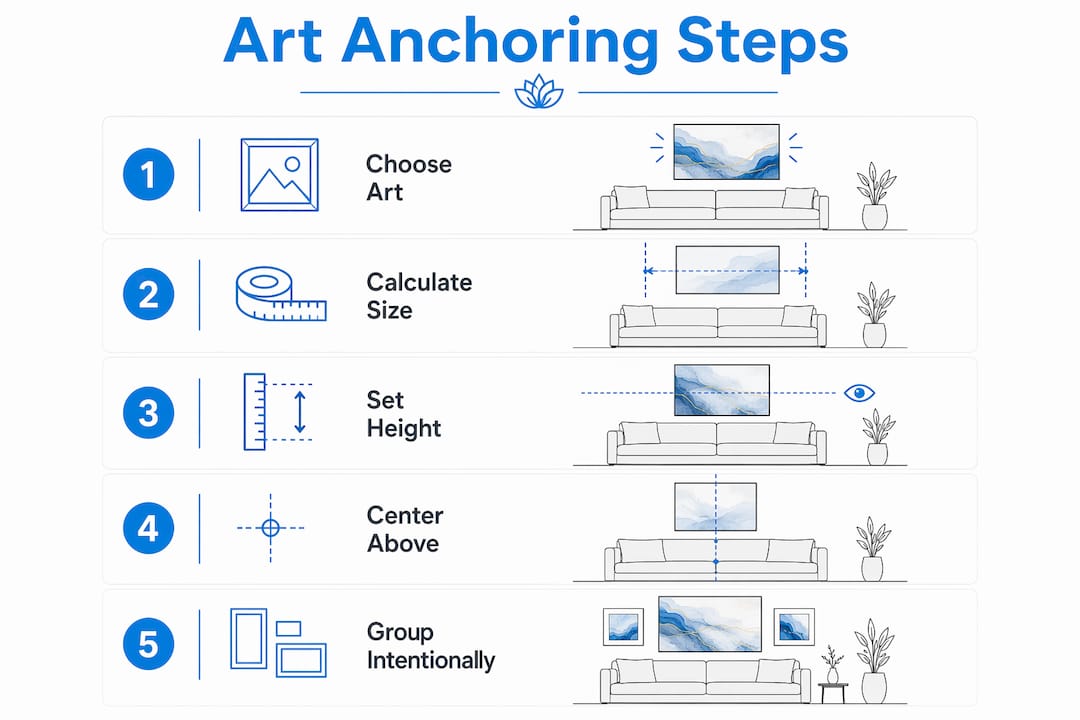
Art anchors furniture arrangements by acting as a proportional focal point that ties your furniture to the wall, balances visual weight, and sets the color and mood for the entire space. The core principle is simple: artwork hung at the right size and height transforms a floating sofa into a grounded, intentional seating area. Interior designers treat this relationship as structural, not decorative. Get it right and the whole room clicks into place. Get it wrong and even beautiful furniture looks adrift.
Here is what that looks like in practice:
- Size: Artwork should span two-thirds to three-fourths the width of the furniture below it.
- Height: The bottom edge of the frame sits 6–10 inches above the furniture top.
- Centering: Center art over the furniture, not the wall, especially when the sofa is offset.
- Eye level: The artwork’s center point lands at 57–60 inches from the floor.
- Small pieces: Group them so their combined footprint meets the size guidelines above.
How art anchors furniture arrangements: size and placement rules
The two-thirds rule is the single most reliable starting point in furniture-art design. For a 7-foot sofa, that means artwork roughly 56–63 inches wide, centered on the sofa with the bottom edge 6–10 inches above the cushions. Tiny art above a large sofa does not just look wrong; it makes the furniture look accidental, like someone forgot to finish the room.
Height matters just as much as width. Hanging art too high is the most common mistake homeowners make, and it creates a visual disconnect between the furniture and the wall. The 6–10 inch gap between the top of the furniture and the bottom frame is the sweet spot where art and furniture read as one unit rather than two separate objects sharing a wall.
- Aim for artwork width at two-thirds to three-fourths of the sofa or console width.
- Keep the bottom edge 6–10 inches above the furniture surface.
- Set the artwork center at 57–60 inches from the floor on open walls.
- Center on the furniture, not the wall, when the sofa is off-center.
- Group smaller pieces so their combined outer boundary meets the width target.
Pro Tip: If your sofa has tall cushions or a high back, use the lower end of the 6–10 inch range. Too much gap and the art starts to float; too little and it looks cramped.
Why art is a design foundation, not a finishing touch
Most homeowners buy furniture first, paint the walls, then hunt for art to fill the gaps. Interior designers do the opposite, and the results show why. Treating art as a foundational element rather than a final decorative touch defines the room’s color palette, mood, and furniture scale from the start, which makes every subsequent decision faster and more cohesive.
“An artwork can influence the proportions, colour and scale of a space, and guide the eye towards the place you notice first when you enter a room. When it is part of the conversation from the very beginning, art feels much more connected to the overall ambience.” — Will Meyer, interior designer
When you start with a piece you genuinely love, it tells you what color to paint the walls, which sofa fabric to choose, and where the eye should land when someone walks in. The role of art in home decor shifts from decoration to decision-making tool. That is a fundamentally different way to design a room, and it produces fundamentally different results.
How art balances the visual weight of bulky furniture
A large sectional or an oversized credenza carries serious visual mass. Without something on the wall to answer it, that furniture dominates the room and the space feels heavy on one side. Art counterbalances that mass by pulling the eye upward and distributing visual weight across the vertical plane.
“A striking painting can serve as a visual focal point paired with sofas and tables, and can offset the weight of larger pieces that could otherwise dominate a space.” — Sophie Goldhill, co-founder of Liddicoat & Goldhill
The art does not need to match the furniture’s size. It needs to match its visual weight. A bold, high-contrast canvas above a dark leather sofa works because the contrast carries enough visual energy to hold its own. A pale watercolor in the same spot would disappear.
- Choose art with strong contrast or bold color above dark, heavy furniture.
- Scale up: a single large canvas reads stronger than several small pieces above a sectional.
- Use gallery walls covering 60–75% of the furniture width when a single piece is not available.
- Place the heaviest or darkest frame near the center of a grouped arrangement.
- Keep lighter, smaller pieces toward the outer edges to avoid a top-heavy look.
Small and affordable art can still anchor a room
You do not need a large-format canvas to create an anchoring effect. Small artworks grouped intentionally function as one larger visual unit, and the furniture below reads them the same way. Three 16-by-20-inch frames in a row can carry the same visual authority as a single wide canvas if their outer boundary meets the two-thirds width guideline.

The key is choosing pieces you genuinely love. Interior designer Sarah Delaney puts it plainly: even the smallest framed piece can be your most powerful “decoration catalyst” when it reflects your actual taste. Pull a color from that piece and repeat it in a throw pillow or a vase, and suddenly the room has a thread running through it. That repetition is what makes a space feel curated rather than assembled.
Pro Tip: When building a gallery grouping, keep frame spacing at 2–4 inches between pieces. Tighter than that feels cramped; looser and the grouping loses its unity as a single visual anchor.
Practical tips for choosing and customizing canvas art
Measuring before you shop is non-negotiable. Pull out a tape measure, get the exact width of your sofa or console, then calculate two-thirds and three-fourths of that number. Those two figures are your size range. Shop within it, not outside it.
- Measure the furniture width first, then multiply by 0.66 and 0.75 for your target range.
- Customize canvas dimensions when standard sizes fall short of the proportional target.
- Repeat colors and textures from the artwork in pillows, rugs, or accessories to integrate the piece naturally.
- Plan lighting around the art rather than as an afterthought; a picture light or angled track head transforms how the piece reads at night.
- Match art style to furniture style: clean-lined abstract works with modern furniture; textured or layered pieces suit transitional or traditional rooms. Sensecanvas offers custom sizing across more than 15,000 designs, so hitting the exact proportional target is straightforward.
For more on pairing specific art styles with furniture types, the art coordination guide at Sensecanvas covers the combinations in detail.
Room function and traffic flow shape where art belongs
A dining room, a hallway, and a living room each demand a different approach. In a high-traffic hallway, art hung too low gets bumped and feels crowded; raise it slightly and keep pieces vertical to add height without narrowing the passage visually. In a dining room, art at seated eye level (roughly 48–54 inches to center) connects better with the experience of sitting at the table than art hung at standing gallery height.
Traffic flow also determines which wall gets the anchor piece. The wall you face when you enter a room is the natural focal point. Placing your strongest art there, centered above the primary furniture piece on that wall, creates an immediate sense of intention. Rooms where the art is on a side wall often feel like the design never quite landed.
Three-dimensional art and sculptures as furniture anchors
Sculptures and three-dimensional wall pieces do something flat canvases cannot: they change as the light moves. A textured wall sculpture above a console catches morning light differently than afternoon light, which gives the room a sense of life that a static print cannot replicate.
Interior designer Elmedina Imamović recommends using sculptures on affordable floating shelves at varied heights rather than limiting them to floor plinths or table surfaces. That approach creates a vertical composition that connects the furniture below to the wall above, which is exactly what anchoring requires. For wall-mounted sculptural pieces, the same size and centering rules apply as for flat art. The depth of the piece adds visual weight, so you can often go slightly smaller in width and still achieve the same anchoring effect. Pairing a three-dimensional anchor with smaller flat pieces around it, as described in the vignette styling guide, creates the kind of layered, collected look that reads as genuinely personal rather than catalog-assembled.
Ready to find a canvas that fits your exact proportions? Sensecanvas carries over 15,000 designs with custom sizing, so you can match the two-thirds rule precisely without settling for a standard size that almost works.

Key Takeaways
Art anchors furniture arrangements most effectively when size, height, and centering follow the two-thirds rule, with the artwork treated as a foundational design element rather than a finishing detail.
| Point | Details |
|---|---|
| Follow the two-thirds rule | Artwork width should be two-thirds to three-fourths the width of the furniture below it. |
| Mind the vertical gap | Keep the bottom edge 6–10 inches above furniture so art and furniture read as one unit. |
| Center on furniture, not the wall | When a sofa is offset, the art follows the sofa to maintain visual connection. |
| Start with art, not furniture | Art set early defines the room’s color palette, mood, and furniture scale from the start. |
| Small pieces work in groups | Grouped frames with 2–4 inches of spacing between them function as a single visual anchor. |
Art as a foundation, not an afterthought
The conventional advice treats art as the last thing you add to a room. Pick the sofa, choose the rug, paint the walls, then find something to hang above the fireplace. That sequence produces rooms that look finished but never quite feel right, because the art is always responding to decisions made without it.
The more honest framing is that art is the clearest signal of what a room is actually for. A bold abstract canvas tells you the room welcomes energy and contrast. A quiet landscape tells you it is built for stillness. Neither is wrong, but both make furniture choices obvious in a way that no paint chip or fabric swatch ever does. When you start with a piece that genuinely moves you, the rest of the room tends to follow.
The proportional rules, the 57–60 inch center height, the two-thirds width guideline, the 6–10 inch gap above the sofa back, these are not arbitrary standards. They exist because the human eye reads art and furniture as a single composition, and those measurements are where the composition holds together. Ignore them and the room feels unsettled without anyone being able to say exactly why.


