

How Color Shapes Meaning in Abstract Art
In abstract art, color functions as a primary language. It shapes mood, emphasis, and spatial reading without leaning on a single recognizable form. A small saturated red square on a gray field reads as urgent. That same red diluted into a wash across a large canvas reads as calm, almost atmospheric. Nothing figurative changed. Only the color did.
Three variables do most of the work: hue (the color itself), value (how light or dark it is), and chroma (how saturated or muted it is). Painters manipulate these three levers the way a composer manipulates pitch, tempo, and volume. This piece moves through the theory, the psychology, the compositional mechanics, and finally into exercises you can try with a scrap canvas before you touch a finished piece.
- Hue, value, and chroma are the control variables behind every color decision in abstract work.
- Color relationships (complementary, analogous, triadic) change how energetic or settled a piece feels.
- Composition, texture, and lighting all interact with color to shift what a viewer actually perceives.
Key Takeaways
Color functions as an independent expressive language in abstract art, controlled through hue, value, and chroma, and its meaning shifts with relationships, composition, materials, and lighting.
| Point | Details |
|---|---|
| Three control variables | Hue, value, and chroma drive nearly every emotional and visual effect in abstract color choices. |
| Relationships change meaning | Complementary pairs vibrate, analogous schemes calm, and triadic schemes balance energy with variety. |
| Restraint often reads stronger | A rule-of-three palette usually communicates more clearly than an unlimited, fully saturated one. |
| Materials shape the outcome | Glazing, soak-stain, and impasto each change how a single color reads on the finished surface. |
| Lighting is not optional | Wall color and light temperature shift perceived hue enough to change how a finished piece feels at home. |
Table of Contents
- The Role of Color in Abstract Art: Hue, Value, and Chroma
- What Colors Mean: Kandinsky, Itten, and Museum Teaching
- Color Harmony: Complementary, Analogous, and Triadic Schemes
- Color, Composition, and Texture Working Together
- Studio Exercises for Testing Color Before You Commit
- How Sense Canvas Puts Color Theory Into Practice
- The Historical Evolution of Color in Abstract Movements
- Beyond Kandinsky: How Other Abstract Artists Used Color
- Color as Emotional Narrative in Abstract Work
- Materials and Techniques That Change How Color Reads
- Lighting and Viewing Conditions Change What Color You See
- What the Research Actually Supports About Color in Abstract Art
- Frequently Asked Questions
- Sources
The Role of Color in Abstract Art: Hue, Value, and Chroma
Every color decision in abstract work reduces to three properties, and confusing them is the fastest way to misjudge a palette.
- Hue is the color family itself: red, blue, yellow, and everything between. It carries most of the cultural and psychological weight, since a viewer’s first read of a canvas is almost always “what color is this,” not “how saturated is it.”
- Value measures lightness or darkness independent of hue. A pale blue and a navy blue share the same hue but produce entirely different moods.
- Chroma, or saturation, measures intensity. A dull, grayed olive and a vivid lime are the same hue family at wildly different chroma levels.
Artists use these Munsell-derived properties to steer emotional atmosphere. Tints, made by adding white, tend to soften a mood into something cheerful or airy. Shades, made by adding black, tend to darken it into something heavier or more serious. That’s why a canvas built from pale pinks and creams feels almost weightless next to one built from deep maroons and charcoals, even if both use “the same” red.
One more distinction trips up painters moving between digital tools and the studio: additive color (light, as on a screen) mixes toward white, while subtractive color (pigment) mixes toward black or mud. A palette that glows on a monitor can turn flat and gray once mixed in acrylic, which is why testing swatches on the actual surface matters more than trusting a screen preview.
What Colors Mean: Kandinsky, Itten, and Museum Teaching
Wassily Kandinsky treated color as something closer to sound than to decoration. He argued that colors carry inherent psychological and even spiritual qualities. Blue, in his framework, pulls toward the spiritual and peaceful. Yellow pushes toward aggression and vitality. Red radiates warmth and confidence, almost a physical heat coming off the canvas. Kandinsky believed color could act directly on a viewer’s interior state, bypassing the need for any recognizable subject at all.
Johannes Itten built on this with a more systematic framework: warm versus cool color families, the emotional pull of high versus low saturation, and the way value contrast creates emphasis independent of hue. Museum teaching resources still lean on this vocabulary. Smarthistory’s color primer walks through complementary and analogous relationships and shows how value contrast alone can direct a viewer’s eye before hue enters the equation. The National Gallery of Art’s educational materials use Monet, Matisse, and Kandinsky side by side to demonstrate how color shapes a sense of time of day or emotional temperature even in representational work, a lesson that transfers directly to abstraction.
A quantitative study of abstract paintings found that color harmony contributes to explaining market price, and that contrast metrics in hue and saturation were correlated with outcomes more strongly than simple color-complexity counts. That’s a rare data point in a field mostly built on interpretation, and it’s worth taking seriously.
- Cultural context shifts these readings. White signals purity in many Western contexts and mourning in parts of East Asia.
- Kandinsky’s associations were personal theory, not universal law. Treat them as a vocabulary, not a rulebook.
- Artist intent can override any “standard” meaning entirely. Context inside the piece matters more than a color chart.
Color Harmony: Complementary, Analogous, and Triadic Schemes
Painters rarely pick colors in isolation. They pick relationships, and the relationship changes how the same hue behaves.
- Complementary schemes pair colors opposite each other on the wheel (red and green, blue and orange). Placed side by side at similar value and chroma, complements create an optical vibration, almost a buzzing edge where they touch. That’s what gives certain abstract passages their electric quality.
- Analogous schemes pull colors that sit next to each other (blue, blue-green, green). These feel cohesive and calm because the eye doesn’t have to reconcile opposing signals.
- Triadic schemes use three hues spaced evenly around the wheel, which balances energy with variety. It’s punchier than analogous but more stable than a straight complementary clash.
- Split-complementary softens a complementary pair by swapping one color for its two neighbors, keeping some tension without the full vibration.
Most working painters lean on a practical shortcut: the “rule of three,” limiting a composition to roughly three dominant colors (plus their tints and shades) rather than reaching for every hue on the palette. Restraint reads as intentional. A canvas with eight competing hues at full saturation usually reads as noise, not complexity.
Pro Tip: Before committing to a full canvas, paint three small swatches side by side, complementary, analogous, and triadic, using the same two or three base colors. The version that feels most “finished” at swatch size usually holds up at full scale.
Color, Composition, and Texture Working Together
Color never acts alone. It works with shape, proportion, and surface, and those interactions change what a viewer actually sees.
Contrast in value (light against dark) reads as structural, almost architectural. Contrast in hue alone, at matched value, reads as softer and more atmospheric, since the eye has less of a hard edge to grab onto. Proportion matters just as much as contrast type: a small saturated accent against a large muted field draws the eye instantly and functions almost like a focal point in a representational painting, while that same saturated color spread across the whole canvas loses its punch and becomes the new baseline.
Paint handling changes color’s temperature and weight beyond the pigment itself.
- A thin glaze lets underlying layers show through, cooling and complicating a hue.
- Scumbled, dragged paint breaks a color into flecks that read as textured and lively rather than flat.
- Heavy impasto catches real shadow, adding a physical value shift that shifts throughout the day as light changes.
Studio Exercises for Testing Color Before You Commit
Theory only goes so far. The fastest way to build reliable color judgment is running short, low-stakes studies before touching a final canvas, and teaching resources consistently point to the same handful of exercises as the most efficient path there.
- Monochrome value study. Work in a single hue at varying tints and shades. This forces you to solve composition and emphasis through value alone, which is often the real skeleton of a strong piece.
- Complementary-contrast study. Pick one complementary pair and build a small composition using only those two colors plus white and black. Notice where the vibration helps the piece and where it fights it.
- Triadic composition exercise. Choose three evenly spaced hues and force yourself to use all three in meaningfully different proportions rather than splitting the canvas into equal thirds.
A sequenced approach like this, moving from monochrome to complementary to triadic, lets you isolate one variable at a time instead of guessing at all three simultaneously.
Pro Tip: To mute a color without deadening it, mix in a touch of its complement rather than reaching for black. A red toned down with green stays warm and alive; a red toned down with black just goes muddy and flat. Preserve your brightest highlights by adding a local tint late, rather than trying to lift value back out of a mixture that’s already gone dark.
How Sense Canvas Puts Color Theory Into Practice
Sensecanvas curates more than 15,000 designs across abstract, nature, and symbolic themes, which function as a real-world test of the same principles covered above: complementary tension, analogous calm, restrained triadic palettes. Every piece can be customized to size, so a small saturated accent piece or a large muted field can be scaled to the wall it needs to fill. The Sensecanvas blog breaks down color combinations that work across wall types and explains how palette choices interact with room mood. Before buying, run the same value study and rule-of-three check covered above against the room’s existing palette, not just the piece in isolation.
The Historical Evolution of Color in Abstract Movements
Color’s independence from representation didn’t happen all at once. Early modernists like Kandinsky and Kupka, working around 1910 through the 1920s, still leaned partly on landscape and figure as scaffolding even as they pushed hue toward pure expression. The Bauhaus, under Itten’s teaching, formalized color as a subject in its own right, treating it as a system to be studied rather than a byproduct of depicting the world.
Mid-century American abstraction split into two distinct color philosophies. The Abstract Expressionists, painters working through gesture and scale in the 1940s and 1950s, used color as an extension of physical movement, thick and often turbulent. Color Field painting, emerging alongside it, went the opposite direction: large, flat expanses of saturated or muted hue meant to be experienced almost meditatively, with no gesture competing for attention.
By the 1960s, hard-edge abstraction and Op Art artists sharpened color relationships into precise, almost scientific contrasts, chasing the same optical vibration Itten described decades earlier but with mechanical precision instead of painterly texture. Minimalism, running parallel, often stripped palettes down to one or two colors entirely, betting that restraint alone could carry emotional weight.
What ties these movements together isn’t a shared palette. It’s a shared belief that color didn’t need a subject to justify its presence on the canvas. Each generation simply found a new set of tools, gesture, flatness, geometry, restraint, to prove that same point.
Beyond Kandinsky: How Other Abstract Artists Used Color
Mark Rothko built entire canvases from two or three soft-edged rectangles of color, betting that scale and proximity alone could produce an almost physical emotional response in a viewer standing close. His hues shift gradually rather than contrasting sharply, which is part of why his work reads as meditative rather than energetic.
Josef Albers took the opposite approach with his “Homage to the Square” series, using nested squares of flat, hard-edged color to demonstrate how the same hue can appear to shift depending on what surrounds it. Albers wasn’t interested in emotion so much as perception itself, proving that color is never seen in isolation, only in relation.
Helen Frankenthaler soaked thinned paint directly into raw canvas, letting color bleed and pool rather than sit on top of a primed surface. The technique, called soak-stain, produced hues that feel translucent and atmospheric rather than solid, closer to watercolor than oil.
Bridget Riley pushed color into pure optical effect, using tight stripes and repeating forms in contrasting hues to make the canvas appear to vibrate or move, even though nothing on it is actually moving. Her work makes the abstract point most literal: color alone, arranged correctly, can trick the eye into motion.
Each of these approaches treats color as the entire argument of the painting, not a decoration layered on top of one.
Color as Emotional Narrative in Abstract Work
Abstract paintings don’t tell stories in the traditional sense, but color often builds something close to narrative arc across a single canvas. A composition that shifts from cool, muted blues in one corner toward warm, saturated oranges in another creates a sense of movement or transformation, even without a single recognizable object guiding that read.
Sequence matters here almost as much as choice. A viewer’s eye tends to move from the most saturated or highest-contrast area toward quieter zones, which means the placement of a single intense color functions like a first sentence in a story, setting the emotional register everything else responds to. Painters who understand this treat color placement as pacing, not just decoration.
Repetition and rhythm play into this too. A color that recurs in small doses across a canvas, rather than appearing once in a single large mass, tends to feel more resolved and intentional, almost like a refrain. A color that appears exactly once, especially at high contrast, tends to read as a rupture or a climax.
None of this requires literal symbolism to work. A viewer doesn’t need to know that yellow “means” vitality to feel the emotional lift when a small yellow passage breaks up an otherwise cool, subdued field. The response happens at a more immediate, almost physiological level, which is precisely the effect Kandinsky was chasing when he described color acting directly on a viewer without any representational detour required.
Materials and Techniques That Change How Color Reads
The medium itself changes what a color can do before a single compositional decision gets made. Oil paint dries slowly and blends smoothly, letting colors shift gradually into one another, which is part of why Rothko’s soft-edged fields feel so seamless. Acrylic dries fast and tends to sit flatter on the surface, which suits harder edges and more graphic color relationships.

Glazing, applying thin, transparent layers of color over a dried base, lets underlying hues show through and complicate the final result in ways a single flat coat never could. A blue glaze over a dried yellow ground produces a green that feels layered and lit from within, different from mixing blue and yellow directly on a palette.
Surface choice matters too. Raw, unprimed canvas absorbs paint the way Frankenthaler exploited, producing soft, bleeding edges and muted chroma. A heavily primed, smooth surface keeps color sitting on top, crisp and often more saturated, since none of the pigment sinks in and dulls.
Application tools shift the story further. A palette knife pulls thick paint into ridges that catch real shadow, adding value contrast the color itself doesn’t contain. A soft brush or sponge can push pigment into a gradient so smooth it reads almost like a screen gradient rather than handmade paint. Spray techniques, used by some contemporary abstractionists, produce a soft-focus color field with none of the texture a brush would leave behind.
Every one of these choices changes not the color itself, but how confidently and how clearly that color reaches the viewer.
Lighting and Viewing Conditions Change What Color You See
The same abstract painting can look meaningfully different under a gallery’s daylight-balanced bulbs versus a living room’s warm incandescent lamp. Warm household lighting shifts blues toward gray and pushes reds and oranges toward even more intensity, which means a canvas chosen under bright showroom light might read noticeably warmer once it’s hanging at home.
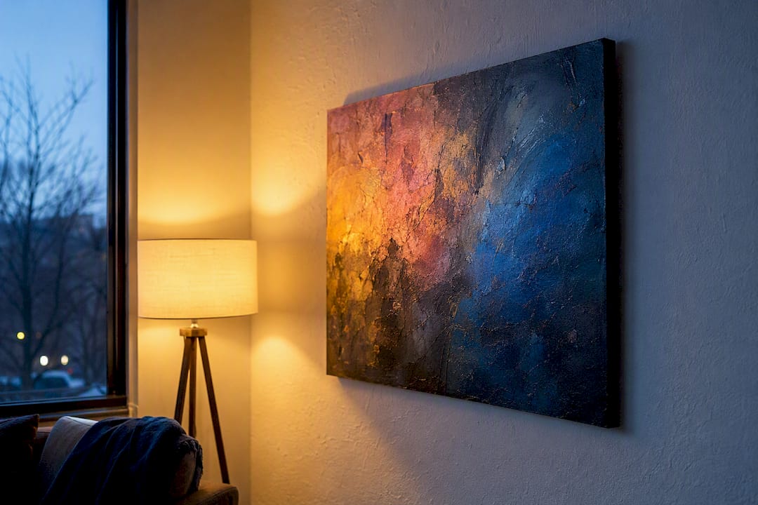
Distance and angle matter almost as much as the light source. A textured, impasto surface catches raking light differently depending on where a viewer stands, meaning the same painting can shift from crisp value contrast to soft, blended color depending on whether the light hits it straight on or from the side.
Surrounding wall color has an outsized effect too, one many buyers overlook entirely. A neutral or white wall lets a canvas’s true colors read cleanly, while a strongly colored wall behind it can shift the perceived hue of the art itself through simultaneous contrast, the same optical effect that makes gray look warm next to blue and cool next to orange. A muted abstract piece can look dull against a busy, saturated wall and striking against a quiet neutral wall color one.
This is part of why testing a swatch or a small print in the actual room, under the actual lighting, beats trusting a screen image alone. Color is never fixed. It’s always a relationship between the pigment, the light hitting it, and everything sitting next to it.
What the Research Actually Supports About Color in Abstract Art
Most explainers on this subject treat Kandinsky’s color associations as settled fact: blue means spiritual, yellow means aggressive, and so on down a tidy chart. That’s a misreading of what he actually offered. Kandinsky wrote from personal conviction, not from a study, and treating his associations as universal rules leads painters to make timid, checklist-driven color decisions instead of trusting what actually happens on their own canvas.
The far more useful lesson buried in the same research is quieter: contrast and relationship measurably outperform simple color variety in shaping how a piece gets received. A painting doesn’t need more colors. It needs the colors it has to be doing real work against each other.
If there’s one place to start, it’s not the color wheel. It’s the monochrome value study, the exercise most painters skip because it feels too plain to matter. Solve emphasis and depth in one hue first. Chroma and hue variety are the easy part that comes after the composition already works. Most color problems in a finished abstract piece trace back to a value structure that was never solved in the first place.
Frequently Asked Questions
What is the main role of color in abstract art? Color acts as an independent expressive language, carrying mood, emphasis, and spatial structure without needing a recognizable subject to support it.
Does color theory in abstract art follow strict rules? No. Frameworks from Kandinsky and Itten offer a shared vocabulary and starting associations, but cultural context and an individual artist’s intent can shift how any given color actually reads.
Why do some abstract paintings use only two or three colors? Restraint, often called the rule of three, tends to read as more intentional and lets viewers focus on relationships and texture instead of sorting through competing hues.
How does lighting affect the perception of color in abstract art? Warm household bulbs shift blues cooler and intensify reds and oranges, while a strongly colored wall behind a piece can visibly alter its perceived hue through simultaneous contrast.
What’s the fastest way to test a color palette before painting a full canvas? Run a small monochrome value study first, then a complementary swatch, then a triadic version, and compare which one holds its emotional read at a glance.


