

Abstract Art Color Combinations That Work With Any Wall
Treat your wall color as fixed, then choose abstract canvas art for either contrast or harmony. That single rule eliminates most bad purchases. A muted sage wall, for example, pairs beautifully with abstract art carrying terracotta, deep ochre, and warm cream accents — the earthy tones contrast the cool green without fighting it.
Three things to do right now:
- Hold a printed swatch or sample against the actual wall in natural light.
- Identify your wall’s undertone: warm (yellow, red, orange base) or cool (blue, green, gray base).
- Decide the art’s role: a bold focal point (contrast) or a quiet complement (harmony).
Key Takeaways
The single most reliable rule for abstract art color combinations: treat the wall as fixed, read its undertone, then choose art for contrast or harmony and test it in the room before buying.
| Point | Details |
|---|---|
| Wall color is your anchor | Identify warm vs. cool undertone first; every palette choice follows from that reading. |
| Contrast vs. harmony | Complementary palettes energize; analogous and monochromatic palettes calm — pick one direction per room. |
| 60-30-10 accent role | Art typically occupies the 10% accent slot; echo one art color in textiles to unify the room. |
| Test before you buy | Hold a swatch against the wall, photograph it in morning and evening light, and confirm sizing before ordering. |
| Sensecanvas | Over 15,000 abstract canvas designs, custom sizing from $85, with multiple finishes to match any wall palette. |
Table of Contents
- What are the best abstract art color combinations for painted walls?
- Which palette type should you choose for abstract canvas art?
- Color combinations that work with your specific wall color
- How does room function change which color palette works best?
- Sizing and placement rules that make art look intentional
- How to test color pairings before you commit to a purchase
- Why the wall-first approach is the one worth trusting
- Sensecanvas makes the wall-first approach easy to act on
- Sources
What are the best abstract art color combinations for painted walls?
Five rules you can memorize and use every time you shop for a canvas:
1. Read the undertone first. A wall labeled “greige” can lean warm or cool depending on the light. Pull the undertone before you browse. As The Painted Hinge notes, when a room is already painted, that color is fixed — your job is to shop around it, not against it.
2. Choose contrast or harmony, not both. Complementary palettes (opposites on the color wheel) create energy and pop. Analogous palettes (neighbors on the wheel) create calm and cohesion. Pick one direction per room.
**3. That accent position is where abstract art shines. It’s the natural place to introduce a color you then echo in throw pillows or a rug.
4. Test in the room, not in the store. Light direction and bulb temperature shift how both paint and canvas read. A piece that looks warm under fluorescent store lighting can turn muddy under your incandescent fixtures at home.
5. Frame finish and canvas texture are part of the palette. A black frame sharpens definition against light walls. Natural oak warms a cool-toned room. Metallics echo hardware finishes. Matte canvas reads softer than a glossy print under direct overhead light.
Pro Tip: Photograph your wall at three times of day — morning, midday, and evening — and use those photos when comparing art swatches online. The color shift is often more dramatic than you’d expect.
Which palette type should you choose for abstract canvas art?
The palette relationship between your wall and your art determines whether a room feels alive or settled. Color theory applied to decor shows that each palette type serves a different mood and function.
| Palette Type | Visual Effect | Best Room | Example Swatch |
|---|---|---|---|
| Complementary | High contrast, energizing | Living room, dining room | Navy wall / orange + gold art |
| Analogous | Calm, cohesive | Bedroom, reading nook | Sage wall / olive + warm cream art |
| Monochromatic | Sophisticated, restful | Bedroom, spa bath | Light gray wall / charcoal + silver art |
| Triadic | Bold, playful | Kids’ room, creative studio | White wall / teal + coral + mustard art |
| Split-complementary | Balanced energy | Home office, entryway | Beige wall / dusty blue + terracotta art |
| Neutral + pop | Versatile, modern | Any room, small spaces | Cream wall / black + single warm accent art |
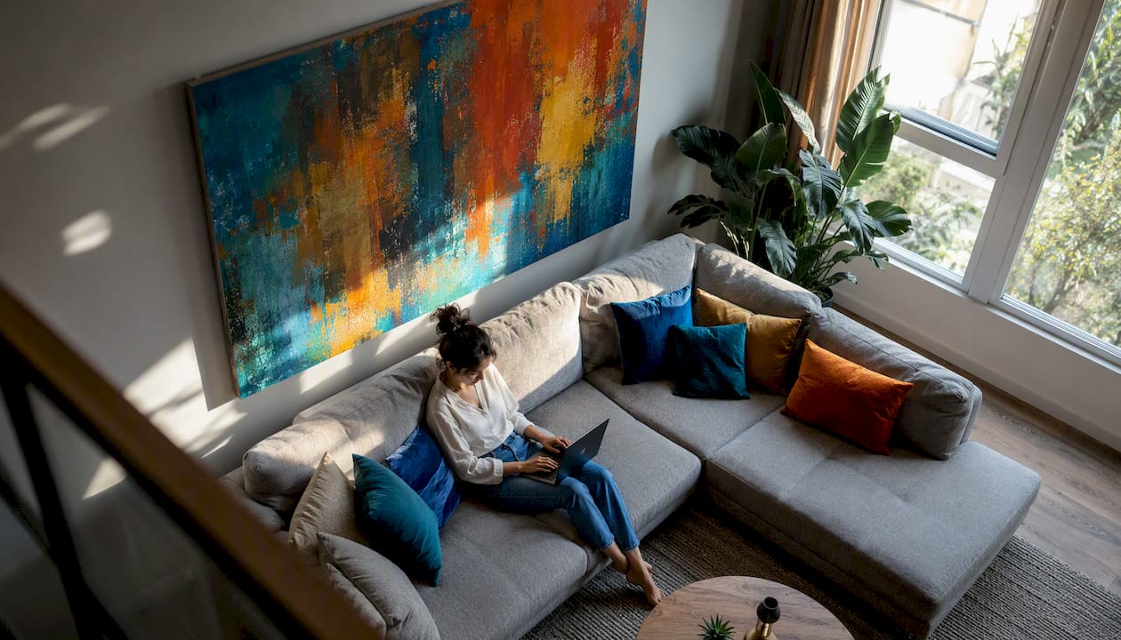
Earthy palettes — sage, terracotta, muted blue — are among the most durable choices for residential interiors right now, working across multiple room styles without dating quickly. Abstract art is especially adaptable here because it prioritizes mood and texture over subject matter, which means a single well-chosen canvas can carry an accent color you repeat in textiles across the room.
For small rooms, muted and airy palettes prevent visual compression. A single oversized canvas in a neutral + pop scheme reads cleaner than a gallery wall of competing colors.
Color combinations that work with your specific wall color
White and cream walls
White walls are forgiving but can feel sterile without the right art. Three directions that work:
- Warm abstract with ochre, rust, and cream: Pulls warmth into a bright room; works above a linen sofa. A single oversized canvas reads better than a triptych here.
- Bold complementary: deep navy + gold accents: High contrast against white; ideal for an entryway or above a console. Add a metallic frame to echo any brass hardware.
- Earthy neutral: charcoal + warm taupe + sage: Grounded and modern; suits a home office or dining room. A textured canvas adds depth that flat white walls lack.
Cream walls lean warm, so cool-toned art (muted teal, dusty lavender) creates a gentle contrast without jarring the eye.
Beige and taupe walls
These walls carry a warm undertone. Matching art to an interior style works best when you lean into that warmth or deliberately cool it down:
- Terracotta + deep ochre + off-white: Harmonious and grounded; suits a living room above a tan leather sofa.
- Dusty teal + warm sand + bronze: Split-complementary; adds energy without clashing. A triptych format works well across a wide wall.
- Charcoal + cream + muted gold: Neutral with a metallic pop; echoes warm wood furniture finishes.
Light gray walls
Gray walls are cool-leaning but versatile. Warm art prevents the room from feeling clinical:
- Blush + dusty rose + warm white: Soft and welcoming; ideal for a bedroom or sitting room.
- Mustard + burnt orange + cream: Warm complementary contrast; energizes a gray living room.
- Navy + silver + white: Monochromatic cool palette; sophisticated for a home office. A matte canvas finish reduces glare under recessed lighting.
Dark gray and navy walls
Dark walls need art with enough contrast to read clearly. Go lighter or bolder:
- Gold + cream + warm amber: Classic contrast; a single large canvas above a fireplace is the strongest placement.
- Coral + blush + white: Warm and unexpected against deep navy; works in a dining room or bedroom.
- Sage + dusty green + off-white: Analogous cool palette; quieter but still visible. Avoid small formats — they disappear on dark walls.
Green and olive walls
- Terracotta + deep rust + warm cream: Earthy split-complementary; the most natural pairing for green walls.
- Blush + warm white + gold: Soft and feminine; suits a bedroom or reading corner.
Blush and pink walls
- Dusty teal + sage + cream: Cool contrast that keeps the room from reading too sweet.
- Deep burgundy + warm gold + ivory: Rich and layered; works in a dining room or entryway.
Black walls
Black walls demand bold, light-dominant art. Abstract pieces with white, cream, gold, or vivid coral read clearly and prevent the wall from absorbing the canvas entirely. A metallic or gold-leaf finish in the artwork echoes the drama of the wall without competing.
Otherwise the piece reads as a dark rectangle on a dark wall.*
How does room function change which color palette works best?
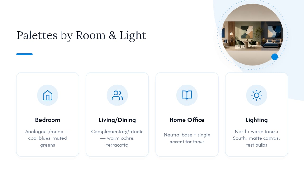
Room purpose shapes palette choice as much as wall color does. A room-by-room approach to wall art consistently shows that mood-matching outperforms pure color-matching.
Bedrooms benefit from analogous or monochromatic palettes — cool blues, muted greens, soft grays. The goal is rest, not stimulation. Avoid high-contrast triadic schemes here.
Living rooms and dining rooms handle complementary and triadic palettes well. These are social spaces where energy is welcome. Warm palettes (ochre, terracotta, coral) encourage conversation.
Home offices work best with a neutral + pop scheme: a grounded base with one focused accent color. Overly complex palettes fragment attention.
North-facing rooms receive cool, indirect light all day. Warm-toned art — ochre, amber, terracotta — compensates and prevents the room from feeling cold. South-facing rooms show true color but increase UV exposure; matte canvas holds up better than glossy prints under sustained direct sun.
Pro Tip: Swap your bulbs to the temperature you actually use before testing any art sample. A 2700K warm bulb and a 5000K daylight bulb can make the same canvas look like two different pieces.
Sizing and placement rules that make art look intentional
Getting the color right and the size wrong is a common and expensive mistake. Follow these numbered rules before you order:
- Match canvas width to furniture. Above a sofa or bed, the canvas (or art grouping) should span roughly 60–75% of the furniture’s width. Narrower reads like an afterthought.
- Hang at eye level. The center of the canvas should sit approximately 57–60 inches from the floor — the standard gallery hang height. Above furniture, leave 6–8 inches of space between the top of the piece and the bottom of the canvas.
- Single oversized vs. triptych. One large canvas reads cleaner in small rooms. A triptych works on wide walls but requires consistent spacing (2–3 inches between panels).
- Account for canvas depth. A 1.5-inch gallery-wrap canvas projects off the wall and casts a subtle shadow, which adds dimension. A thin frame on a flat print sits flush and reads smaller.
- Avoid these ordering mistakes: buying without measuring the wall, ignoring the furniture below, and choosing a size based on the product thumbnail rather than the listed dimensions.
For small spaces specifically, one well-scaled canvas in a muted palette does more than a cluster of small prints competing for attention.
How to test color pairings before you commit to a purchase
Buyer’s remorse on wall art almost always traces back to skipping the testing step. Designers consistently recommend trusting your immediate emotional response first, then verifying scale, color temperature, and whether you want harmony or contrast before committing.
Pro Tip: Print a scaled mockup of the canvas at home, tape it to the wall, and live with it for 24 hours. You’ll catch sizing and color issues that no screen preview reveals.
A short pre-purchase checklist:
- Hold a printed swatch or sample print against the actual wall.
- Photograph it in morning and evening light — colors shift more than you expect.
- Create a digital mockup scaled to your wall dimensions using your phone’s camera and a free room-visualization app.
- Confirm the retailer’s return policy, customization options, and available sizes before ordering.
- Keep originals away from direct sunlight; UV exposure fades pigments over time. If a window is unavoidable, UV-filtering glazing extends a canvas’s life significantly.
Document your final choice with a photo and note the wall’s undertone. That record saves time on every future purchase.
Why the wall-first approach is the one worth trusting
Most people shop for art they love, then try to make it work in a room. The wall-first approach flips that sequence, and the difference in outcomes is significant. When the wall color is fixed, every decision that follows has a clear reference point: undertone, contrast level, scale, and finish all resolve faster.
Abstract art is the ideal category for this approach. Because it communicates through color and texture rather than subject matter, a single canvas can carry an accent color that ties together furniture, textiles, and accessories across the whole room. That’s a level of decorating leverage a landscape or portrait rarely delivers.
The 70/30 dominant-to-accent ratio within the canvas itself matters here too. A piece where one color dominates and one or two accents support it integrates into a room more cleanly than a canvas with six competing colors at equal weight. When browsing, look for that internal hierarchy in the artwork before you look at anything else.
Sensecanvas makes the wall-first approach easy to act on
Sensecanvas carries over 15,000 canvas designs, with abstract options spanning every palette type covered in this guide — from earthy neutrals to bold complementary schemes. Prices start at $85, and every piece is available in multiple sizes so you can match the canvas width to your furniture without compromise.

Customization is built into the ordering process: choose your size, finish, and framing before checkout. If the abstract ocean palette suits a light gray or blue wall, or you need a high-contrast piece for a dark accent wall, the catalog has both. Browse the full abstract collection, use the sizing guide to confirm dimensions, and order a sample print to test against your wall before committing to the full canvas.


