

Art Placement Tips for Living Spaces: A Homeowner's Guide
Follow five simple rules and your living-space art will always look intentional, not accidental.
- Scale to furniture. Art should span 60–75% of the furniture width beneath it — anything narrower floats and looks lost.
- Center at eye level. Aim for the artwork’s center at 57–60 inches from the floor, the same height museums use.
- Keep spacing consistent. For groupings, hold 2–6 inches between frames so the arrangement reads as a unit.
- Anchor with one dominant piece. One strong focal piece grounds a wall better than five small ones competing for attention.
- Respect negative space. Bare wall around art is not wasted space — it gives each piece room to breathe and be seen.
The sections below turn each one into exact measurements, step-by-step methods, and room-specific guidance you can use today.
Key Takeaways
Correctly scaled art, hung at eye level with consistent spacing, is the single change that makes a living space look professionally decorated rather than assembled.
| Point | Details |
|---|---|
| Scale to furniture first | Art above a sofa should span 60–75% of the sofa’s width; blank walls call for 50–70% coverage. |
| Center at 57–60 inches | Hang the artwork’s center at 57–60 inches from the floor — the museum standard that works in any room. |
| Gallery spacing: 2–6 inches | Keep 2–6 inches between frames for groupings; tighten to 1.5–2 inches in narrow corridors and stairwells. |
| Hardware matches weight | Use picture hooks for pieces up to 30 lb; toggle bolts, studs, or French cleats for anything heavier. |
| Sensecanvas custom sizing | Order canvases in exact dimensions at Sensecanvas so your piece fits the measurements you calculated. |
Table of Contents
- What are the key art placement tips for living spaces?
- How do you pick the right size and scale for living-room art?
- Exactly where should you hang art — eye level, centers, and alignment?
- How do you plan a gallery wall that looks curated, not chaotic?
- How do you make mixed frames and mediums look cohesive?
- Where should you place art in each room of your home?
- What hardware do you need to hang art safely on any wall?
- What are the most common art placement mistakes and how do you fix them?
- What do designers know about art placement that most homeowners miss?
- How does lighting affect where you should place art?
- How do you choose art styles and colors that work with your room’s decor?
- How do you group art by theme or style for a cohesive arrangement?
- The rule most homeowners get backwards
- Ready to order a canvas sized exactly for your wall?
- Sources
What are the key art placement tips for living spaces?
The cheat sheet below captures the numbers designers reach for most often. Print it, tape it to your clipboard, and bring it to the store.
Core measurement rules
- Center height: 57–60 inches from floor to artwork center (museum standard)
- Art width above furniture: 60–75% of the furniture’s width
- Art width on a blank wall: 50–70% of the available wall width
- Gap above sofa back: 6–10 inches between sofa top and frame bottom
- Gap above console or buffet: 4–8 inches
- Gallery wall spacing: 2–6 inches between frames; 1.5–2 inches for narrow walls and stairwells
Measurement reference table
| Placement scenario | Recommended art width | Gap / clearance |
|---|---|---|
| Above a sofa (72 in) | 43–54 in | 6–10 in above sofa back |
| Above a console (48 in) | 29–36 in | 4–8 in above surface |
| Above a mantel, use a similarly scaled piece that leaves some breathing room above the shelf. | ||
| Above a bed (queen, 60 in) | 36–45 in | 4–6 in above headboard |
| In hallways or narrow walls, arrange art that fills around half to two-thirds of the available wall width with appropriately tighter spacing between frames. | ||
| In stairwells, align art centers roughly parallel to the stair angle with consistent spacing between pieces. |
Paper-template method (no extra holes)
- Trace each frame on kraft paper or newspaper and cut out the shape.
- Mark the hanging hardware position on each template.
- Tape templates to the wall with painter’s tape and step back to check scale and spacing.
- Adjust until satisfied, then nail or drill through the marked hardware spots.
- Remove paper and hang.
Floor layout works the same way: arrange all frames on the floor first, photograph the arrangement, then transfer it to the wall using the template method above.
How do you pick the right size and scale for living-room art?
Scale beats quantity every time. One correctly sized piece reads stronger than four small prints scattered across the same wall — the small ones just create visual noise.
Start with your furniture width. A 72-inch sofa calls for art roughly 43–54 inches wide (60–75% of 72). A 48-inch console calls for something in the 29–36-inch range. These numbers come from sizing guidelines that designers use precisely because they account for the visual weight of the furniture below.
A 10-foot wall (120 inches) can comfortably hold a piece 60–84 inches wide, or a gallery grouping that spans that range. Anything narrower will look like a postage stamp.
Frame width affects perceived size more than most people expect. A 3-inch ornate frame adds roughly 6 inches to each dimension. If you are working close to the upper limit of a size range, a slim or frameless float mount keeps the piece from overwhelming the wall.
Pro Tip: When in doubt between two sizes, go larger. A piece that is slightly too big reads as confident; a piece that is slightly too small reads as an afterthought. If budget is a constraint, a single large canvas or a triptych almost always outperforms a cluster of small prints at the same price point.
Art visualizer tools and augmented reality apps let you test scale in your actual room before buying — a useful step when you are deciding between two sizes and do not want to guess. Understanding how art anchors furniture arrangements can also help you see why scale relative to the furniture line matters more than the wall’s total square footage.
Exactly where should you hang art — eye level, centers, and alignment?
The single rule: aim for the center of the artwork at 57–60 inches from the floor. That is the height at which a standing adult’s eye naturally lands, and it is the standard used by galleries and museums for good reason.
Step-by-step hanging method
- Measure the furniture height (sofa back, console top, mantel shelf).
- Add the recommended gap (6–10 inches above a sofa; 4–8 inches above a console).
- Calculate the desired center height: for a standalone piece, use 58–59 inches as your target.
- Find the artwork’s center: measure the frame height and divide by two.
- Subtract that half-height from your target center to get the top-of-frame height.
- Mark the top-of-frame line lightly with a pencil.
- Measure down from that line to the hanging hardware on the back of the frame.
- Mark the hardware position and install your hook or anchor.
- Check with a level before stepping back.
Quick tools list
- Tape measure (25 ft)
- Pencil and painter’s tape
- Spirit level or laser level
- Hammer and picture hooks
- Power drill with appropriate bits for wall type
- Wall anchors (drywall, toggle, or masonry as needed)
Exceptions worth knowing: On a staircase, follow the slope of the stairs rather than a fixed center height — keep the center of each piece roughly parallel to the stair angle. Very low ceilings (under 8 feet) benefit from hanging art slightly lower than 57 inches so the room does not feel compressed. Leaned art on a shelf or ledge skips the center-height rule entirely and can sit at any height that reads well with the objects around it.
How do you plan a gallery wall that looks curated, not chaotic?
Build around an anchor piece first. Designers consistently advise starting with the largest or most visually dominant piece, placing it slightly left of center or at eye level, then arranging smaller pieces around it. A gallery wall without an anchor tends to look like a random collection of frames.
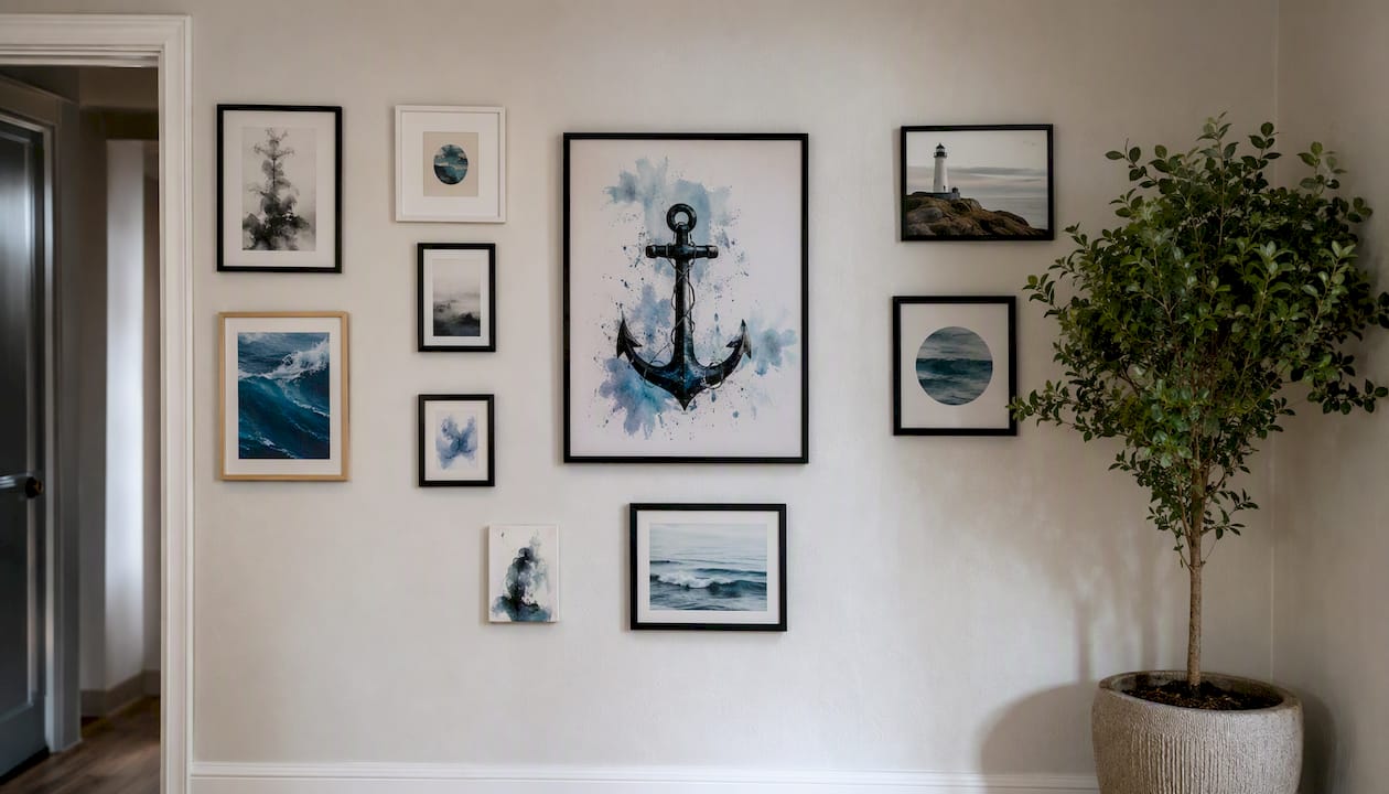
Spacing discipline is what separates a curated wall from a cluttered one. The standard range is 2–6 inches between frames. Use the tighter end (2–3 inches) for narrow corridors, stairwells, or when you want a dense, editorial feel. Use the wider end (4–6 inches) on large open walls where the pieces need room to register individually.
Gallery wall layout options
| Layout type | Best-fit wall | Visual effect | Notes |
|---|---|---|---|
| Salon / eclectic mix | Large feature wall | Rich, collected, layered | Needs strong anchor piece |
| Symmetrical grid | Hallway, bedroom | Clean, modern, ordered | Works best with uniform frames |
| Linear row | Hallway, above console | Graphic, architectural | Keep tops or centers aligned |
| Ledge / leaning | Shelf, mantel, floor | Casual, flexible, easy to swap | No holes; great for renters |
When composing a salon-style wall, start by placing the anchor piece, then add vertical pieces on one side and horizontal pieces on the other to avoid a flat, grid-like result. Photograph the floor layout before you start hanging — it takes two minutes and saves a lot of spackle.
Pro Tip: Mix objects and mediums deliberately. A small mirror, a textile panel, or a ceramic wall piece among framed prints adds depth that a uniform set of prints cannot replicate. Keep one unifying element — a shared frame color, a consistent mat width, or a repeating material — so the mix reads as intentional rather than random. For seasonal freshness, swap one or two pieces every few months without rebuilding the whole wall.
For more on rotating arrangements and balancing wall decor across seasons, the linked guide covers the practical side of that process.
How do you make mixed frames and mediums look cohesive?
Unify by a shared element, not by making everything match. When every frame is identical, the wall looks like a store display. When nothing shares anything, it looks like a yard sale. The sweet spot is two to three frame styles maximum, tied together by one consistent element.
- Frame color: Black, white, natural wood, or gold each work as a unifier. Pick one and let the other frames vary in profile or material.
- Mat width: Consistent matting (typically 2–3 inches) across varied print sizes creates visual order even when the frames differ.
- Float mounts: Use these for small objects, textiles, or irregular pieces — they give 3D items a clean, gallery-appropriate presentation.
- Slim frames: A thin metal or wood frame modernizes almost any print and keeps the art, not the frame, as the focal point.
- Warm wood frames: These pull a room warmer and work particularly well with botanical prints, photography, and abstract pieces in earth tones.
Mixing 3D objects — a small ceramic, a woven textile panel, a shadowbox — adds tactile interest that flat prints alone cannot. The key is negative space: leave enough bare wall around 3D pieces so they do not compete with the frames beside them.
Pro Tip: Limit yourself to two to three frame styles per wall. One style reads too uniform; four or more reads chaotic. A practical shortcut: choose one dominant frame (used on the largest pieces), one accent frame (used on two or three smaller pieces), and let everything else be a mat-unified print.
For practical guidance on mixing art styles while keeping a room cohesive, that resource covers the framing and medium decisions in more detail.
Where should you place art in each room of your home?
Each space has its own sightlines, furniture heights, and traffic patterns — the placement rules shift slightly per room.
- Living room above sofa: Art width at 60–75% of sofa width; bottom of frame 6–10 inches above sofa back; center at 57–60 inches from floor.
- Mantel: Art width at 60–75% of mantel width; bottom of frame 3–6 inches above the shelf; a single large piece or a leaned canvas works well here.
- Entryway: One strong piece at eye level (57–60 inches center) creates an immediate impression; a console with art above it (4–8 inch gap) anchors the entry without crowding the door.
- Stairwell: Follow the stair slope, keeping each piece’s center parallel to the stair angle; spacing of 2–3 inches between frames; a linear diagonal arrangement reads cleanest.
- Hallway: A linear row with tops aligned works best; keep spacing at 1.5–3 inches; art width at 50–70% of the wall width between doorways.
- Small rooms: One correctly scaled piece almost always beats a gallery wall — it avoids visual compression. Choose art with light tones or open compositions to keep the space feeling larger.
Above a bed, center the art on the headboard and leave 4–6 inches of clearance above it. A single wide piece (36–45 inches for a queen) or a diptych reads cleaner than a cluster in a bedroom, where the goal is calm rather than stimulation.
What hardware do you need to hang art safely on any wall?
Choose hardware rated for at least 1.5 times the artwork’s weight, and match the anchor to the wall material. A canvas that falls because of an undersized hook is a $200 mistake that leaves a hole and a dent.
- Lightweight pieces under 10 lb: Adhesive strips (3M Command strips) or small picture hooks work well; adhesive strips are ideal for renters since they remove cleanly.
- 10–30 lb: Standard picture hooks handle most framed prints and medium canvases in this range; use drywall anchors if you cannot hit a stud.
- 30 lb and above: Use toggle bolts, molly anchors, or locate a stud. For very heavy panels (large canvases, mirrors, framed tapestries), a French cleat distributes weight across a wider span and is far more secure than any single hook.
- Plaster walls: Plaster is brittle and can crack around standard nails; use a drill with a masonry bit and a wall anchor rated for plaster.
- Brick or masonry: Requires a hammer drill, masonry bit, and masonry anchors; adhesive strips will not hold reliably on textured masonry.
Pro Tip: For tall canvases (anything over 36 inches tall), use two hanging points rather than one. A single central hook lets the canvas pivot; two points keep it flat and level. In earthquake-prone areas, add a small piece of museum putty or earthquake wire at the bottom corners to prevent swinging.
What are the most common art placement mistakes and how do you fix them?
- Too small: The single most common error. Fix: use the 60–75% furniture-width rule before buying. When in doubt, size up.
- Hung too high: Art drifts up when people hang it at standing height rather than eye-level center. Fix: lower the piece until its center sits at 57–60 inches from the floor.
- Overcrowded gallery wall: Too many pieces with inconsistent spacing reads as clutter. Fix: remove the smallest or weakest pieces, increase spacing to at least 2–3 inches, and let the anchor piece dominate.
- Chosen only to match finishes: Art selected purely to echo the sofa color or rug pattern tends to feel flat and impersonal over time. Fix: choose at least one piece for emotional connection, not just palette coordination.
- Ignoring scale relative to furniture: A narrow piece above a wide sofa looks like a bookmark. Fix: measure the sofa, calculate 60–75%, and treat that as your minimum width.
- Single hanging point on a large canvas: The piece pivots and never stays level. Fix: add a second hook or switch to a French cleat.
Quick wall audit: Stand back six feet and check four things in order: (1) Is the art wide enough relative to the furniture? (2) Is the center at roughly eye level? (3) Is the spacing between pieces consistent? (4) Does the arrangement relate to the furniture below it, or does it float independently? If you answer yes to all four, the wall is working.
What do designers know about art placement that most homeowners miss?
Designers treat art as a starting point, not a finishing touch. When a strong piece is chosen early, it can set the room’s color direction, determine the furniture scale, and even influence perceived ceiling height. Most homeowners do the opposite — they furnish the room, paint the walls, and then look for art that “goes with” everything. That sequence almost guarantees art that feels like an accessory rather than an anchor.
Three insights practitioners return to repeatedly:
Favor one strong piece over many weak ones. A single dominant artwork, sized correctly and hung at eye level, anchors a room more successfully than multiple small pieces that compete with furniture and conversation. The collected-over-time approach — adding one meaningful piece at a time rather than buying a uniform set — produces walls that feel personal and layered rather than decorated.
Use unexpected materials. Textiles, ceramics, mirrors, and shadowboxes introduce texture that flat prints cannot replicate. Mixing mediums while keeping a unifying element (frame color, mat width) is what gives a wall a gallery feel without a gallery budget.
Rotate seasonally. Swapping one or two pieces every few months keeps a room feeling fresh without a full redesign. A ledge or picture rail makes this effortless.
Pro Tip: When a client or homeowner says a room “feels off” but they cannot identify why, the art is usually the culprit — either too small, hung too high, or chosen to match rather than to lead. Fixing the art fixes the room.
The role of art in home decor goes deeper on how a single well-chosen piece can reframe an entire room’s mood and proportion.
How does lighting affect where you should place art?
Light is the variable most homeowners overlook until a piece they loved in the store looks flat or washed out on the wall. Natural and artificial light affect art differently, and placement decisions should account for both.
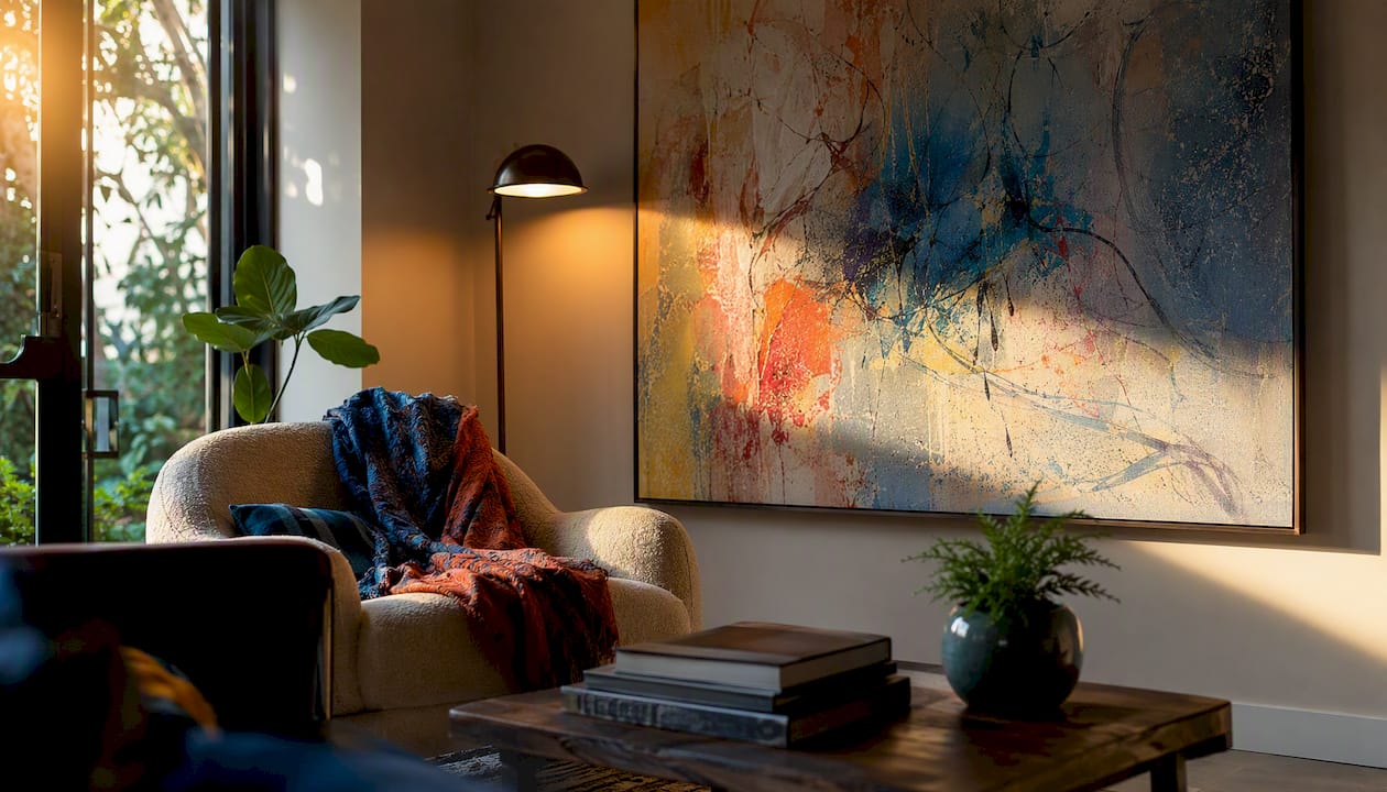
Direct sunlight is the main threat to longevity. UV rays fade pigments over time, particularly in photographic prints and watercolors. Position art on walls that receive indirect natural light rather than walls that face a south-facing window with unobstructed sun exposure. If a sunny wall is the only option, UV-filtering glass or a UV-protective canvas coating extends the life of the piece significantly.
Artificial lighting shapes how color and texture read at night. Warm incandescent or LED bulbs (2700–3000K) bring out warm tones in earth-toned and warm-palette art; cooler daylight bulbs (5000K and above) suit black-and-white photography and cool-toned abstracts. Picture lights mounted on the frame or adjustable track lighting aimed at a 30-degree angle from the wall minimize glare while creating the focused, gallery-style illumination that makes art look intentional rather than incidental.
Glossy or varnished surfaces create glare under direct overhead lighting. If you have recessed can lights directly above a piece, tilt them slightly off-center or choose a matte or satin finish canvas to reduce reflection.
How do you choose art styles and colors that work with your room’s decor?
The most reliable approach is to pull from the room rather than match it exactly. Identify two or three colors already present in the space — in the rug, upholstery, or drapery — and look for art that uses those colors as accents rather than its dominant palette. An exact color match tends to look deliberate in a flat way; a piece that echoes the room’s tones while introducing something new feels considered.
Style follows the same logic. A room with clean-lined, modern furniture reads well with abstract or geometric art. A room with warm wood tones and layered textiles suits botanical prints, landscape photography, or figurative work. The goal is contrast that complements rather than contrast that clashes — a bold abstract in a traditional room can work beautifully if the colors align, but a heavily ornate gilded frame in a minimalist space will fight everything around it.
For rooms with a neutral palette (whites, grays, beiges), art is the fastest way to introduce a color story. One large canvas with a strong color presence can do more for a room than repainting a wall. For rooms that are already color-rich, black-and-white photography or monochromatic prints provide visual rest without disappearing. Coordinating art with furniture styles covers the practical decisions around matching art aesthetics to specific furniture periods and materials.
How do you group art by theme or style for a cohesive arrangement?
Grouping works best when the pieces share at least one clear thread — subject matter, color family, medium, or era. That shared thread is what makes a collection read as intentional rather than random.
Subject-based groupings are the most straightforward: botanical prints together, architectural photography together, abstract works in a similar palette together. They work because the visual logic is immediately legible to anyone who looks at the wall. The risk is that they can feel too literal — a wall of only bird prints in a nature-themed room can tip from curated into themed.
Style-based groupings give more flexibility. Mixing a line drawing, a photograph, and a small oil painting that all share a muted, earthy palette creates a cohesive group without requiring the same subject. The palette is the thread. This approach tends to produce walls that feel more personal and less like a catalog spread.
A practical rule: group pieces that you would describe using the same two or three adjectives. If you can say “calm, textural, warm” about all five pieces in a grouping, the wall will hold together. If one piece breaks that description, it probably belongs somewhere else in the room — or in a different room entirely.
The rule most homeowners get backwards
The conventional advice on decorating with art runs roughly like this: furnish the room, choose your paint color, then find art that ties it all together. That sequence is backwards, and it is why so many rooms feel like the art was an afterthought — because it was.
Art chosen to “go with” a finished room is almost always too safe. It matches the sofa, echoes the rug, and disappears into the background. The rooms that actually stop people are the ones where a strong piece was chosen first, and the furniture and palette were built around it. That is not a radical design philosophy — it is just the order of operations that gives art the weight it deserves.
They exist because they reflect how the human eye actually reads a room: in relation to furniture, at a comfortable viewing height, with enough breathing room between pieces to register each one. Getting those numbers right is the mechanical part. The harder part is choosing art that you actually want to live with — something that earns its place not because it matches the throw pillows, but because it changes how the room feels.
One more thing worth saying plainly: small art is almost always the wrong call. The instinct to buy small because it feels “safer” produces walls that look timid. Size up, use the furniture-width rule as your floor, and trust that a well-scaled piece will carry the room.
Ready to order a canvas sized exactly for your wall?
Sensecanvas carries over 15,000 canvas designs — abstracts, botanicals, animal themes, motivational pieces, and more — and every piece is available in custom sizes. That means you can take the measurements from the cheat sheet above (say, 48 inches wide for a 72-inch sofa) and order a canvas cut to fit, rather than hunting for something close enough.

Whether you need a single statement piece above a sofa, a triptych sized for a large blank wall, or a mantel focal piece in a specific finish, Sensecanvas lets you specify the dimensions at checkout. Prices start at $85, and the customization option removes the guesswork of whether a standard size will actually work in your space. Browse the full canvas wall art collection and use your measurements to filter by size before you buy.
Sources
- How to choose art for your home: a complete guide to style, size and placement
- How to style a gallery wall the right way, according to designers
- How to arrange wall art in every room: a designer’s guide to pro-level hanging
- How to transform your home with art
- How to hang art, artfully
- How to make a gallery wall


