

The Best Scripture Wall Art Ideas for a Modern Home
The strongest scripture wall art ideas right now lean into design first: a single large canvas or bold typography print over the sofa, a rustic wood sign in an entryway, a small gallery wall mixing verses with photos, or a $10 DIY engineering print for a quick win. Before buying anything, measure your wall and pick a verse of five to ten words if the piece will be large. That one step prevents most of the sizing mistakes people make with faith-based decor.
TL;DR:
- Large scripture pieces over sofas should span about two-thirds to three-quarters of the sofa’s width and be centered around 57 to 60 inches from the floor.
- Short phrases like “Be Still” or “This Is the Day” are ideal for large-scale wall art since they remain readable from across the room, while longer passages are better as grouped small prints.
- Command strips and lightweight frames enable damage-free hanging for renters, and correct sizing involves testing font size on regular paper before final printing.
- Choosing the right material depends on the room: canvas for durability and gallery feel, vinyl decals for removability, and acrylic or metal for sleek, modern looks.
- Proper lighting, such as angled picture lights and indirect LED fixtures, prevents glare and preserves the artwork’s color contrast over time.
Table of Contents
- Scripture Wall Art Ideas by Style
- Where Should You Hang Scripture Art in Each Room?
- Budget-Friendly and DIY Scripture Wall Art Projects
- How to Build a Scripture Gallery Wall That Doesn’t Look Random
- Choosing a Verse and Getting the Typography Right
- Which Material Should You Choose: Canvas, Wood, Metal, or Vinyl?
- Framing Options and Their Impact on Style and Preservation
- Lighting Considerations for Scripture Wall Art
- Why Sense Canvas Makes Sense for Custom Scripture Pieces
- Get Your Scripture Piece Made to Fit Your Wall
- Sources
Scripture Wall Art Ideas by Style
Scripture decor works best when the style matches the room, not the other way around. Trends right now favor minimalist typography and neutral palettes that let a single verse anchor a space without turning it into a church gift shop.
- Modern typography: Clean sans-serif type, black or charcoal on white or cream, one short verse. Fits living rooms, home offices, entryways.
- Farmhouse wood: Distressed or stained wood signs with routed or hand-lettered text. Fits kitchens, mudrooms, and rustic bedrooms.
- Gallery canvases: A cluster of framed prints mixing scripture with botanicals or family photos. Fits stairwells and living room walls.
- Tapestries: Woven or printed fabric with a verse or floral border. Fits bedrooms and reading nooks that want texture without a frame.
- Decals: Vinyl lettering applied directly to the wall. Fits rentals and nurseries where a frame feels heavy or permanent.
Short phrases like “Be Still” or “This Is the Day” hold up at large scale because the eye can read them from across a room. Longer passages, like a full Psalm, work better as small framed prints grouped together, where a viewer is standing close enough to actually read the text. When in doubt, pick one dominant color, choose a font you could read from ten feet away, and commit to one focal wall instead of spreading scripture pieces across the whole house.
Where Should You Hang Scripture Art in Each Room?
Placement matters more than the verse itself. A beautiful piece in the wrong spot, at the wrong size, just reads as clutter. A few rules hold across almost every room.
- Living room: Art above a sofa should span roughly two-thirds to three-quarters of the sofa’s width for a balanced look, and center the piece around 57 to 60 inches from the floor.
- Entryway: Go welcoming, not solemn. A verse about hospitality or peace on a wood sign or small canvas greets guests without overwhelming a narrow wall.
- Bedroom: Choose calmer verses about rest or peace. Tapestries and soft-toned canvases work well above the headboard, sized to roughly match the bed frame’s width.
- Kitchen: Verses about gratitude or provision fit naturally near a dining table. Avoid unsealed wood or paper prints near the stove or sink. Sealed canvas or acrylic handles moisture and grease better.
- Nursery: Vinyl decals or lightweight framed prints keep things simple and easy to update as the child grows.
- Home office: Motivational, purpose-driven verses pair well with bold typography quotes for a focused, less devotional feel.
If you’re renting, skip the drill. Command strips and lightweight frames hold most canvas pieces under 20 pounds without damaging walls, and a guide to art sizing helps you get proportions right before you commit to a piece.
Budget-Friendly and DIY Scripture Wall Art Projects
You don’t need a custom canvas budget to get a striking piece on the wall. A few DIY methods deliver a high-end look for very little money, and knowing when to DIY versus when to order custom saves both time and disappointment.
- Engineering prints: Print a large typographic verse at 36×48 or 24×36 inches through a copy shop’s architectural plotter for roughly $3 to $10. Mount it with simple wood rails top and bottom, or hang it with magnetic rails and Command strips for a damage-free install.
- Faux-plaster canvas: Coat a blank canvas with joint compound or plaster medium, texture it with a putty knife, then stencil or hand-letter your verse once it dries. The texture reads as expensive even when the materials cost under $20.
- Vinyl lettering on acrylic: Cut adhesive vinyl text and apply it to a sheet of clear or frosted acrylic, then mount it on standoff hardware for a floating, modern effect that suits minimalist rooms.
Engineering prints are thin plotter paper, so they’re light and forgiving to hang but won’t survive humidity or repeated handling the way canvas does. Faux-plaster canvas has more texture and durability but takes a weekend project’s worth of patience. Acrylic looks sleek up close and holds up to cleaning, though fingerprints show more than they do on canvas.
Pro Tip: Test your verse’s font size by printing it on regular paper first and taping it to the wall. If you can’t read it comfortably from your usual seat on the couch, size up before you commit to the final print.
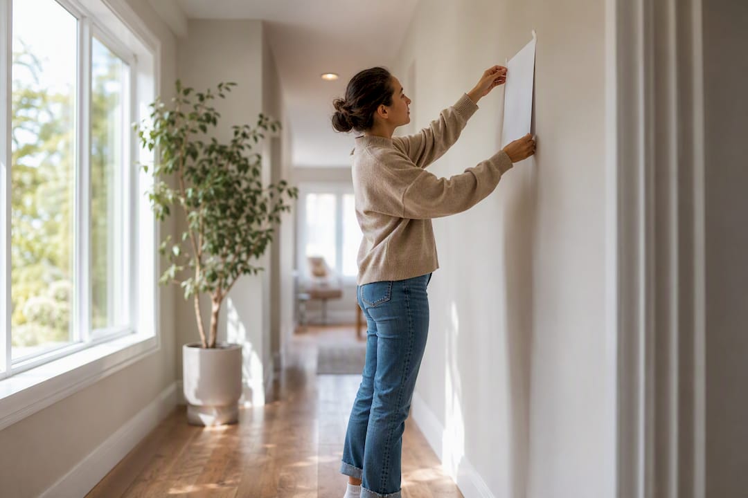
How to Build a Scripture Gallery Wall That Doesn’t Look Random
A gallery wall full of Bible verses can look like a designed space or a cluttered bulletin board, and the difference comes down to method, not luck. Designers consistently start with one anchor piece and keep spacing consistent, usually around two to three inches between frames.
- Pick your anchor first, the largest canvas or most meaningful verse, and build the rest of the layout around it.
- Lay the pieces out on the floor, or trace paper templates and tape them to the wall, before you drive a single nail.
- Align the overall footprint to a furniture piece below it, like a console table or sofa, so the grouping feels intentional rather than floating.
- Mix in a photo or a botanical print alongside the scripture pieces. An all-text wall can tip into “churchy” territory fast, while a mixed wall reads as curated. A gallery wall guide can walk you through spacing math if you’re working with an odd-shaped wall.
- Hang the anchor piece first, then work outward, saving the lightest and smallest pieces for last since they’re easiest to adjust.
Pro Tip: A three-piece grouping, one anchor canvas flanked by two smaller supporting pieces, is one of the most reliable layouts for balance, and it reads clearly even from across the room.
Choosing a Verse and Getting the Typography Right
The verse you pick and the way it’s typeset decide whether the piece looks intentional or like a leftover church banner. Distance is the first thing to consider: short phrases of five to ten words read best on large pieces viewed from across a room, while longer passages belong on smaller framed prints meant to be read up close.
- Skip ornate script fonts for anything longer than a short phrase. They look elegant in a logo, but they slow readers down on a full verse.
- Clean serif or a bold sans-serif typeface holds up at every size and in every lighting condition.
- On dark walls, use cream or light gold text. On white or pastel walls, charcoal or black type gives the strongest contrast.
- In rooms with low natural light, avoid thin, light gray fonts. They wash out and become nearly unreadable by evening.
A verse like “Be Still and Know” works as a bold three-inch-tall statement piece. Psalm 23 works far better as an 8×10 print in a cluster of frames, where someone can lean in and actually read it.
Which Material Should You Choose: Canvas, Wood, Metal, or Vinyl?
Material changes both the look and the lifespan of the piece, and picking the wrong one for the room is a common, avoidable mistake.
- Canvas: Durable, gives a gallery feel, and holds color well over years. The default choice for a statement piece over a sofa.
- Wood signs: Warm and farmhouse-friendly, but grain and stain can limit font legibility on detailed text.
- Vinyl decals: Cheap, removable, and ideal for renters or rooms that get redecorated often.
- Acrylic and metal: Sleek and modern, priced higher, and best suited to contemporary spaces rather than cozy or traditional rooms.
Wipe canvas and acrylic with a dry microfiber cloth; avoid glass cleaner on wood signs, which can strip the finish. For a piece meant to be the room’s focal point, custom canvas printing beats an off-the-shelf print almost every time, since you control the exact size and color balance for your wall instead of settling for a standard 16×20.
Framing Options and Their Impact on Style and Preservation
The frame around a scripture piece changes its personality almost as much as the verse itself. A thin black metal frame gives a modern, gallery-style edge, while a wide, distressed wood frame pulls the same print toward farmhouse or traditional territory. Floating frames, where the canvas edge shows around a slim border, work well for canvas prints that already have finished, painted sides and don’t need glass.
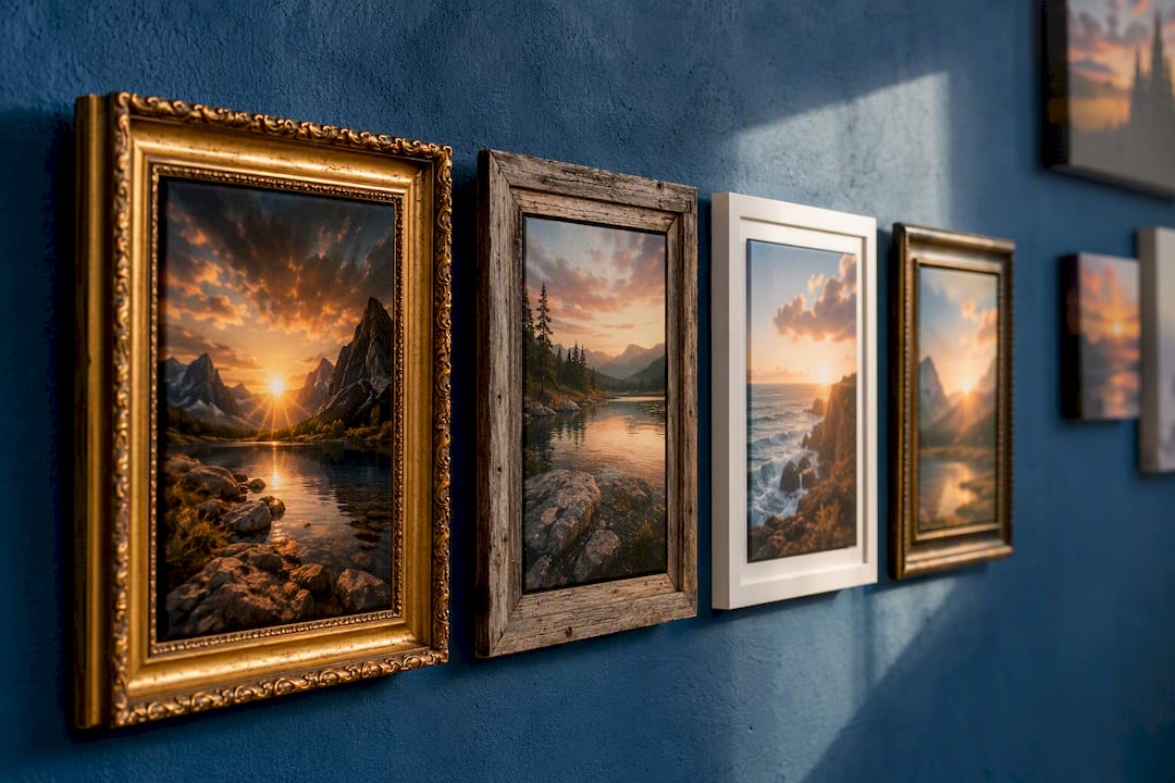
Glass or acrylic glazing does more than protect against dust. UV-filtering glass slows fading in a piece that hangs in a sunny room, which matters for paper prints far more than for canvas, since canvas ink tends to hold color longer under normal indoor light. Matting adds a buffer between the print and the glass, which looks classic in a formal living room but can feel fussy in a minimalist space.
For high-traffic rooms like kitchens or entryways, skip raw wood frames that absorb moisture and grease over time. A sealed canvas print with no frame at all, or a simple metal frame, holds up better and needs less maintenance. If a piece has sentimental weight, like a verse chosen for a wedding or a child’s birth, archival matting and UV glass are worth the extra cost since they slow yellowing and keep the print looking sharp for decades rather than years.
Lighting Considerations for Scripture Wall Art
Even a well-chosen verse in the right font falls flat under bad lighting. Direct, harsh overhead light creates glare on glossy canvas or acrylic, washing out the text exactly where you want the most impact. Angled picture lights or adjustable track lighting, aimed slightly downward from above the piece, avoid that glare and add depth without overpowering the room.
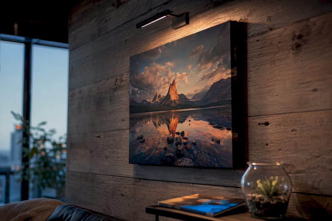
Natural light is a double-edged tool. A wall that gets strong afternoon sun looks great during the day but risks fading paper prints and some inks over years, which is another reason canvas tends to outlast prints in bright rooms. If your scripture piece sits somewhere without much natural light, like a hallway or a windowless office, a warm-toned LED wall sconce, in the 2700 to 3000 Kelvin range, keeps the piece visible without casting the cool, clinical light that some LED fixtures produce.
Matte finishes handle mixed or low light better than glossy ones, since they scatter light rather than bouncing it back at the viewer. If you’re set on a glossy or metallic finish for a modern look, plan for indirect lighting from the start rather than trying to fix glare after the piece is already hung.
Why Sense Canvas Makes Sense for Custom Scripture Pieces
Most scripture wall art mistakes come down to two things: the piece is the wrong size for the wall, or the text doesn’t have enough contrast to read well. Sense Canvas addresses both directly, with more than 15,000 artwork options and the ability to adjust size and color to fit a specific wall rather than settling for a standard print size.
That matters most for large statement pieces, where an inch of wall space in either direction changes whether the piece looks intentional or awkward. A verse in pale gray on a light beige wall might look elegant in a mockup and disappear entirely once it’s hung, and a size adjustment before ordering avoids the more common problem of guessing wrong on scale. Browsing the full collection before finalizing a verse and room plan is the simplest way to catch both issues before they become permanent.
— Sense
Get Your Scripture Piece Made to Fit Your Wall
Buying a pre-made print off a shelf means accepting whatever size, color, and font the manufacturer chose. Sensecanvas skips that trade-off. With over 15,000 designs and full control over size and color adjustments, you get a canvas built for your actual wall, not a generic 16×20 that might be two inches too small over your sofa or too pale against your paint color.
If you’ve already picked your verse and measured your wall using the sizing rules above, you’re most of the way there. Browse the motivational and scripture-style options for typography inspiration, or head straight to the Sense Canvas homepage to start customizing size and color for your space. Prices start at $85, which puts a properly sized, high-contrast statement piece well within reach for most rooms in the house.


