

Two Thirds Rule for Colorful Wall Art: Exact Sizing, Palettes, DIY
The fastest ways to bring color into a room are an oversize statement canvas, a tonal gallery wall, a colorful textile or tapestry, and framed prints with bold matting. Each works in a different type of space, and the right pick depends on wall size, existing furniture, and how much commitment you want. Below you’ll find placement rules, palette guidance, material tradeoffs, DIY options, and a look at where a custom canvas from Sensecanvas fits into the plan.
TL;DR:
- Oversize abstract canvases provide the most visual impact with minimal effort, especially when placed over large furniture like sofas or beds.
- For cohesive gallery walls, maintain a constant element such as frame color or palette, and use layout patterns like symmetrical grids or central anchors for a curated look.
- Matching art colors to existing room textiles and following the 60-30-10 rule enhances harmony, with digital and custom options offering precise sizing and color control.
- Lightfastness depends on avoiding direct sunlight and controlling humidity, while proper hanging hardware and occasional rotation help preserve color vibrancy over years.
- DIY projects and budget options, such as acrylic pouring or repurposed thrift frames, can deliver bold visual impact, but tailored custom canvases ensure precise scale and color consistency.
Table of Contents
- Colorful Wall Art Ideas Worth Stealing
- Room-by-Room Picks for Colorful Art
- Building a Gallery Wall That Looks Curated, Not Cluttered
- Picking Colors and Palettes That Actually Work
- Choosing the Right Material for Colorful Art
- How to Hang and Light Colorful Wall Art the Right Way
- DIY and Budget-Friendly Colorful Wall Art
- Why Sense Canvas Works for Custom Colorful Canvas Art
- Cultural and Thematic Threads in Colorful Wall Art
- Colorful Art Across Modern, Bohemian, and Minimalist Styles
- Keeping Colorful Wall Art Looking Sharp for Years
- Digital Art and Prints as a Colorful Wall Option
- An Honest Take on What Actually Makes a Colorful Wall Work
- Ready to Put a Custom Canvas on Your Wall?
- Sources
Colorful Wall Art Ideas Worth Stealing
Some of these ideas take an afternoon. Others take a weekend and a staple gun. Here’s the full menu, ranked roughly by how much visual impact you get per hour of effort.
- Oversize abstract canvas. One large piece over a sofa or bed does more work than five small ones. Large abstracts remain a defining trend for open concept living areas, and they read as intentional rather than accidental.
- Tonal gallery wall. Pick five to nine pieces in one color family, different subjects. Hanging note: keep gaps between frames at 2 to 3 inches.
- Color-block panels. Two or three solid-hue canvases hung as a set. Works well flanking a TV or over a console table.
- Framed prints with colorful matting. A neutral print gets punch from a saturated mat. Pairs naturally with existing neutral furniture.
- Wall tapestries. Great for rental units since they hang from a rod, no drilling required.
- Neon or typography art. A single bold word or phrase piece works best in a home office or entry, not a bedroom.
- Clustered mirrors and art. Mixing a round mirror with two or three colorful prints adds light and depth to a small hallway.
- Seasonal switchable prints. Buy one frame, rotate the print quarterly. Cheapest way to keep a room feeling fresh.
- Triptychs. A single image split across three canvases. Best over a long console or a wide, empty stretch of wall.
- Layered leaning art. Skip the hardware. Lean two or three pieces of varying height against a wall on a shelf or floor.
Each of these connects back to what’s already in the room. A color-block set can pull its palette straight from a set of throw pillows, while a tonal gallery wall can echo the undertone in a rug. That link between wall and textile is what keeps a colorful room from feeling like a paint chip display.
Room-by-Room Picks for Colorful Art
Color behaves differently depending on what a room is for, and designers tend to match palette to function rather than picking a favorite hue and hoping it works everywhere.
- Living room: An oversize canvas above the sofa, sized to roughly two-thirds the sofa’s width. Warm tones like red, orange, and yellow suit social spaces because they read as energetic in a room built for conversation.
- Bedroom: Cool gradients, soft blues, and nature-inspired prints support rest. Leave real breathing room above the headboard rather than crowding it.
- Home office: A small, bold print or a typographic piece placed directly in your sightline keeps energy up during long work sessions.
- Hallway or entry: A tall vertical piece or a narrow stacked gallery makes a tight space feel taller. A single wall sconce aimed at the art helps it register as a focal point.
- Kitchen or dining: Metal or acrylic prints wipe clean easily. Playful colorful pieces work best when they pick up a tile color or a runner already on the table.
Building a Gallery Wall That Looks Curated, Not Cluttered
Designers rely on a principle worth borrowing directly: cohesion through variation. You mix different subjects, sizes, and even mediums, but you hold one element constant, whether that’s frame color, matting, or a shared palette. Drop that anchor and a wall of eight different pieces stops looking curated and starts looking random.
A few layout patterns handle most rooms:
- Symmetrical grid: Even spacing, matched frame sizes. Reads formal and works well in dining rooms.
- Central anchor with satellites: One larger piece in the middle, smaller works arranged around it.
- Stairway gallery: Pieces follow the angle of the stairs, spaced evenly along the rise.
- Salon style: Dense, overlapping arrangement that fills a large wall floor to near-ceiling.
Keep the whole arrangement centered around 57 to 60 inches at eye level, and leave 2 to 3 inches between smaller frames so the grouping doesn’t feel jammed. Align the outer edges with the furniture below when possible.
Pro Tip: Trace each frame onto craft paper, cut it out, and tape the paper templates to the wall before you hang anything. Move them around until the spacing looks right, then swap paper for art. It saves you from patching a dozen unnecessary holes.
Picking Colors and Palettes That Actually Work
Color choice should follow the room’s job, not just your favorite shade. Warm tones energize social spaces; cooler tones calm bedrooms and reading nooks, which is why designers consistently split palette advice along that warm/cool line.
- Pull one or two colors directly from an existing rug, curtain, or set of pillows, then add a single accent color the room doesn’t already have.
- Apply the 60-30-10 rule: 60% dominant color, 30% secondary, 10% accent, and let your art carry that accent.
- Complementary palettes (opposite colors on the wheel) create drama; analogous palettes (neighboring colors) create cohesion; neutral-plus-accent creates balance without risk.
- Test any print under your room’s actual lighting at both midday and evening, since color shifts noticeably between natural and warm bulb light.
Pulling accents straight from existing textiles is the single fastest way to make a new piece look like it belongs, rather than like it just arrived.
Choosing the Right Material for Colorful Art
The surface you print or paint on changes how saturated the color looks and how long it lasts.
- Canvas: Holds deep, saturated color and handles large-scale printing well. Gallery-wrapped canvas is the standard choice for statement pieces, and it’s the specialty at Sensecanvas, which builds oversize colorful canvases to fit exact wall dimensions.
- Metal and acrylic: High gloss finish, wipes clean in seconds, best suited to kitchens, dining rooms, and modern spaces where fingerprints and splatter are a real concern.
- Textiles and tapestries: Add texture and help absorb sound in rooms with hard floors or high ceilings. Renters can hang them from a curtain rod with no wall damage.
- Mixed media: Layered materials add tactile interest but usually cost more and demand a sturdier mounting setup.
Keep any colorful piece out of direct, prolonged sunlight to slow fading, and control humidity in the room. Canvas can generally be dusted with a dry microfiber cloth; avoid glass cleaner on acrylic prints, which can cloud certain coatings.
How to Hang and Light Colorful Wall Art the Right Way
Getting placement and lighting right is what separates art that looks intentional from art that looks like an afterthought.
- Measure the furniture below your target wall and aim for artwork proportionate to that width, centered around 57 to 60 inches from the floor (link).
- Choose your lighting: a dedicated picture light or track fixture intensifies saturated color, while a matte finish cuts glare in rooms with strong direct sun.
- Match hardware to weight. Command strips work for lightweight prints and renters; toggle anchors or a French cleat are safer for large or heavy canvases.
- Lay the full arrangement out on the floor first, mark positions with paper templates, then hang and step back to check the view from where you actually sit.
DIY and Budget-Friendly Colorful Wall Art
You don’t need a big budget to fill a wall with color. A few reliable, low-cost projects deliver real visual punch:
- Acrylic pour painting: Pour diluted acrylic paint onto canvas or wood, tilt to blend. About an hour, under $30 in supplies.
- Fabric-wrapped foam boards: Wrap a bold patterned fabric around a foam insulation board and staple the back. This kind of project delivers strong color impact with minimal tools.
- Painted thrift frames: Buy old frames at a thrift shop, repaint in one bold color, insert a print or fabric swatch.
- Stenciled wood panels: Paint a geometric stencil pattern on scrap plywood for an oversize look on a small budget.
Thrift shops, flea markets, printable art files, and dollar-store frames refreshed with spray paint all stretch a tight budget further. Buy finished pieces instead when scale, exact color matching, or frame quality genuinely matter, since those are the three things DIY struggles to nail consistently.
Why Sense Canvas Works for Custom Colorful Canvas Art
Sensecanvas carries more than 15,000 designs, customizable by size and color palette, which solves the two hardest parts of adding colorful art: getting the scale right and matching a specific palette. Custom canvas vendors can supply color-consistent, properly sized pieces that fit the two-thirds width rule exactly instead of forcing a room to work around a standard size. Pricing starts at $85, which keeps an oversize statement canvas within reach. For matching art to what you already own, the guide to interior styles and the small-space canvas guide go deeper.
Cultural and Thematic Threads in Colorful Wall Art
Color rarely stands alone. It usually carries a theme, and thematic choices are where a lot of colorful walls go from generic to genuinely personal. Moroccan-inspired geometric patterns in jewel tones, Mexican folk art motifs in hot pink and turquoise, Japanese ukiyo-e style waves in indigo and coral, or West African mud cloth patterns in ochre and black all bring a specific visual language along with the color.
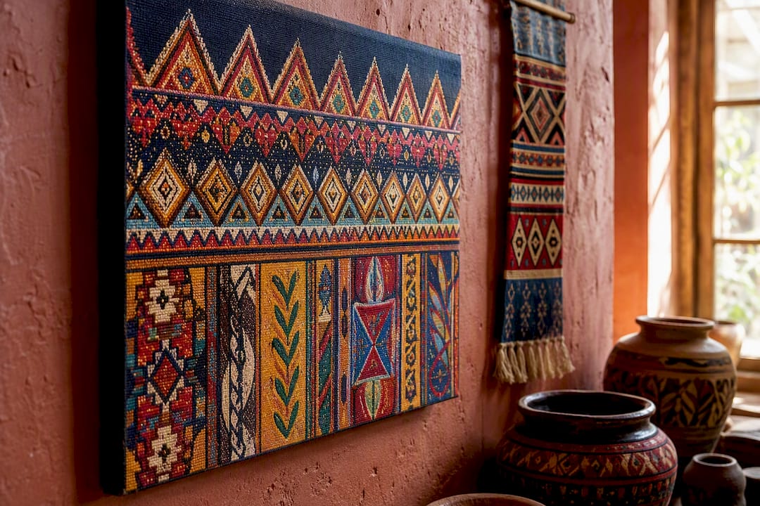
The trick is picking a theme that connects to something real, whether that’s a place you’ve traveled, a family background, or simply an aesthetic you’re drawn to, rather than grabbing a pattern because it’s trending. A single Ankh-inspired piece or an Egyptian motif canvas can anchor an entire room’s palette if the surrounding decor picks up even one of its colors.
Religious and symbolic imagery works the same way. A piece built around a forbidden fruit motif or a paradise garden theme carries both color and narrative weight, which gives a room a focal point that a plain abstract can’t quite match. Motivational typography pieces do similar work in offices, where a bold color palette paired with a specific phrase gives the room both energy and a point of view.
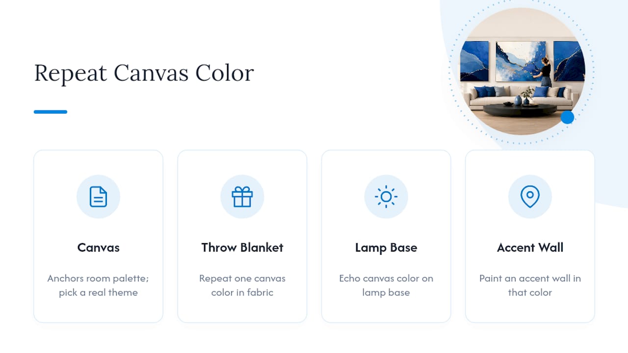
The rule that keeps thematic art from feeling like a costume: repeat one of its colors somewhere else in the room, whether that’s a throw blanket, a lamp base, or a painted accent wall. That repetition is what makes a themed piece look chosen rather than dropped in.
Colorful Art Across Modern, Bohemian, and Minimalist Styles
The same colorful canvas can look completely different depending on the style around it, and matching art to interior style is really about matching density, not just hue.
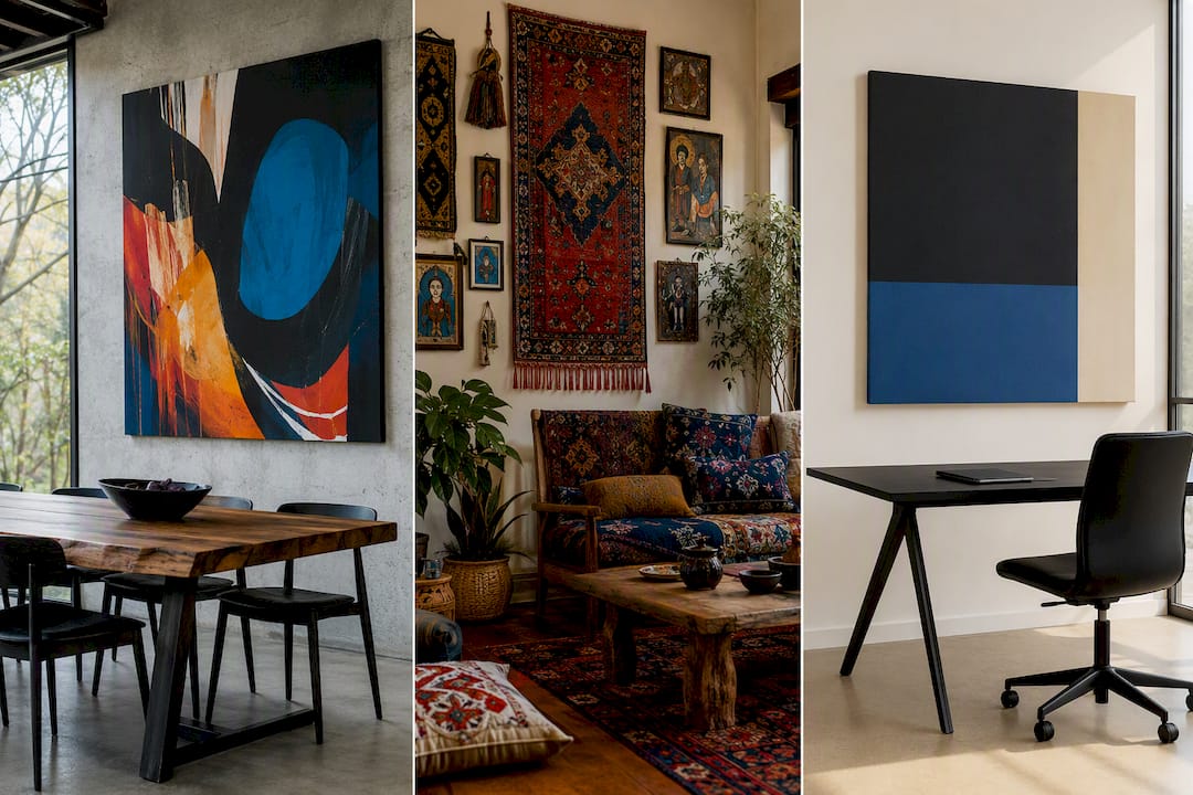
Modern spaces favor fewer, bolder pieces. One oversize abstract canvas in a saturated palette against a clean, neutral wall does more for a modern living room than five smaller framed prints ever could. Geometric shapes and color-block panels also read as distinctly modern.
Bohemian interiors thrive on layering. Tapestries, clustered gallery walls, and mixed-media pieces in warm, earthy-but-vibrant tones (terracotta, mustard, deep teal) all work together in a way that would feel chaotic in a modern room but feels collected in a bohemian one. Texture matters as much as color here.
Minimalist rooms need restraint. A single, well-placed colorful piece against a mostly white or neutral backdrop creates more visual impact than a gallery wall would, since minimalism relies on negative space to make the color pop. One triptych or one color-block panel is usually the ceiling, not the floor, for a minimalist room.
Knowing which camp your room falls into before you shop saves you from buying five pieces that fight each other on the wall.
Keeping Colorful Wall Art Looking Sharp for Years
Color fades. That’s just physics, but how fast it fades depends entirely on choices you control. Direct sunlight is the biggest threat to saturated pigments, so keep bold canvases off walls that get hours of unfiltered afternoon sun, or use UV-protective glass if the piece hangs in a bright spot anyway.
Humidity matters almost as much. Bathrooms and uninsulated basements can warp canvas stretcher bars and encourage mold behind frames, so stick to acrylic or metal prints in consistently damp rooms. Dust canvas with a dry, soft microfiber cloth rather than water or cleaning spray, which can push dust into the weave. For framed prints behind glass, a standard glass cleaner on a cloth, never sprayed directly on the glass, works fine.
Check hanging hardware every year or two, especially for heavier canvases on Command strips, since adhesive strength degrades with temperature swings. A slight sag or tilt is often the first sign a strip needs replacing before a piece actually falls.
Rotate pieces between rooms occasionally if a wall gets heavy sun exposure over time. It’s a simple way to even out fading across your whole collection rather than concentrating the wear on one unlucky canvas.
Digital Art and Prints as a Colorful Wall Option
Digital art has become a legitimate category of its own, not just a cheaper stand in for painted originals. Digital illustrators and generative artists now sell high-resolution files specifically formatted for large-scale canvas or print, often in color combinations that would be difficult to mix by hand.
The advantage is flexibility. A digital file can be resized to fit almost any wall without the quality loss you’d get scaling up a small physical painting, which makes digital art a strong match for the two-thirds width rule regardless of your furniture’s dimensions. It also opens the door to instant customization: swapping a background color or adjusting saturation to match a specific room’s palette before you ever print it.
The tradeoff is that not all digital prints translate well to canvas. Flat, low-resolution files can look pixelated at large sizes, so resolution and file format matter more here than with a scanned painting. A reputable print or canvas provider will flag resolution issues before production rather than after you’ve already unpacked a blurry statement piece.
For anyone building a themed or highly specific palette, whether that’s a family name design or a favorite motif, digital art also tends to be the most affordable path to a fully customized, oversize piece, since there’s no original artwork to source or ship.
An Honest Take on What Actually Makes a Colorful Wall Work
Most advice on colorful wall art focuses on trends: the color of the year, the “it” gallery layout, the latest palette everyone’s suddenly using. None of that matters nearly as much as scale and placement. A perfectly on-trend color palette hung too small, too high, or off center from the furniture below will always look wrong, while a slightly unfashionable color choice hung at the right height and sized to that two-thirds rule will look intentional.
The other place conventional advice falls short is treating color selection as a standalone decision. It isn’t. The strongest colorful walls pull directly from something already in the room, a rug, a set of pillows, even a tile backsplash, rather than starting from a blank slate. Skip that step and you get a room that looks like a paint store display rather than a home.
If you’re prioritizing one thing first, make it this: measure before you buy. Get the width, get the height, get the two-thirds ratio locked in. Color and theme are the fun part, but scale is what determines whether the piece reads as art or as clutter.
— Sense
Ready to Put a Custom Canvas on Your Wall?
Sensecanvas skips the guesswork of finding a pre-made piece in exactly the right size and palette. Measure your wall width, calculate two-thirds of that for your target size, and pick a finish, gallery-wrapped canvas for a modern statement or a more textured option for a bohemian room.
Once you have those numbers, browse colorful abstract canvas options sized to match, or start from the Sensecanvas homepage to filter by theme and size. With over 15,000 designs and pricing starting at $85, you can order a piece cut to your exact wall, not the other way around.


