

Drive Foot Traffic: Retail Store Art Ideas You Can Test From $85
The fastest ways to attract customers and keep them browsing longer: a bold window installation, a branded feature wall, suspended or sculptural pieces, and small multisensory touches that pair art with light or sound. Quick wins (modular frames, a single oversize canvas) can go up this week; bigger investments (kinetic sculpture, backlit walls) pay off over months. We cover both, plus how to place, rotate, and budget for each.
TL;DR:
- Keep one evergreen window anchor throughout the year, leave clear space around it, and swap modular supporting pieces seasonally instead of redesigning the entire display.
- Place the center of feature wall art roughly 57 to 60 inches above the floor, and use removable rails or adhesive hooks in leased spaces.
- Before overhead installation, confirm ceiling anchors are rated for the piece’s weight, keep exits and walkways clear, and hire professionals for motorized or wired pieces.
- Track foot traffic and conversion for two weeks before and after a major art rotation, then use the comparison to decide what stays.
- The Cornell study found dynamic generative art drove higher engagement and word of mouth than static art, especially among shoppers with little art interest.
Table of Contents
- 1. Window and front-of-store art ideas
- 2. Feature walls and in-store gallery art
- 3. Suspended, sculptural, and three-dimensional art
- 4. Multisensory art and ambient treatments
- 5. Small-store and pop-up art strategies
- 6. Materials, props, fixtures and sourcing
- 7. Placement, sightlines and rotation schedule
- 8. Budgeting and DIY vs. pro installation
- 9. Canvas wall art in retail: practical applications
- 10. Incorporating local artists and community art collaborations
- 11. Interactive art installations to engage customers
- 12. Digital art and technology integration in retail displays
- 13. Aligning art choices with brand identity and target audience preferences
- Author perspective: why artification is a strategic retail move
- Sense Canvas: quick ways to order or customize retail canvas art
- FAQ
- Sources
1. Window and front-of-store art ideas
Your window is the only real estate every passerby sees, whether they walk in or not, so treat it like a stage rather than a storage shelf. One theatrical focal piece, oversized, well-lit, and simple enough to read in three seconds, usually outperforms a cluttered arrangement of smaller items competing for attention.
Two approaches work well depending on your rhythm. A single anchor installation (a large sculpture, a dramatic backdrop canvas, a suspended object) can stay for months as your evergreen signature. Layered, modular prints let you swap panels seasonally without redesigning the whole space, which suits stores that want frequent refreshes without frequent cost.
Staging matters as much as the art itself. Leave generous negative space around the focal piece so it does not compete with signage or product. Treat hero products as sculptural objects in their own right, raised, spotlit, and paired with one piece of art rather than surrounded by many.
For quick swaps between full redesigns:
- Clip-frame or magnetic panel systems that let staff change prints in minutes.
- Paper or fabric installations (folded, pleated, or hung) that are cheap to replace seasonally.
- A rotating “theme corner” that pairs one anchor piece with changing props around it.
- Modular grid frames that hold multiple small prints in a single large-format layout.
Design researchers who study window merchandising often recommend treating these displays like fine-art installations, using proportion, texture, and perceptual light to guide a shopper’s emotional read on the brand before they ever step inside.
Pro Tip: Keep one evergreen anchor piece in the window year-round and rotate only the smaller supporting elements around it, so your storefront stays recognizable while still feeling fresh.
2. Feature walls and in-store gallery art
A feature wall does double duty: it anchors the store’s identity and gives customers a natural photo moment near product they can actually buy. The format you choose should match your ceiling height, foot traffic pattern, and how often you want to change it.
- Gallery grid: multiple smaller canvases arranged in a grid, good for storytelling across a product line or theme.
- Single oversize canvas: one dramatic piece behind a checkout or fitting-room area, low effort to maintain.
- Mural or wallpaper accent: best for a flagship or anchor location where permanence is fine.
- Mixed shelving integration: art interspersed with product displays so the wall reads as curated rather than decorative.
Place the dominant piece at average eye level for your customer base, roughly 57 to 60 inches to its center, and build secondary tiers above and below to create a visual hierarchy rather than a flat wall of equal-weight items. When a feature wall sits near shelving, group art and product by color or theme so the eye reads them as one composition instead of two competing displays.
For leased retail or pop-up spaces, removable systems (gallery rail hanging kits, adhesive hooks rated for canvas weight, slatwall panels) let you install a full gallery wall without damaging the space and take it down cleanly when the lease ends. Our guide to art curation for interiors walks through mixing formats and sizes so a gallery wall reads as intentional rather than assembled in a hurry.
3. Suspended, sculptural, and three-dimensional art
Flat art competes for wall space that shelving and signage also want. Suspended and sculptural pieces claim a different dimension entirely, ceiling height and open floor zones, so they add visual depth without crowding product displays.

Ceiling-hung mobiles, paper installations, or fabric sculptures work well over open walkways and checkout zones where customers naturally look up while waiting. Floor sculptures suit open zones with clear sightlines on all sides, entryways, atriums, or the center of a large showroom.
Before installing anything overhead or freestanding, run through a basic safety checklist:
- Confirm ceiling anchor points are rated for the piece’s weight, not just drywall.
- Keep sculptural pieces clear of fire exits, sprinkler heads, and walking paths.
- Use shatter-resistant materials in any area customers can reach or bump.
- Check local fire code for hanging materials in public retail spaces.
Kinetic or slow-moving digital installations tend to hold attention longer than static pieces and are more likely to get photographed and shared, which extends their reach past the people who physically walk in. That dwell-time effect is one reason dynamic art has become a popular, if more technical, upgrade from static sculpture.
Pro Tip: A simple DIY mobile built from lightweight metal or paper can deliver much of the visual interest of a professional kinetic sculpture at a fraction of the cost, as long as you solve the anchoring safely.
Professional installation earns its cost mainly for anything motorized, electrically wired, or suspended over high-traffic zones, where liability and precision matter more than style.
4. Multisensory art and ambient treatments
Visual art works harder when it is not working alone. Backlit panels, soft projection, and LED accent lighting add drama to a piece without needing a bigger or more expensive installation, and they let you change the mood of the same artwork just by shifting the light with programmable outdoor LED roofline lighting systems.
Layering in sound and scent extends the effect. A low-level soundscape can mark the transition between zones (a calmer track near a reading nook, a livelier one near the entrance) without customers consciously noticing the shift. Scent pairing works on a similar logic: warmer, woodier notes tend to suit earthy color palettes, while brighter citrus or floral notes pair naturally with bold or pastel art. Pilot scent in one zone before committing storewide, since overpowering fragrance can undercut an otherwise strong display.
- Backlit panels for a single hero piece near checkout or the entrance.
- Soft ambient projection on a blank wall as a low-cost rotating “art” option.
- Zone-specific soundtracks that shift mood without separate signage.
- Scent piloted in one corner before a storewide rollout.
A review of visual merchandising and store atmospherics argues that visual merchandising performs best when it integrates non-visual elements like sound and scent rather than treating display design as a purely visual exercise.
A 2025 Cornell study found that dynamic, generative art produced higher shopper engagement and more word-of-mouth than static art in retail testing, particularly among shoppers who do not consider themselves especially art-minded. That suggests motion and light, not just the art object itself, do real work in holding attention.
5. Small-store and pop-up art strategies
Limited square footage rewards art that works vertically and modularly rather than art that needs wall-to-wall space.
- Build a vertical gallery on a narrow wall instead of a wide one, stacking three to five pieces floor to ceiling.
- Keep a feature wall narrow but deliberate: one strong piece beats a crowded arrangement in a tight footprint.
- Extend window continuity inside the door so the storefront theme does not feel like it stops at the glass.
- Use magnetic or clip-frame systems for art near product so staff can swap pieces in minutes during a changeover.
- Add a QR-enabled print that links to an artist story or a behind-the-scenes video, adding content depth without taking floor space.
- Prioritize placement in this order for tight layouts: entrance sightline first, checkout second, fitting room third.
Pop-ups benefit from the same logic in miniature: pick one or two placements that do the most visual work and skip the rest rather than spreading thin art across every wall.
6. Materials, props, fixtures and sourcing
Material choice should follow budget and exposure, not just looks. Canvas holds up well in moderate light and handles frequent handling better than paper, making it a practical choice for feature walls and gallery grids. Acrylic face-mounted prints read as more premium and resist humidity, useful near entrances or fitting rooms. Framed prints suit lower-traffic spots where some glare is acceptable. Textiles and fabric panels work well for soft, acoustic-dampening accents in sound-sensitive zones.
- Canvas: durable, affordable, good for feature walls and rotating sets.
- Acrylic face-mount: premium look, better humidity resistance, higher cost.
- Framed prints: lower upfront cost, more glare-sensitive placement needs.
- Textiles: softens acoustics, works well in fitting rooms or lounges.
For fixtures, gallery rail systems allow toolless height adjustment and are ideal for leased spaces. Slatwall accommodates art alongside product hooks for integrated merchandising. Pedestals suit sculptural pieces in open floor zones, and backlit frames add drama to a single hero piece without a full lighting retrofit.
Sourcing options range widely in cost and lead time: print-on-demand canvas services offer fast turnaround and consistent sizing, local artists bring originality and community goodwill, and prop rental houses work well for short-term installations or seasonal swaps. Whatever you choose, build in a simple maintenance routine: dust canvas with a soft dry cloth, avoid direct sunlight on unprotected prints, and check hanging hardware seasonally for wear.
7. Placement, sightlines and rotation schedule
Shoppers in U.S. retail environments tend to scan left to right and top to bottom, so anchor your primary piece at eye level and build secondary art above or below it to guide that natural scan path instead of fighting it.
Four spots consistently earn the most visual attention and deserve your strongest pieces: the window, the entry threshold, the checkout counter, and fitting room walls. These are the places customers pause, even briefly, and where art has the most time to register.
- Window and threshold: highest-impact, change seasonally.
- Checkout: strong single piece, rarely needs to change.
- Fitting rooms: smaller, personal-scale art that rewards a closer look.
- Secondary walls: lowest priority, safe to rotate least often.
Practitioner guidance on visual merchandising recommends refreshing displays on a quarterly cycle to avoid the “stale background” effect, where customers stop noticing art that has not changed in months. Case observations from design portfolios back a similar cadence: windows in flagship and lifestyle stores often change biweekly to monthly, while interior tables and fixtures rotate roughly every six months. A simple way to track impact without new software: note foot traffic and conversion from your point-of-sale system for two weeks before and after a major rotation, and compare.
8. Budgeting and DIY vs. pro installation
Most retail art projects fall into one of three cost tiers, and matching your ambition to the right tier avoids both overspending and underdelivering.
- Starter tier: print-on-demand canvas, clip-frame systems, and DIY paper installations. Low cost, fast turnaround, good for testing a concept before committing further.
- Mid-tier: custom-sized canvas sets, gallery rail systems, and basic backlit accents. Moderate cost, usually a mix of DIY and light professional help.
- Investment tier: kinetic sculpture, full mural work, or integrated lighting and media walls. Highest cost, generally requires professional fabrication and installation.
Before committing to any tier, run through a short planning checklist: confirm wall or ceiling weight capacity, assign one staff member to manage installation day, and schedule the swap for a low-traffic hour. If a piece hangs over a walkway or uses electrical wiring, check local permit requirements and confirm your liability coverage extends to in-store installations.
Pro Tip: When hiring an installer or fabricator, ask for examples of retail-specific work, not just gallery or residential installs, since weight-bearing hardware and public-safety standards differ in commercial spaces.
9. Canvas wall art in retail: practical applications
Canvas wall art works across nearly every placement we have covered: feature walls, checkout backdrops, themed sets for seasonal rotations, and custom sizing for the odd-shaped walls that standard frames never fit well. Because designs can be ordered to a specific size, a single irregular wall segment stops being a design problem and becomes a feature.
A large catalog with thousands of designs across themes like abstract, animal, motivational, and pop art gives stores enough range to match a feature wall to a specific seasonal theme without commissioning original work. Pricing for custom office wall art starts from $85, a useful benchmark for budgeting a single accessible feature piece before scaling up to a full wall. For practical sizing guidance on larger walls, our piece on scaling artwork for commercial interiors and our notes on first impressions in client-facing spaces cover install considerations specific to commercial settings.
10. Incorporating local artists and community art collaborations
Partnering with local artists gives a store something a catalog alone cannot: a direct tie to the neighborhood a customer recognizes. A rotating “artist of the month” wall, a consignment arrangement where local work hangs for sale, or a commissioned mural tied to a community theme all build goodwill that pure decor does not.
Practical structure matters here. Set clear terms upfront: who owns the piece, how long it stays up, whether it is for sale, and what commission (if any) the store takes on a sale. A simple one-page agreement avoids confusion later.
Community collaborations also generate their own marketing moment. An opening night for a local artist’s wall, even a small one, gives you a reason to invite press, post on social channels, and bring in customers who might not otherwise stop by. The MDPI study on artification in retail found that artistic components in store interiors were associated with improved brand image and store differentiation, and a community tie adds a layer of authenticity that stock art cannot replicate.
Rotate community partnerships on a seasonal basis so multiple local artists get exposure over a year, and keep one slot reserved for a longer-term or signature collaboration if a partnership proves popular with customers.
11. Interactive art installations to engage customers
Art that invites participation, rather than passive viewing, tends to hold attention longer and generates its own social sharing. A chalk or magnetic wall where customers add to a growing mural, a touch-responsive light installation, or a simple “build your own” display using modular panels all turn a static decoration into a small event.

Interactive pieces do not need to be technical to work. A low-cost example: a pinboard wall where customers leave notes, photos, or small contributions over time, creating an evolving piece that changes the store’s look without new purchases. A more involved example: a projection-based wall that responds to movement, which suits stores with higher foot traffic and a bit more budget.
Place interactive installations where lingering is welcome, not in a tight aisle or near checkout, and keep maintenance simple so staff can reset or clean the piece between visits without special tools. The payoff tends to be social: customers photograph and share installations they participated in far more than ones they only walked past.
12. Digital art and technology integration in retail displays
Digital screens and projection mapping let a single physical space host multiple “artworks” without hanging anything new. A screen showing a slow-moving generative pattern, a projection-mapped wall that shifts with the season, or a simple looping video art piece near the entrance all deliver variety without repeated print costs.
The Cornell research on generative art is directly relevant here: dynamic, generative art produced measurably higher engagement and word-of-mouth than static art in retail testing, especially for shoppers who do not think of themselves as particularly interested in art. That is a strong argument for at least one digital or motion-based element even in a store built mostly around physical pieces.
Practically, start small: a single screen or projector running a changing art loop is far cheaper than building out a full digital wall, and it can be swapped or updated without a reinstall. Pair it with a static anchor piece nearby so the display does not feel like a kiosk competing with the rest of the room.
13. Aligning art choices with brand identity and target audience preferences
Art only works as a merchandising tool when it matches who actually shops with you. A playful, pop-colored gallery wall suits a youth-oriented brand but can undercut a premium or minimalist identity, while an oversize monochrome canvas reads as sophisticated in a design-forward boutique and cold in a family-focused store.
Start by naming the two or three words that describe your brand (energetic, minimal, warm, bold) and test every art decision against them before cost or trend. Color carries particular weight here: cooler tones tend to read as calm and premium, while warmer tones read as energetic and approachable. Our guide to color in art selection breaks down which palettes support which brand feelings in more depth.
Audience preferences matter as much as brand tone. A store serving a younger, trend-driven customer can rotate art more aggressively and lean into bold or digital pieces, while a store serving a more traditional customer base benefits from fewer, higher-quality anchor pieces that change rarely. Our piece on how art reinforces brand identity covers this pairing in more detail for retail and office settings alike.
Author perspective: why artification is a strategic retail move
Most stores treat art as the last line item, the thing that gets bought once decor is “settled.” That gets the order backward. Research tying artistic display to brand image, differentiation, and customer satisfaction suggests art belongs in the same budget conversation as signage or lighting, not after it.
The practical move is to treat art like any other marketing test: run a small, cheap change, measure foot traffic or dwell time, and scale whatever actually moves the number. Budget for periodic refreshes the same way you budget for seasonal marketing, not as an afterthought.
— Sense
Sense Canvas: quick ways to order or customize retail canvas art
Ordering custom canvas art does not need to compete with running your store. We offer over 15,000 designs across themes like abstract, animal, and motivational art, each customizable to the exact size your wall needs, so an awkward feature wall or a tight fitting-room corner stops being a layout problem.
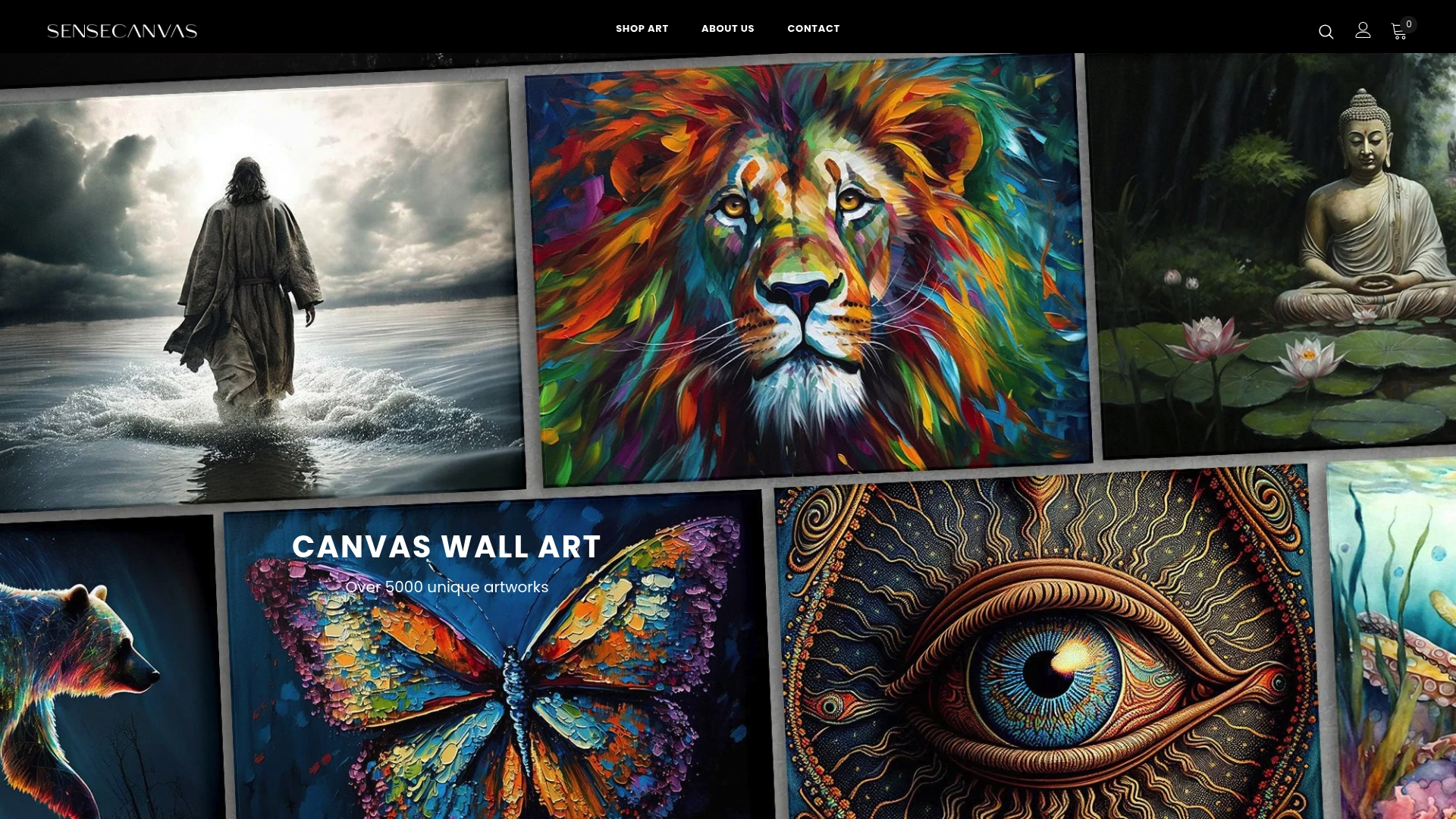
- Start with a themed bundle (money and motivation, abstract, or floral) for a cohesive gallery wall in one order.
- Customize dimensions to fit irregular walls without cropping or stretching the design.
- Browse the full canvas wall art collection to compare themes side by side.
- Check the floral collection for a softer palette suited to boutique or lifestyle spaces.
Orders can often include shipping options and satisfaction guarantees, making testing a new feature wall less risky. Browse Sensecanvas to pick a starting piece for your next rotation.
FAQ
What are some examples of visual merchandising?
Visual merchandising covers window displays, feature walls, mannequin styling, product groupings by color or theme, and signage that guides customer flow. Art fits into nearly all of these, from a single anchor canvas behind checkout to a full gallery wall near a fitting room.
What is the best color to use in a retail store?
There is no single best color since it depends on your brand identity and audience, but cooler tones tend to read as calm and premium while warmer tones read as energetic and approachable. Our guide to color in art selection breaks down which palettes suit which brand tone.
How do I decorate my shop with art on a budget?
Start with one strong, eye-level feature piece near your entrance or checkout rather than spreading a small budget across many walls. Custom canvas pieces starting from $85 offer an accessible way to test a feature wall before committing to a larger installation.
What are the core principles of retail merchandising?
Common principles include clear sightlines, eye-level anchor placement, consistent brand storytelling, and regular rotation to avoid displays going stale. Practitioner guidance recommends refreshing major displays on a roughly quarterly cycle to keep customers noticing them.
How often should retail art displays be rotated?
Window and threshold displays benefit from frequent changes, with case observations showing flagship windows changing biweekly to monthly in some stores, while interior fixtures and tables can rotate on a much slower cycle. A good default is micro-swaps weekly near the entrance and fuller refreshes quarterly elsewhere.


