

Mood Board Art Selection: A Practical Guide for Artists
Mood board art selection is the process of building a curated visual contract that translates one clear creative direction into the constraints you use to choose or commission artwork. Three actions get you started immediately:
- Write a one-line creative brief before you collect a single image (“warm, textured abstraction with a muted clay palette for a living room focal wall”).
- Collect widely, then cut hard: gather 40–60 references in the first round, then curate to 12–20 final images. This numeric range is supported by MadeGoodDesigns and Storyflow.
- Label every reference with its decision job (color, texture, scale, composition) so the board drives real choices rather than just looking good.
This method applies directly to selecting canvas wall art for a home or office, briefing a commissioned piece, or presenting direction to a client. Sensecanvas, which carries over 15,000 canvas designs across abstract, nature, and motivational themes, is a natural endpoint: once your board is finalized, its palette and size constraints map directly to a product search or custom order.
Table of Contents
- What a mood board actually does for art selection
- The core elements every art mood board needs
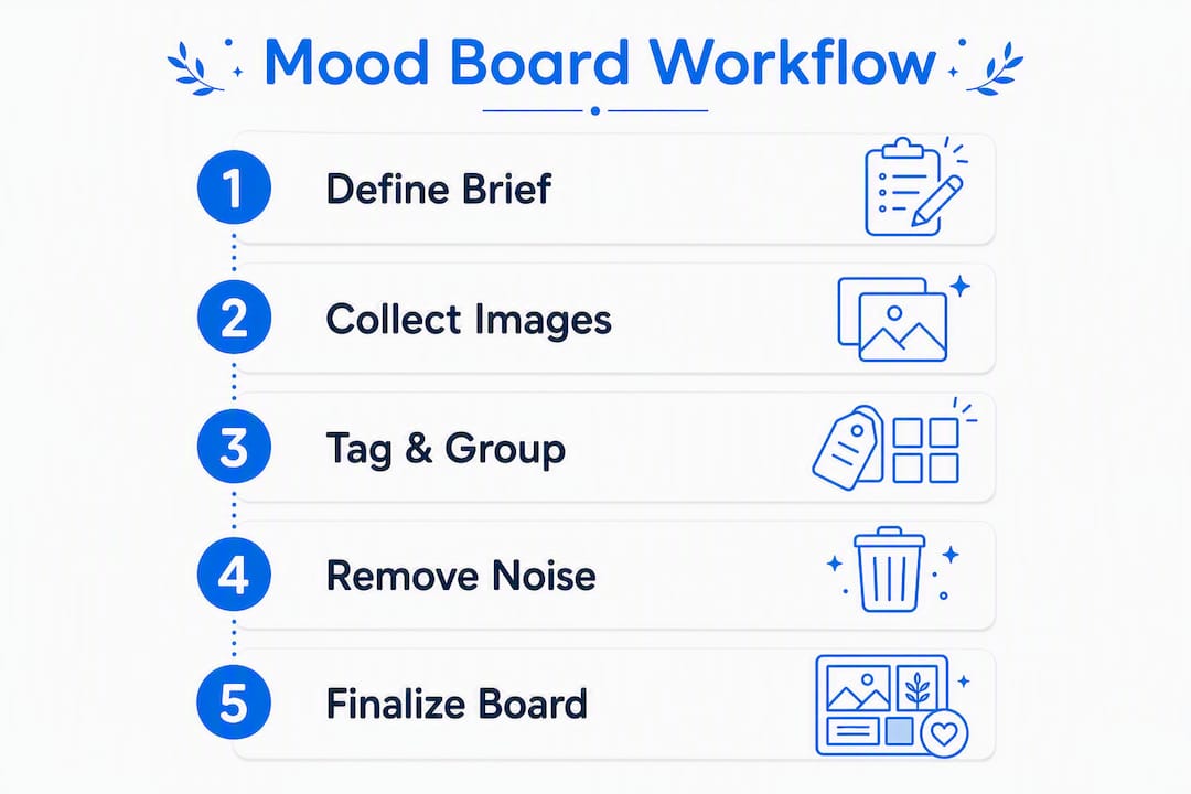
- A 5-step workflow for mood-board-driven art selection
- Which tools work best for building your board?
- How to use a finished board to choose or commission art
- Ready-to-copy templates for art selection
- Common mistakes artists make with mood boards
- Build a usable mood board in a single session
- Integrating your mood board with a broader project style
- When and how to update a mood board mid-project
- Key Takeaways
- The part most artists skip
- From mood board to finished wall art with Sensecanvas
- Useful sources and templates
What a mood board actually does for art selection
A mood board is a curated set of visual references that communicates tone, aesthetic, and emotional direction before any money is spent or brush hits canvas. Think of it as the gap-closer between a vague feeling (“I want something bold but calm”) and a specific, defensible choice.
For artists and buyers, the value is practical:
- Reduces ambiguity. A board replaces subjective adjectives with concrete visual evidence. “Earthy” means something different to everyone; a cluster of terracotta-toned photographs does not.
- Aligns stakeholders. When a client, designer, and artist all look at the same board, disagreements surface before production, not after.
- Creates a filter. Every candidate artwork either fits the board’s direction or it does not. That binary makes decisions faster and easier to defend.
Short use cases where this matters: selecting a single large canvas for a living room wall, writing a commission brief for an illustrator, or preparing a gallery proposal with a consistent visual thread. Art affects room mood in measurable ways, which makes the upfront alignment a mood board provides worth the hour it takes to build one. Nielsen Norman Group also notes that mood boards are effective early in the design process and help teams reach consensus before any production begins.
The core elements every art mood board needs
A mood board that actually drives art selection contains more than pretty pictures. Each element has a specific job:
- Color swatches (4–7 colors, with HEX codes for digital boards). Extract these from your strongest reference images. HEX codes prevent drift when you are comparing digital prints or briefing a printer. Color palettes guide art selection more reliably than verbal descriptions.
- Texture and material photos. A photograph of matte linen, rough concrete, or brushed metal communicates finish quality that color alone cannot. For physical or spatial projects, texture references communicate materiality that digital boards often miss entirely.
- Scale and placement references — A photo of a large-format canvas on a white wall, or a room shot showing proportional relationships, prevents the common mistake of choosing a piece that is technically beautiful but wrong for the space.
The caption is the most skipped element and the most important. Without it, a board is a scrapbook. With it, it is a brief.
A 5-step workflow for mood-board-driven art selection
A repeatable five-step process produces boards that guide practical decisions rather than just inspire vaguely. Here is the method:
-
Write a one-sentence creative brief. This is your filter for every decision that follows. Format: “[Feeling] [style] with [palette constraint] for [specific context].” Example: “Calm, textured abstraction with a muted blue-gray palette for a home office focal wall.” If a reference does not serve this sentence, it does not belong on the board.
-
Collect 40–60 references in the first pass. Cast wide. Pull from Pinterest, film stills, architectural photography, fabric swatches, and nature shots. Lateral sources from different industries often carry the underlying visual logic you need without the literal similarity that makes a board feel derivative.
-
Cut to 12–20 final references and tag each with its job. This discipline, consistently recommended by workflow guides, separates a functioning board from a scrapbook. Every surviving image gets a one-line tag: palette: warm clay, texture: matte paper, composition: centered subject, reference standard: the quality level to match. No tag, no spot on the board.
-
Group by theme and add cluster captions. Arrange the tagged images into layers: color, texture, composition, reference standard. Add a one-line caption beside each cluster. This grouping is what makes the board readable to someone who did not build it.
-
Finalize and use it as a decision contract. Make key assets larger or centered so viewers immediately grasp the primary aesthetic intent. Export or print the board. Include a one-line approval note and the name of whoever signs off. From this point, the board governs every art selection or commission decision on the project.
Pro Tip: Treat the mood board as a contract, not a collection. Before finalizing, remove any image that does not have a named job. Then add a simple line at the bottom: “Approved by: [Name], [Date].” That single step prevents scope creep and protects both artist and client.
Which tools work best for building your board?
The right tool depends on whether materiality matters to your project.

Digital boards win on shareability, iteration speed, and remote collaboration. Pinterest works well for the wide-collection phase. Once you have your strongest references, move them into Milanote for a clean, client-facing layout, or Figma if the board needs to live inside a larger design workflow. Canva provides ready-made mood board templates and is the fastest path to a polished, shareable export. Adobe Illustrator gives designers full layout control and is worth the learning curve when the board will be printed or presented formally.
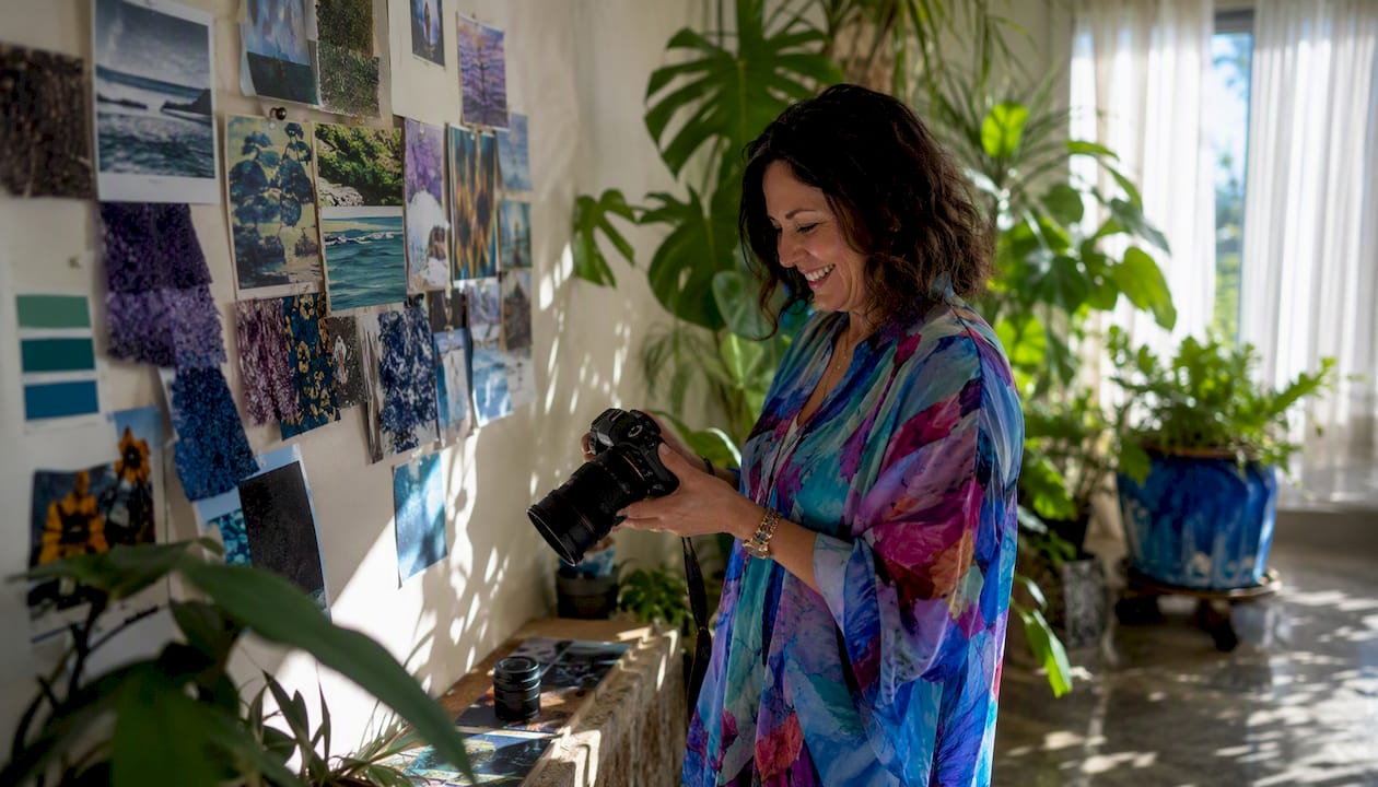
Physical boards win when texture and finish are the point. A fabric swatch pinned next to a paint chip communicates something a JPEG cannot. If you are selecting art for a room where the wall finish, upholstery, or flooring matters, a physical board with actual material samples is worth the extra effort.
| Dimension | Digital board | Physical board |
|---|---|---|
| Shareability | High — link or PDF | Low — must photograph |
| Iteration speed | Fast — drag and drop | Slow — repin or reprint |
| Texture accuracy | Low — screen-dependent | High — actual materials |
| Client presentation | Easy — async review | Strong in-person impact |
| Best for | Remote projects, commissions, canvas art | Spatial, interior, material-focused work |
Recommended template by project type:
- Commission brief: Canva or Milanote, board with 12–20 images, a HEX palette strip, and three annotated clusters
How to use a finished board to choose or commission art
The board is only useful if it drives a decision. Three tests keep the process honest:
- The job test. Remove any candidate artwork that does not serve at least one tagged job on the board. If it is not solving a named problem (palette, texture, composition, reference standard), it is a distraction.
- The match test. Does the piece match at least two core board elements: palette, texture, and composition? One match is coincidence. Two is alignment.
- The hierarchy test. Does the piece compete with the board’s key asset, or does it support it? A piece that fights the dominant visual direction on the board will fight it on the wall too.
For commissions, translate the board into a brief with these fields:
- One-line direction (copy directly from your creative brief)
- Size or aspect ratio (e.g., 24×36 inches, landscape)
- Color constraints (HEX codes from your palette swatches)
- Texture notes (e.g., “visible brushwork, matte finish”)
- Reference-standard images (two or three images from the board that set the quality bar)
- Deadline and budget
For canvas art purchases, the board’s palette and scale references translate directly into product filters. Measure your wall first: a single large canvas typically works best at two-thirds the width of the furniture below it. For groupings, art curation for interiors follows the same principle — treat the grouping as one visual unit and size it accordingly. A placement reference photo on your board, showing a similar-scale piece in a similar space, prevents the most common sizing mistake.
Ready-to-copy templates for art selection
Template A: Commission brief
Direction: [One-line creative brief]
Size / aspect ratio: [e.g., 24×36 in, portrait]
Palette: [HEX 1], [HEX 2], [HEX 3], [HEX 4]
Texture: [e.g., matte, visible grain, smooth finish]
Reference standards: [Image 1 — job], [Image 2 — job]
Deadline: [Date]
Budget: [$]
Approved by: [Name, Date]
Template B: Board export layout
One-line direction: [Creative brief sentence]
Images (12–20 total):
  — Cluster A: Color | Caption: [palette constraint]
  — Cluster B: Texture | Caption: [finish/material note]
  — Cluster C: Composition | Caption: [structural note]
  — Cluster D: Reference standard | Caption: [quality bar]
Palette strip: [HEX 1] [HEX 2] [HEX 3] [HEX 4] [HEX 5]
Approval: [Name, Date]
Layout examples:
- Single-direction board: All 12–20 images on one canvas, key asset centered and at 1.5× the size of supporting images. One-line direction at the top. Palette strip along the bottom edge.
- Two-direction comparison: Two boards side by side, each with its own one-line direction and palette strip. Use this when presenting alternative creative routes to a client before committing.
Sample captions:
- “Palette: warm clay and dusty rose — primary color constraint for all selections.”
- “Texture: rough linen weave — sets the surface quality standard.”
- “Composition: off-center subject with negative space — governs framing decisions.”
Common mistakes artists make with mood boards
Most mood board failures trace back to one of three habits:
- Collecting favorites without tagging jobs. The fix is simple: during the curation pass, require a one-line job tag for every image before it makes the final board. If you cannot name the job in ten seconds, the image is not earning its place.
- Final board too large or cluttered. A board with 40 images and no hierarchy communicates nothing. Cut to 12–20 curated items, make the reference standards visually dominant, and remove anything that duplicates a job already covered by a stronger image.
- No visual hierarchy. If every image is the same size, the viewer has no way to know what matters most. Make the key assets larger or centered. Add a one-line summary at the top of the board. Hierarchy on the board is what lets a viewer grasp the direction in under ten seconds, which is roughly how long you have before attention drifts.
A fourth mistake worth naming: mixing two creative directions on one board. If you are torn between a warm, earthy palette and a cool, minimal one, build two separate boards and choose between them. A board that tries to serve two directions serves neither.
Build a usable mood board in a single session
This checklist fits a 30–60 minute working session:
- Minutes 0–15: Write the brief. One sentence. Feeling, style, palette, context. Do not move to collection until this is done.
- Minutes 15–35: Collect references. Aim for 30–50 images across Pinterest, Google Images, and your own photo library. Include at least five lateral sources (film, architecture, nature, textiles).
- Minutes 35–50: Cut and tag. Reduce to 12–20 images. Tag each with its job. Delete anything without a tag.
- Minutes 50–55: Group and caption. Arrange into clusters (color, texture, composition, reference standard). Write one caption per cluster.
- Minutes 55–60: Export and approve. Export as PDF or image. Add the approval line. Share with any collaborators or clients.
Quick filter card for evaluating any artwork candidate:
- Job test: Does it serve a named job on the board? Yes / No
- Match test: Does it match at least two core board elements? Yes / No
- Hierarchy test: Does it support rather than compete with the key asset? Yes / No
Three “yes” answers: accept. Any “no”: reject or replace. For client approvals, send the finalized board with a one-line summary and two reference-standard images highlighted. That is enough for most stakeholders to give a clear go or no-go.
Integrating your mood board with a broader project style
A mood board built for one wall or one commission does not exist in isolation. The space around it, the existing furniture, the lighting, and the other art already in the room all exert pressure on what works. Matching art to interior styles requires the mood board to account for the room’s existing visual language, not just the piece in isolation.
The practical approach: before finalizing your board, photograph the target wall and the surrounding space. Add that photo to the board as a context reference, tagged “environment: existing palette and scale.” Any candidate artwork that clashes with that reference fails the match test regardless of how well it fits the board’s other elements.
For projects with multiple rooms or multiple pieces, build one master board that captures the overarching direction, then create sub-boards for each space or piece. The master board governs palette and quality standard; the sub-boards handle composition and scale specifics. Mixing art styles across a home works best when all pieces share at least one element from the master board, even if their styles differ.
When and how to update a mood board mid-project
A mood board is a living document until the art is ordered or the commission is delivered. After that, it becomes an archive. Knowing when to update it versus when to hold firm is a judgment call, but a few rules help:
Update the board when: the project scope changes (a new wall is added, the room’s function shifts), a key reference image no longer fits the direction that has emerged, or a client introduces a new constraint (a specific color that must be avoided, a size limitation).
Do not update the board when: you are simply bored with the original direction or a new image catches your eye. Mood board drift is real. Every change to a finalized board should be deliberate and documented, with a new approval note and date.
Version control matters. Save each major version of the board as a separate file (v1, v2, v3) rather than overwriting. When a client changes their mind and wants to return to an earlier direction, you will have the evidence. Store the exported board with the project files, not just in a browser tab or a temporary folder.
For long projects, schedule a board review at the midpoint. Ask one question: does every image still serve its tagged job given what you now know about the space, the budget, and the client’s preferences? Remove what no longer earns its place and add nothing without a named job.
Key Takeaways
A mood board for art selection works because it converts a vague creative feeling into a specific, testable set of constraints that govern every choice from first reference to final purchase.
| Point | Details |
|---|---|
| One-line brief first | Write the creative direction before collecting any images — it is the filter for every decision. |
| Collect wide, cut hard | Gather 40–60 references in the first pass, then reduce to 12–20 with a job tag on each. |
| Tag every reference | Label each image with its decision job (color, texture, scale, composition) to turn the board into a brief. |
| Board as contract | Finalize with an approval name and date; the board governs all art selection and commission decisions. |
| Sensecanvas as endpoint | Map your board’s palette, size, and texture constraints directly to Sensecanvas’s 15,000+ canvas designs for a fast, informed purchase. |
The part most artists skip
The mood board step most people skip is not the collection phase. Everyone enjoys gathering images. The step that gets skipped is the second-pass curation: the deliberate, sometimes painful act of cutting 40 images down to 15 and forcing a one-line job tag onto every survivor.
That cut is where the board becomes useful. A board of 40 unlabeled images is a scrapbook. A board of 15 tagged, grouped, and captioned images is a brief. The difference between those two things is the difference between a vague conversation with a client and a signed contract.
There is also a tendency to treat the mood board as a one-time artifact, something you build at the start and then ignore. The boards that actually improve art selection are the ones that get updated at project midpoints, versioned carefully, and stored with the final files. When a client disputes a direction six weeks in, the dated, approved board is the clearest possible answer.
For canvas art specifically, the board’s palette and scale references do real work. A HEX code is more useful than “something warm.” A placement reference photo is more useful than “medium-sized.” The specificity the board forces is exactly what makes the final purchase feel right rather than approximate.
From mood board to finished wall art with Sensecanvas
Once your board is finalized and approved, the path to a finished canvas is straightforward. Measure your wall, note the aspect ratio that fits the space, and use your board’s palette and texture notes to filter your options. Sensecanvas carries over 15,000 canvas designs starting at $85, covering abstract, nature, motivational, and custom themes, so the board’s constraints narrow a large catalog to a short, confident shortlist.
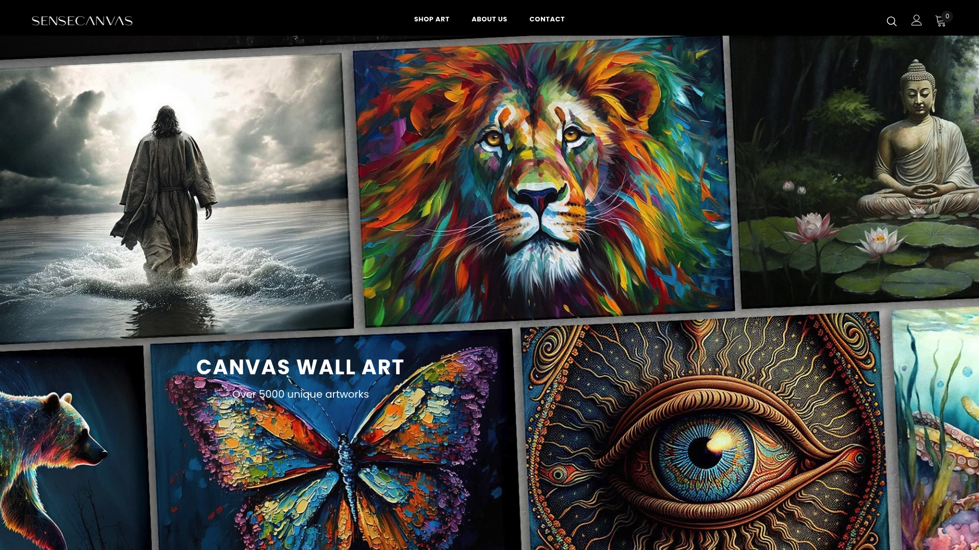
The practical sequence: measure the wall, identify the aspect ratio from your scale reference, match the palette using your HEX codes, and order a sample size before committing to the full-format piece. A test print in the actual space, under the room’s real lighting, catches mismatches that even the best mood board cannot fully predict. Browse the full canvas wall art collection at Sensecanvas to find the piece your board has already described.
Useful sources and templates
- Mood Boards in UX: How and Why to Use Them — Nielsen Norman Group’s research-backed guide; covers hierarchy, consensus-building, and when to use boards in a project timeline.
- How to Make a Mood Board (With Examples) — MadeGoodDesigns’ five-step process with numeric guidance (40–60 collect, 12–20 final) and visual examples.
- Create Mood Boards Online with Canva — Canva’s template library; the fastest starting point for a client-facing board or a quick commission brief.
- How to Make a Mood Board — StudioBinder’s guide, with strong coverage of physical boards and texture references for spatial projects.
Recommended first template for artists: a client-brief board in Canva with 12–20 images, a five-color palette strip with HEX codes, and three annotated clusters. Build it once, save it as a template, and reuse the structure for every project.


