

Neutral Room Color Art Selection for Bold Canvases
For a neutral room, the single best move is one large, textured canvas that matches your wall’s undertone and carries a clear range from light to dark. That combination — texture, tonal contrast, and scale — is what separates a neutral room that feels intentional from one that just feels unfinished.
Here’s how to act on that immediately:
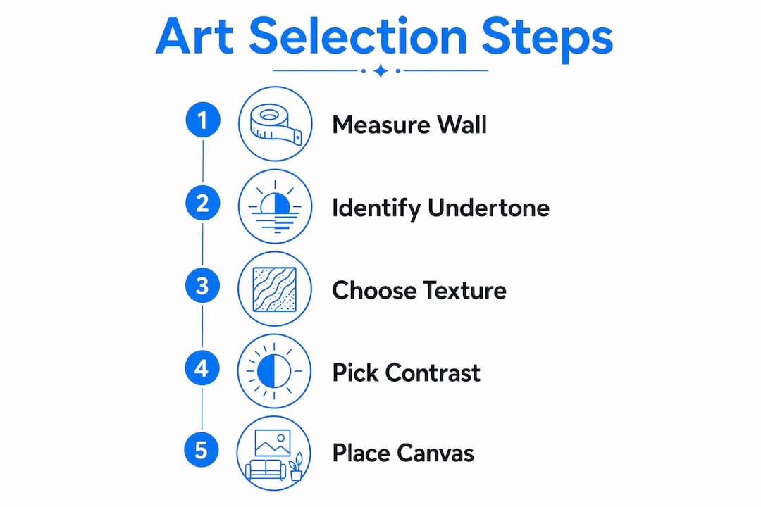
- Measure your wall first. Target a canvas that spans roughly two-thirds to three-quarters of your main furniture piece’s width.
- Identify your undertone. Hold a white sheet against your wall in natural light. If the wall looks warm beside it, you have a warm neutral. If it looks slightly blue or gray, you have a cool neutral.
- Choose a texture type. Heavy brushwork, linen canvas, or plaster-relief surfaces all cast subtle shadows that flat prints cannot.
- Confirm a value range. The artwork should include lights, midtones, and at least one dark note — cream to charcoal reads sophisticated; cream to off-white reads flat.
Sensecanvas offers over 15,000 artworks with customization options, so you can dial in size, texture, and tonal range rather than settling for whatever fits the box.
Pro Tip: Before ordering, photograph your wall under your actual room lighting and compare it to the artwork’s product image. Undertones shift dramatically between natural daylight and incandescent bulbs.
Table of Contents
- Why does texture prevent neutral rooms from feeling bland?
- How do you size and place a canvas in a neutral room?
- What colors work best against warm, cool, and mixed neutral palettes?
- Which materials add the most tactile richness to neutral rooms?
- How do frame and mount choices change the way neutral art reads?
- What lighting setup makes neutral art read as intended?
- What should you confirm before buying a canvas?
- How do you maintain bold canvas art in a neutral room?
- Key Takeaways
- What most buyers get wrong about bold art in neutral rooms
- Sensecanvas makes neutral room art selection concrete
- Useful sources and further reading
Why does texture prevent neutral rooms from feeling bland?
The short answer: texture creates shadow lines, and shadow lines create depth. A flat print on a beige wall gives the eye nothing to land on. A canvas with visible heavy brushwork or plaster-like relief casts micro-shadows that shift as daylight moves across the room, making the piece feel alive without adding color.
Tonal contrast works the same way. The perception of “boring” in neutral rooms usually comes from insufficient tonal range rather than a lack of color. A palette that runs only from cream to warm white has nowhere for the eye to travel. Broaden that range to include a deep charcoal or ink note and the same neutral palette suddenly reads as layered.
Key texture types that work in neutral interiors:
- Heavy impasto brushwork — creates ridges that catch raking light
- Plaster-relief surfaces — dimensional, shadow-rich, and tactile
- Mixed-media relief — combines materials for varied surface depth
- Woven or fiber art — adds softness and sculptural shadow play that 2D prints cannot replicate
Scale matters too. Large-scale canvases anchor open-concept rooms far more effectively than clusters of small pieces, which tend to fragment the eye rather than settle it.
How do you size and place a canvas in a neutral room?
Size up when you’re uncertain. A canvas that feels slightly large in the store almost always looks right on the wall. One that feels “safe” in the store usually looks small once it’s hanging.
Practical sizing rules:
- Span two-thirds to three-quarters of your sofa or console width for living rooms
- Hang the bottom edge 6–12 inches above furniture to keep the grouping connected
- Use taller vertical pieces in narrow niches or hallways to draw the eye upward
- Choose diptychs or triptychs for long horizontal walls where a single piece would look lost
For open-concept rooms, one large statement piece or a balanced diptych outperforms a crowded gallery wall. The eye gets a single place to rest, which is exactly what a calm neutral room needs. Save smaller pieces for entryways, reading nooks, or bedroom corners where a quieter moment fits the scale of the space. For small-room strategies, canvas sizing for compact spaces covers the specifics.
Pro Tip: After hanging, step back and check that there’s breathing room around the piece. Negative space around a hero canvas reinforces the calm rather than crowding it.
What colors work best against warm, cool, and mixed neutral palettes?
Match undertone first, then add one contrast anchor. That’s the whole strategy.
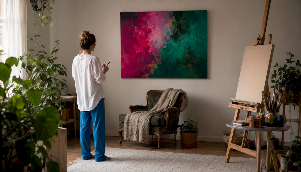
Designers consistently recommend aligning artwork with the room’s dominant neutral family and then introducing a single darker note — charcoal, ink, or umber — to create depth without disrupting the harmony. Skipping the contrast anchor is what makes neutral art look washed out rather than serene.
Palette suggestions by room type:
- Warm neutrals (sandy beige, oat, terracotta): Art with warm cream grounds, amber midtones, and deep umber or burnt sienna darks. A single charcoal note anchors without cooling the room.
- Cool neutrals (mist gray, pale stone, soft white): Dusty blues, pale ochres, and cool off-whites. A deep ink or slate dark provides the contrast anchor.
- Mixed or greige undertones: Lean toward earthy abstracts with both warm and cool notes — the artwork bridges rather than commits to one temperature.
For living rooms, one saturated accent in the artwork (a single deep teal or rust passage) reads as intentional when the rest of the palette stays tonal. Bedrooms and offices generally benefit from staying strictly within the tonal range, where the contrast comes from value (light vs. dark) rather than hue. Nature-inspired palettes that pair well with neutral rooms are worth exploring through nature-themed canvas ideas.
Which materials add the most tactile richness to neutral rooms?
Choose materials that cast shadows and show surface variation throughout the day. A canvas that looks one way at noon and different at 7 PM under warm lamplight earns its place on the wall.
- Heavy-brushwork oil or acrylic canvas — ridges catch light at low angles; the piece changes character by hour
- Linen canvas — the weave texture shows through paint layers, adding organic grain
- Plaster or gesso relief — sculptural surface that reads as dimensional from across the room
- Woven fiber or textile art — introduces softness both visually and acoustically, which matters in hard-surface rooms with wood floors and glass
Durability considerations: canvas prints on kiln-dried pine stretcher bars resist warping better than cheaper alternatives. Archival pigment inks rated for long-term fade resistance protect bold colors in rooms with significant natural light. For rooms with open layouts, fiber art also absorbs sound — a practical bonus that flat prints don’t offer.
Pro Tip: If your room already has woven throw pillows or a jute rug, a canvas with visible linen texture or a fiber art piece will feel like it belongs rather than competes. Pair textures across surfaces for a cohesive layered look. See layering textures with canvas prints for more on this approach.
How do frame and mount choices change the way neutral art reads?
Pick one framing strategy and repeat it. That repetition is what makes a room feel designed rather than assembled.
Frame finish either softens or sharpens artwork’s impact in a neutral interior. Thin natural wood keeps pieces airy and organic. Gallery-style matte black provides structural contrast — but only works when another matte-black element already exists in the room (a lamp base, cabinet hardware, a side table leg). Without that echo, a black frame reads as an intrusion.
Framing options and when to use them:
- Thin natural wood — best for warm neutrals and organic, Japandi, or Wabi-Sabi interiors
- Matte black gallery frame — best for cool neutrals and modern or industrial rooms where black already appears
- Off-white or linen mat — adds breathing room around smaller pieces; increases perceived scale
- Floater frame — lets the canvas edge show, creating a shadow gap that reads as gallery-quality
“Frame finish choice can either soften or sharpen the artwork’s impact in a neutral interior — use repetition of the chosen finish in the room to create cohesion.” Thin natural wood frames keep compositions organic; black frames provide modern definition only when echoed elsewhere.
Mounts and spacing affect perceived scale directly. A mat that adds two inches around a medium canvas can make it read as a size larger. For gallery walls in neutral rooms, consistent frame formats make the arrangement read as a single composition rather than a collection of separate decisions.
What lighting setup makes neutral art read as intended?
Start with the bulb. Use CRI 90+ bulbs at 2700K–3000K for warm neutral interiors — high-CRI lighting reveals subtle tonal differences that lower-quality bulbs flatten into a single muddy tone. For cool-neutral rooms, shift toward 3500K to keep the palette crisp without going clinical.
Positioning tips:
- Picture lights mounted directly on the frame cast even, close-range illumination that enhances texture
- Adjustable track lighting angled at 30 degrees from the wall minimizes glare while highlighting surface relief
- Angled ceiling fixtures work for larger pieces where a picture light would look undersized
For heavy textured canvases, confirm the hanging hardware can support the weight — French cleats or D-ring pairs rated for the canvas weight are more reliable than single sawtooth hangers. Keep light sources at least 12 inches from the canvas surface to prevent heat buildup over time.
Pro Tip: Live with the art in its intended spot for a day before committing. Photograph it at morning, midday, and evening under your actual bulbs. Tonal values shift more than most buyers expect between natural and artificial light.
What should you confirm before buying a canvas?
Pre-purchase checklist:
- Measure the wall and the furniture below it — confirm the canvas spans two-thirds to three-quarters of the furniture width.
- Identify your wall’s undertone (warm or cool) and verify the artwork’s palette aligns.
- Decide on texture type: brushwork, linen, plaster relief, or fiber.
- Confirm size options — ask whether custom dimensions are available if standard sizes don’t fit.
- Check lead time, especially for custom or made-to-order pieces.
- Review the return policy before ordering — some large-format canvases are final sale.
- Request a proof image or digital mockup under your intended lighting conditions.
- Confirm shipping dimensions and whether hanging hardware is included.
- Ask about framing options and whether frames are included or add-on costs.
- Request care instructions for the specific material and ink type.
Questions worth asking any vendor directly: Can I order a material sample? What is the customization process for non-standard sizes? Is the stretcher bar kiln-dried? What is the warranty on print quality?
Undertone matching across your whole room, including cabinetry and furniture finishes, is worth thinking through carefully. Coordinating neutral undertones across surfaces follows the same warm-vs.-cool logic that applies to art selection.
How do you maintain bold canvas art in a neutral room?
Canvas art requires less maintenance than most buyers expect, but a few habits protect the investment.
Dust lightly every few weeks using a soft, dry microfiber cloth or a clean, dry brush. Never use water or cleaning sprays directly on the canvas surface — moisture can cause the substrate to warp or the ink to lift, particularly on textured surfaces where liquid pools in the relief.
Keep bold canvases out of direct sunlight when possible. UV exposure fades pigments over time, even on archival prints. If the piece hangs near a south-facing window, consider UV-filtering window film rather than moving the art. For rooms with high humidity, such as kitchens or bathrooms, a canvas with a UV-resistant varnish coat holds up better than an uncoated print.
For textured or mixed-media pieces, avoid pressing or touching the surface. The raised areas are the most fragile part of the piece. If a corner of the canvas begins to warp, a professional art restorer can re-stretch it without damaging the print.
Key Takeaways
Neutral room color art selection works best when texture, tonal contrast, and scale are treated as the primary levers — not color alone.
| Point | Details |
|---|---|
| Prioritize texture | Choose heavy brushwork, linen, or plaster relief to create shadow lines that flat prints cannot. |
| Ensure a value range | Art should span from light to dark — cream to charcoal reads sophisticated; cream to off-white reads flat. |
| Size up | Target a large proportion of your furniture width; when uncertain, choose a slightly larger size. |
| Match undertone, then anchor | Align art with warm or cool wall undertone first, then add one charcoal or ink note for depth. |
| Sensecanvas for custom fit | Sensecanvas offers 15,000+ artworks with custom sizing starting at $85 — useful when standard sizes don’t match your tonal or scale requirements. |
What most buyers get wrong about bold art in neutral rooms
The conventional wisdom says neutral rooms need neutral art. That’s backwards. Neutral rooms need controlled contrast — and bold canvas art, chosen with tonal discipline, delivers exactly that.
The real mistake most buyers make is matching too precisely. They find a canvas that pulls the exact same beige as their walls and wonder why the room still feels flat. The artwork isn’t supposed to disappear into the wall. It’s supposed to give the eye somewhere to go. One deep note in the artwork — a passage of charcoal, a stroke of deep umber — does more for a neutral room than a dozen carefully matched prints.
The second mistake is going too small. A canvas that looks proportional in a product photo often reads as a postage stamp once it’s on the wall. Size up once and the room snaps into focus.
A few practical points worth knowing about Sensecanvas specifically: you can request custom sizing, which matters when your wall doesn’t match standard canvas dimensions. Framing options are available at checkout. And the art coordination guide on the Sensecanvas blog walks through undertone matching by interior style if you want to go deeper before ordering.
Pro Tip: Order a small swatch or request a digital mockup before committing to a large custom piece. Pin paint chips from your wall next to the mockup image and check them under your room’s actual bulbs — not your phone screen.
Sensecanvas makes neutral room art selection concrete
Choosing bold canvas art for a neutral room comes down to three decisions: the right scale, the right texture, and the right tonal range. Sensecanvas is built for exactly that kind of deliberate selection. With over 15,000 canvas artworks starting at $85, customization for non-standard wall sizes, and framing options that include natural wood and gallery-style finishes, you can match undertone, scale, and surface texture without compromising on the boldness that makes the piece worth hanging.

The process is straightforward: measure your wall, identify your undertone, pick a texture type, and browse the catalog filtered by those criteria. Custom sizing is available for walls that don’t fit standard dimensions, and the team can walk you through framing choices before you order. Browse the Sensecanvas catalog to find a large-format, textured canvas that fits your neutral room — or reach out directly to discuss a custom piece.
Useful sources and further reading
External design references used in this guide:
- How to Choose Art for a Neutral Room Without It Feeling Bland — Jangill’s designer-led breakdown of texture and tonal contrast in neutral interiors
- 7 Essential Principles of Minimalist Art Spaces — Minimalism.sg on scale, single hero pieces, and visual rest
- Principles of Design Guide — Superside’s explanation of tonal value range and why neutral schemes fail without it
- How to Choose Neutral Wall Art for a Living Room — Rossetti Art on undertone matching, contrast anchors, and CRI lighting
Sensecanvas resources for immediate action:
- The Role of Texture in Wall Decor — in-depth guide on surface types and how they interact with light
- Matching Art to Interior Styles — undertone and style coordination by room type
- Layering Textures with Canvas Prints — practical pairing of canvas textures with room textiles
- How Art Anchors Furniture Arrangements — sizing and placement tied to common furniture layouts
Before finalizing any purchase, test a sample or digital mockup in your actual space under your intended lighting. Contact Sensecanvas directly for custom sizing, framing guidance, or questions about specific textures and finishes.


